What's new

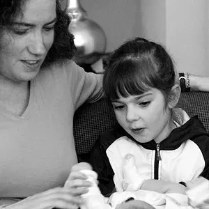
Photoshoot, thoughts?

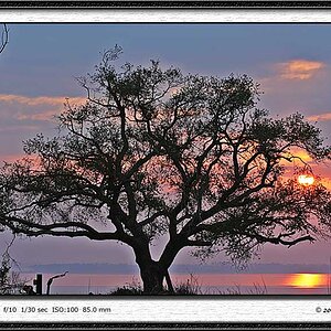
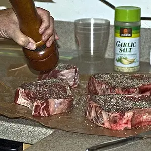
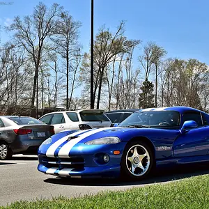
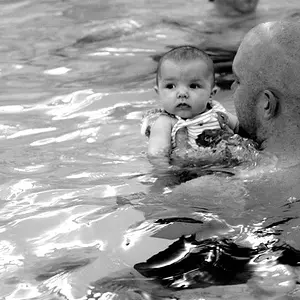
I think you have done a grand job with the lack of equipment. As said there are some colour issues but the 1st one Is great and I like the idea.
Good stuff.
 
Which begs the question... why do you not post them here?

I find that the feedback one gets on TPF tends to lean too heavily toward the technical and not enough toward the, for lack of a better word, artistic properties of a photograph. There are other forums where the balance is skewed more away from the technical, and that's where I look for critique.
 
Which begs the question... why do you not post them here?

I find that the feedback one gets on TPF tends to lean too heavily toward the technical and not enough toward the, for lack of a better word, artistic properties of a photograph. There are other forums where the balance is skewed more away from the technical, and that's where I look for critique.

thanks, thats good to know!
 
So if you know these have problems and you know what you did wrong and you have every excuse why... Why did you post them for critique?

i said ONE of them i knew wasn't good but my WIFE liked it, and i never said i knew what was wrong on any of them except that one. I said the conditions were not ideal which is not an excuse just a simple statement of why that ONE pic came out bad, so take the stick out of your ass and go post your bull**** somewhere else.

to everyone else, thank you for the CC, i planned to take your opinions and put them to use.


euuu, they all came out bad.

bad exposure, selective colouring, "ready to pop" ? really? picaza **** wtfbbqsauce.
 
I just spent about 5 or so minutes fixing your first one... but this is what I was talking about... there isn't a need for the text or the arrow, considering the overall message is implied.

View attachment 16678

I dont know PS very well but how did you edit this one? I really like the deeper shadow on the wall. On the last one you edited I really like how you brought the eyes out and lighten the face. Any tips are greatly appreciated!

To be honest, these were really simple tasks, but I think I'd confuse you more than anything to list everything. The bubble pic has a lot done, but it's not done in a professional manner, so I wouldn't advise recreating it. The only reason I increased the vignette on the wall behind me is because I didn't focus on keeping the gradient intact when taking out the text. So, the back wall looked like someone took black paint and smeared it all over the wall. So, I put a heavy vignette behind her so that you couldn't see it. however, you can still see it on the bottom right hand side by the couch.

I changed that photograph to show you what it would look like without the text, and it looks 10 times better. However, NEVER EVER EVER release a photo edited like that one to a client, or even a family friend or member. There are a thousand things wrong with the editing in that photo. From the wall job, to the fact that the patch on her arm still needs curve adjustment to match the lighting on the rest of her arm.

Like I said, I simply did this for a quick fix to see what it would look like. It took me 5 minutes, but in reality, it would take someone who doesn't know photoshop 45 minutes to an hour to do the same thing.

Your last image was easy.... and I don't mind teaching you on that one.

all I did was select her face using the circular marquee tool with a 30px buffer.... then I got the dodge tool out and pulled it out to where I thought it was bright enough that the exposure would match the rest of the image... then I simply went in and put a tiny bit of contrast back (dodge tool removes contrast), and then selected the side of her face with a 10px buffer and saturated her skin tones back to a pinkish color (After the dodge, it was more yellow-ish).

For her eyes, I just selected them with a 2px buffer and sharpened them a TINY bit.

 
I just spent about 5 or so minutes fixing your first one... but this is what I was talking about... there isn't a need for the text or the arrow, considering the overall message is implied.

View attachment 16678

I dont know PS very well but how did you edit this one? I really like the deeper shadow on the wall. On the last one you edited I really like how you brought the eyes out and lighten the face. Any tips are greatly appreciated!

To be honest, these were really simple tasks, but I think I'd confuse you more than anything to list everything. The bubble pic has a lot done, but it's not done in a professional manner, so I wouldn't advise recreating it. The only reason I increased the vignette on the wall behind me is because I didn't focus on keeping the gradient intact when taking out the text. So, the back wall looked like someone took black paint and smeared it all over the wall. So, I put a heavy vignette behind her so that you couldn't see it. however, you can still see it on the bottom right hand side by the couch.

I changed that photograph to show you what it would look like without the text, and it looks 10 times better. However, NEVER EVER EVER release a photo edited like that one to a client, or even a family friend or member. There are a thousand things wrong with the editing in that photo. From the wall job, to the fact that the patch on her arm still needs curve adjustment to match the lighting on the rest of her arm.

Like I said, I simply did this for a quick fix to see what it would look like. It took me 5 minutes, but in reality, it would take someone who doesn't know photoshop 45 minutes to an hour to do the same thing.

Your last image was easy.... and I don't mind teaching you on that one.

all I did was select her face using the circular marquee tool with a 30px buffer.... then I got the dodge tool out and pulled it out to where I thought it was bright enough that the exposure would match the rest of the image... then I simply went in and put a tiny bit of contrast back (dodge tool removes contrast), and then selected the side of her face with a 10px buffer and saturated her skin tones back to a pinkish color (After the dodge, it was more yellow-ish).

For her eyes, I just selected them with a 2px buffer and sharpened them a TINY bit.


cool thanks, what patch on her arm are you referring to? can you elaborate on the issues with the wall?

thanks
 
I dont know PS very well but how did you edit this one? I really like the deeper shadow on the wall. On the last one you edited I really like how you brought the eyes out and lighten the face. Any tips are greatly appreciated!

To be honest, these were really simple tasks, but I think I'd confuse you more than anything to list everything. The bubble pic has a lot done, but it's not done in a professional manner, so I wouldn't advise recreating it. The only reason I increased the vignette on the wall behind me is because I didn't focus on keeping the gradient intact when taking out the text. So, the back wall looked like someone took black paint and smeared it all over the wall. So, I put a heavy vignette behind her so that you couldn't see it. however, you can still see it on the bottom right hand side by the couch.

I changed that photograph to show you what it would look like without the text, and it looks 10 times better. However, NEVER EVER EVER release a photo edited like that one to a client, or even a family friend or member. There are a thousand things wrong with the editing in that photo. From the wall job, to the fact that the patch on her arm still needs curve adjustment to match the lighting on the rest of her arm.

Like I said, I simply did this for a quick fix to see what it would look like. It took me 5 minutes, but in reality, it would take someone who doesn't know photoshop 45 minutes to an hour to do the same thing.

Your last image was easy.... and I don't mind teaching you on that one.

all I did was select her face using the circular marquee tool with a 30px buffer.... then I got the dodge tool out and pulled it out to where I thought it was bright enough that the exposure would match the rest of the image... then I simply went in and put a tiny bit of contrast back (dodge tool removes contrast), and then selected the side of her face with a 10px buffer and saturated her skin tones back to a pinkish color (After the dodge, it was more yellow-ish).

For her eyes, I just selected them with a 2px buffer and sharpened them a TINY bit.


cool thanks, what patch on her arm are you referring to? can you elaborate on the issues with the wall?

thanks

The arm on the right side of the photograph was covered with a pink arrow head. So, I patched it using her other arm, and warped it to fit exactly. Then I adjusted the brightness to get close to the tone of the arm. It's not perfect, but I didn't want to spend 5 more minutes adjusting curves so that you couldn't tell there is a patch there.

The background had text on it. I selected the text using the polygonal lasso tool, and then patched in using other parts of the wall. After this, I blended the edges of those patches using the spot healing brush tool, and it looked heavily photoshopped. So, to hide what I did, I selected the background using the polygonal lasso and a 30px buffer, and then applied a gradient matching the wall tone over the top of it, and then turned the opacity down to about 85%. If this were a professional photo, I would have restored using the healing brush tool, making sure the tones in the gradient on the wall stayed intact. Then I would have applied a very LIGHT gradient concealing my changes.
 
To be honest, these were really simple tasks, but I think I'd confuse you more than anything to list everything. The bubble pic has a lot done, but it's not done in a professional manner, so I wouldn't advise recreating it. The only reason I increased the vignette on the wall behind me is because I didn't focus on keeping the gradient intact when taking out the text. So, the back wall looked like someone took black paint and smeared it all over the wall. So, I put a heavy vignette behind her so that you couldn't see it. however, you can still see it on the bottom right hand side by the couch.

I changed that photograph to show you what it would look like without the text, and it looks 10 times better. However, NEVER EVER EVER release a photo edited like that one to a client, or even a family friend or member. There are a thousand things wrong with the editing in that photo. From the wall job, to the fact that the patch on her arm still needs curve adjustment to match the lighting on the rest of her arm.

Like I said, I simply did this for a quick fix to see what it would look like. It took me 5 minutes, but in reality, it would take someone who doesn't know photoshop 45 minutes to an hour to do the same thing.

Your last image was easy.... and I don't mind teaching you on that one.

all I did was select her face using the circular marquee tool with a 30px buffer.... then I got the dodge tool out and pulled it out to where I thought it was bright enough that the exposure would match the rest of the image... then I simply went in and put a tiny bit of contrast back (dodge tool removes contrast), and then selected the side of her face with a 10px buffer and saturated her skin tones back to a pinkish color (After the dodge, it was more yellow-ish).

For her eyes, I just selected them with a 2px buffer and sharpened them a TINY bit.


cool thanks, what patch on her arm are you referring to? can you elaborate on the issues with the wall?

thanks

The arm on the right side of the photograph was covered with a pink arrow head. So, I patched it using her other arm, and warped it to fit exactly. Then I adjusted the brightness to get close to the tone of the arm. It's not perfect, but I didn't want to spend 5 more minutes adjusting curves so that you couldn't tell there is a patch there.

The background had text on it. I selected the text using the polygonal lasso tool, and then patched in using other parts of the wall. After this, I blended the edges of those patches using the spot healing brush tool, and it looked heavily photoshopped. So, to hide what I did, I selected the background using the polygonal lasso and a 30px buffer, and then applied a gradient matching the wall tone over the top of it, and then turned the opacity down to about 85%. If this were a professional photo, I would have restored using the healing brush tool, making sure the tones in the gradient on the wall stayed intact. Then I would have applied a very LIGHT gradient concealing my changes.

okay gotcha, I thought you were reffering to a patch on her arm that i created with the original photo, thanks for all your help man, appreciate it!
 
why is it so bad to post photos here that you know isnt perfect but you want other peoples opinions on what you can do to make it better or shoot it better? Some people just love to troll on forums, that will never stop.

My objection has nothing to do with your posting pictures that aren't perfect (for starters, there's no such thing). My problem is your response them medic asked a simple question, based on the perception that you said "I know" several times and made excuses for posting one of the pictures.

Telling someone who took time out of their day to answer you to "take the stick out of your a$$ and post your BS somewhere else" is the response I'd expect from a mouthy, hormonal teenager. So, unless that describes you well, maybe you should count to 10 before you type and post like an adult next time.

There are plenty of sharp-tongued, blowhard know-it-all's on this forum as it is. We don't need anymore.
 
So if you know these have problems and you know what you did wrong and you have every excuse why... Why did you post them for critique?

i said ONE of them i knew wasn't good but my WIFE liked it, and i never said i knew what was wrong on any of them except that one. I said the conditions were not ideal which is not an excuse just a simple statement of why that ONE pic came out bad, so take the stick out of your ass and go post your bull**** somewhere else.

to everyone else, thank you for the CC, i planned to take your opinions and put them to use.
Hmmmmmm, just why would I ask you a serious question like that?

Thanks everyone, I do understand that these have issues especially number 3, i actually hate this photo and the only reason i posted it was because my wife liked it lol. The background in these photos are not ideal by any means as they were all shot in my apartment after sundown with little light and very high iso.
You imply that you already know the problems with all of these and especially #3. It seems as if you are telling us that we've wasted our time to give you CC and encouragement.
My husband loves a lot of really bad stuff I have shot... I am NOT posting that on the internet for someone to CC me on because I know it's problems. And I am sure not going to excuse it. I might SHARE it so we can get a chuckle and rip it up. MANY of us simply share photos and don't ask for CC on them. That's great.

On number one, my wife wanted the text really bad and i needed some Photoshop practice so i went for it! I agree with everything everyone has said here and I will try to correct and hopefully get a better backdrop, i dont think the down comforter worked well haha.
You really imply that you knew all of this and you have excuses as to why you didn't shoot these differently. It seems as if we've spent time trying to help you for... to waste time? So... pardon me if I felt you were wasting our time and asked you why. Take the stick out of YOUR ass.
 
So if you know these have problems and you know what you did wrong and you have every excuse why... Why did you post them for critique?

i said ONE of them i knew wasn't good but my WIFE liked it, and i never said i knew what was wrong on any of them except that one. I said the conditions were not ideal which is not an excuse just a simple statement of why that ONE pic came out bad, so take the stick out of your ass and go post your bull**** somewhere else.

to everyone else, thank you for the CC, i planned to take your opinions and put them to use.
Hmmmmmm, just why would I ask you a serious question like that?

Thanks everyone, I do understand that these have issues especially number 3, i actually hate this photo and the only reason i posted it was because my wife liked it lol. The background in these photos are not ideal by any means as they were all shot in my apartment after sundown with little light and very high iso.
You imply that you already know the problems with all of these and especially #3. It seems as if you are telling us that we've wasted our time to give you CC and encouragement.
My husband loves a lot of really bad stuff I have shot... I am NOT posting that on the internet for someone to CC me on because I know it's problems. And I am sure not going to excuse it. I might SHARE it so we can get a chuckle and rip it up. MANY of us simply share photos and don't ask for CC on them. That's great.

On number one, my wife wanted the text really bad and i needed some Photoshop practice so i went for it! I agree with everything everyone has said here and I will try to correct and hopefully get a better backdrop, i dont think the down comforter worked well haha.
You really imply that you knew all of this and you have excuses as to why you didn't shoot these differently. It seems as if we've spent time trying to help you for... to waste time? So... pardon me if I felt you were wasting our time and asked you why. Take the stick out of YOUR ass.

I cant tell if your serious or troll..... im glad you and your husband only post your perfections, just cause i know what i did wrong it doesn't mean i cant post and have someone tell me what else i did wrong. Shouldn't have to worry about ignorant people like you replying on the forums, if it bothers you that bad then you need a new hobby.

james- same thing as above.. i cant say "i know" without being flamed? So if I take photo knowing i didn't have a good backdrop i cant post to get other opinions on what else i can improve on? Taking time out of their day for negativity, yah that's ignorant and rude. Why are you even wasting your time posting if your so worried about me wasting others time? every post i see you in on TPF is trolling, this thread is about photos and improvements so if you dont have CC then stop replying, go troll some other thread, end of discussion.
 
Yep. I am a troll. Feel free to ignore me! I am happy to give help elsewhere.
 
MLeeK said:
Yep. I am a troll. Feel free to ignore me! I am happy to give help elsewhere.

A serious piece of advice..MLeeK is one of the most helpful people you will EVER find. Total opposite of a troll. Ignore her at your own loss.
 

Create an account or login to comment

You must be a member in order to leave a comment

Create account

Create an account on our community. It's easy!

Log in

Already have an account? Log in here.

New Topics

Back
Top Bottom