Pick...or not to pick...whatever....=)

mishele

Moderator
Staff member
Supporting Member
Joined
Jun 19, 2009
Messages
13,661
Reaction score
4,894
Location
In your dreams!
Can others edit my Photos
Photos OK to edit
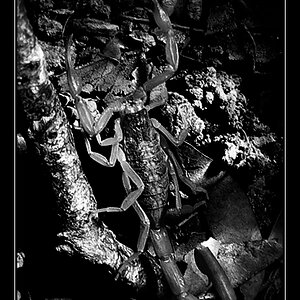
Ok...does color work better or B&W?
Do you feel the movement in one better than the other and why?
1.
5748296430_26c8ba4e14_z.jpg
\
2.
5748296354_3f88c6cb4f_z.jpg
 
I prefer the color one Mish. I find the dark area really distracting in the B&W and I need you to explain how you shot this. I find the first really nice and dreamy.
 
Oh man! I :heart: these!!!

I think they work both ways.


I will suggest that the left edge of the flower is tooooo close to the edge. You should always allow for matting for framing. Aside from just a smudge of breathing room,
 
Yeah these are great Mish. I got a crush on you...r work :sexywink:

Movement wise I prefer the colored version. The BW takes away the color transition that gives the movement effect. #1 for me please!
 
The blurred lines suggest movement in both images, though.
 
I agree Bitter. In my eyes the transition in colour just makes more of a significant movement effect.
 
Movement wise I prefer the colored version. The BW takes away the color transition that gives the movement effect. #1 for me please!
I agree with this. Such a beautiful image! I like how the soft, pastel colours "contradict" the apparent violence of the wind.
 
I prefer the color version. The colors add softness. Lovely photos, both of them.
 
I get a tiny bit more sense of motion in the color version. There are certain places in the b/w that I my eyes stop briefly, for instance, the lines created in the leaves on the left.
 
Mwcfarms.........Thanks....this shot isn't even close to being complicated....lol I'll e-mail you what I did......:sexywink:

BJ........I agree, I do need to give a little more room on the left side. I don't know why I cropped it so close, I'll look at the original.

camz.........How you doin baby!! :sexywink:

invisible......yay, you got the right feel out of the it. I can't say I planned that feeling before hand but man did it jump out at me as soon as I saw it!! (dang should of lied and said I planned everything) lol

NayLoMo6C.........do I get anything for holding that title....lol :greenpbl:

Milady......Thanks, it's looking like the color is the winner....=)
arne...... Thanks!!
Trever....Thanks!!

I was leaning myself towards the color version but I thought it would be interesting to hear why people felt more movement from one or the other.....=)
Thanks for the comments everyone. I'm working on a whole series of these movement type flowers. I'll post more as I have them.....:greenpbl:
 
I still prefer the color version, but seeing the images on another computer screen, I take back my comment about the slightly less sense of movement on the b/w. You have a very nice and unique approach to floral shots.
 
Definitely the color for the reasons stated previously, but did you try anything in between?

... and how did you do this? we all want to know!
 
Definitely the color for the reasons stated previously, but did you try anything in between?

... and how did you do this? we all want to know!

Now how much fun would that be if I just told you how to do it?! :lmao::greenpbl:

I will tell you nothing but a little color work was done in PP..........:sexywink:
 
Last edited:

Most reactions

New Topics

Back
Top