I disagree, I like how it fades up, shows some color, but you also have some in detail, I think though it needs to be sharper, the soft colors might be good for a Hallmark Mothers Day card.
It's a good concept. I like the composition. However, its overexposed which makes all the colors in the top half blown out and the few flowers in the front that are supposed to be in focus look drab and lifeless.
Hope you don't mind but I wanted to "try" and edit your photo. Keep in mind, I'm just doing this as practice and I'm absolutely new to PP in general. I can't even remember what exactly I did...I know I did some messing around with exposure, vibrance, tint, clarity. Let me know what you think.
Good for you with practicing with PS! That's definitely the best way to learn. I'm not wild about the yellow tinge it added to the white flowers. Here's another edit...
Thanks for all of the responses. You are all definitely right about the lack of color - I guess I never noticed that before. I will be sure to keep an eye out for that in the future. Also, thank you transformed and Layspeed for the edits. I like transformed's a little more (the yellow/brown doesn't do much for me), but I appreciate both efforts!
im not big on flowers that are shot down on and personally i think they are boring shots since i look down on flowers every day. try shooting them from underneath if it allows you or using macro. thats just my opinion though.
Thanks for the opinion dearlybeloved. I would use macro, but my macro settings are absolutely horrible. I think it has to be like, 20 cm away to focus so it doesn't really work at all. And I wasn't really shooting down on the flowers. I was more so at the edge of the flower bed, shooting across. But thanks again.


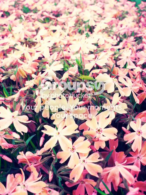


 I just thought I would let you know how I shot it so you could maybe see it in a different way.




![[No title]](/data/xfmg/thumbnail/31/31977-2b717e032201241cbeae8226af23eba4.jpg?1734160754)