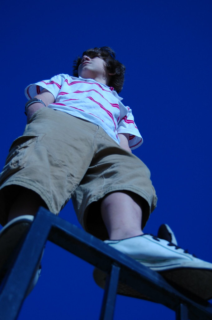
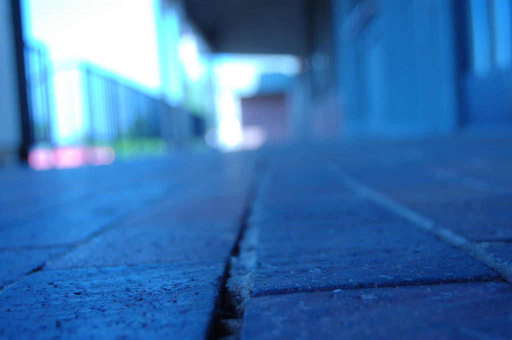
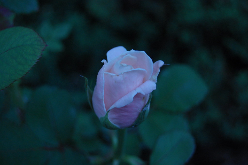
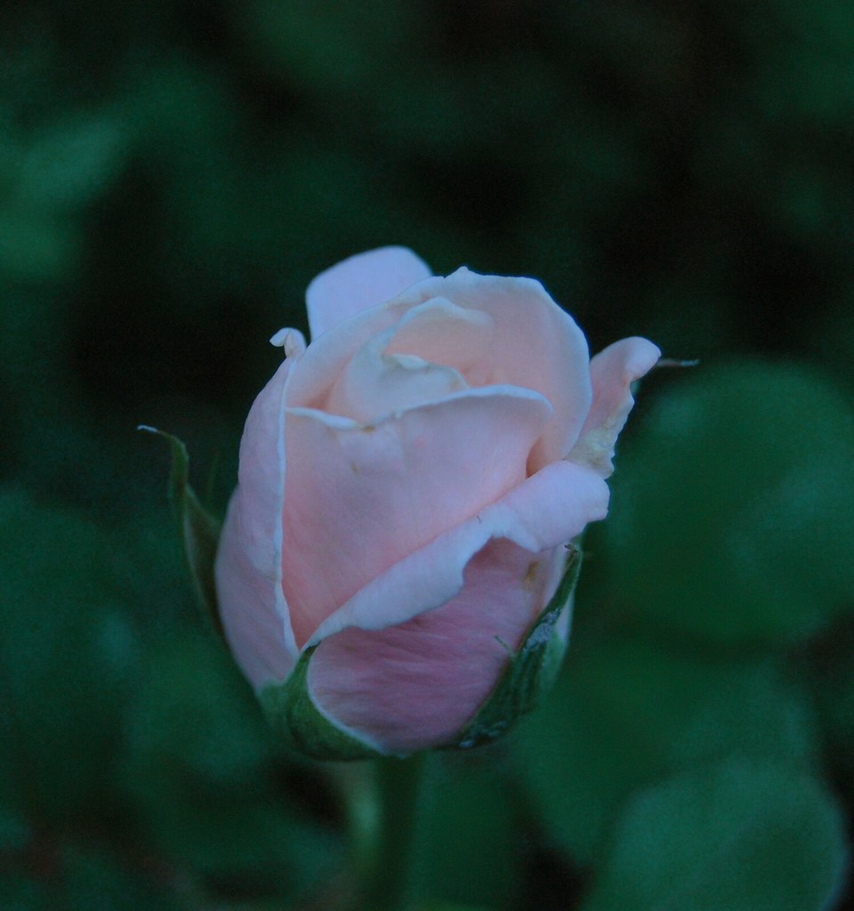
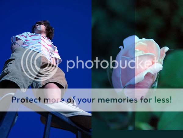
Are all of these too blue on purpose? What's your reasoning?
I like the perspective of #1. I also like the intensity of the sky, but I want his skin to pop a bit more against it.
#2 I find interesting because of the secondary radially horizontal lines that are just perceptable.
I really like #3. The blue works for me. The image makes me feel cold, empty, abandoned, and slighty dissoriented. Like I was left for dead. :thumbup:
#4 and #5, too dark, and too blue. If it were me, on the pink rose, I would crop out the in-focus leaf that is distracting me on the left side.






 Pixmedic's Photo Contest! ($100 prize)