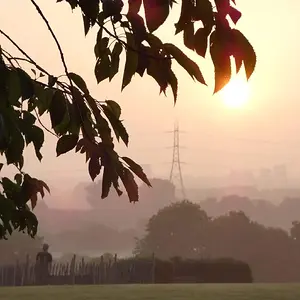
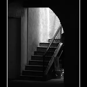
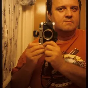
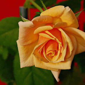
I like the first 3, although the backgrounds are a bit distracting on #2+3.
The door catches my eye too much on #2, and I find myself looking at the chipped paint, etc.
#2 could be cropped more to the left (or tighter) so that the corner of the brick wall is not visable. Your eye is drawn to the corner and whatever that black thing is that is out of focus at the extreme right center.
Being honest I would have to say that #4 + 5 are way too loose cropped, and the backgrounds are very distracting. Those dont really work for me at all.
Basically you want the eye of the person who is looking at the photo to be drawn to the subject, and not the background. Thats why #1 works, because the background is out of focus.
Hope this helps.
Neil



 And in the mid-right one, she's holding herself kinda funny.