What's new

Please feel free to tell me how to improve

i hate to be the one to cry portrait orientation...but these have a lot of dead space with nothing going on. tighten up the crop, or pick a more interesting background.
I beg to differ. I see plenty going on with the so called "dead space". As mentioned, it's all about the mood and 1a nails it! Every inch of that white space makes that shot awesome. An oversize print of this hanging on a wall would be breathtaking IMHO. Not enough fine artists around here.
 
The b&w conversion works great, once you get a nice tight crop that puts her on or near the third vertical. When working with thirds, I'm not a stickler for both vertical and horizontal thirds at the same time, and in in the crop suggested, you end up with too much (for me) white space above her. I'd hit the aspect ratio you need (3:2 or 16:9 for web, or 8x10 for printing) and just get her near the third but the ultimate measure of success is a balanced composition, not necessarily hitting dead on the thirds.

Also, I think the reason that the b&w conversion works so well is that the light is very flat, the background is very flat, and the background is already grey. Not a bad thing (many people would kill to get the soft light figured out), but if you want the color image to work, you have to bring more color into it than just her shirt.

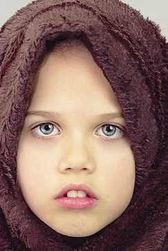
In the last one, while I'm a fan of head wraps and such, but in this one it looks like she's smothered by it. Something heavy like that, I'd have her holding, twisting, winding, unwrapping, doing something with it, so I could get it to frame her, but I could also get it to lift off her a little so she can breath, and also maybe get her hands in the picture, and/or get her expression to be more dynamic.

 
i hate to be the one to cry portrait orientation...but these have a lot of dead space with nothing going on. tighten up the crop, or pick a more interesting background.
I beg to differ. I see plenty going on with the so called "dead space". As mentioned, it's all about the mood and 1a nails it! Every inch of that white space makes that shot awesome. An oversize print of this hanging on a wall would be breathtaking IMHO. Not enough fine artists around here.

OVERSIZE print with the dead space... absolutely. 16x20 or bigger. (I love the use of dead space).

But an 8x10? Crop it. IMO at least.
 
I'm ok with all the dead space top-right but there is something about her leg being so close to the bottom of the frame that makes me uncomfortable.
 
I struggle with cropping, I fight with myself all the time about it. When I first started I would crop the living poop out of every picture, and was told to leave more room. Now I've going the other direction, I leave way to much room.

Any suggestions on cropping? how much would you crop away?

KmH post #11 has given you the optimum crop, but it might depend on what you intend to do with it. In other words; if you are going to print and frame this shot, crop in the proportions that Keith has given you, but then go out a little wider to account for the frame or mat that will cover the margins some. I think I'd try about a quarter of an inch, or more if the frame is particularly deep in the margins.

You can also crop while framing. Print it just as it is, but when you are framing it, trim with scissors, or just mat to the correct crop lines.
 
They have a nice and clean look which is really refreshing to see. Aside from the crop ideas the only knit I see is in the first image, the thin white shoulder strap keeps drawing my eye away.
 
I'm a fan of #3 in a portrait orientation. She has beautiful eyes, captured beautifully.
 
thank you everyone
 
I loved the tighter crop in post #14. There is a lot going on in her expression. :heart: it
 
I would crop the originals until the full image filled the frame. I would copy the originals and then crop the copies down until you had just a portion of the subject in the frame. The 3rd pic is stunning and with cropping all but the subject you have a NATGEO shot! I would also try #3 as just a 1/2 face crop. You almost can't go wrong. Minimally just crop out the negative space.
 
I'm a fan of #3 in a portrait orientation. She has beautiful eyes, captured beautifully.

YES and a nice tight crop to show all that detail in the eyes too
$Untitled-1.webp
 
Nice images of a cute girl ...I like the negative space ...not every single thing in life has to fit into the "rule" of thirds..... Rules are made to be broken
 
Nice images of a cute girl ...I like the negative space ...not every single thing in life has to fit into the "rule" of thirds..... Rules are made to be broken
Amen.

"You can compose anything." - Dennis "Bones" Carpenter
 
Work on some better poses and for gods sake comb the child hair before you start shooting.
 

Create an account or login to comment

You must be a member in order to leave a comment

Create account

Create an account on our community. It's easy!

Log in

Already have an account? Log in here.

New Topics

Back
Top Bottom