What's new

Portrait of a Pretty Lady.. On Location.. Thoughts?

D-B-J

Been spending a lot of time on here!
Joined
Apr 13, 2010
Messages
9,027
Reaction score
2,175
Can others edit my Photos
Photos OK to edit
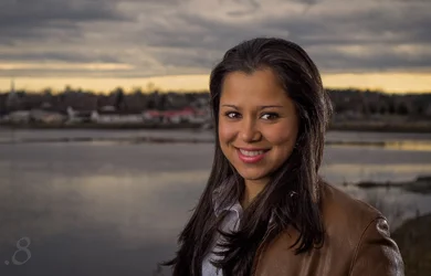
One from last night's shoot. This was lit differently than most of the others. I used a three light setup here-- 45 degrees camera left was a strobe in a brolly, close to the lens axis was another strobe in a white shoot through, and her boyfriend held the hair/backlight, unmodified.

Jenny by f_one_eight, on Flickr

Thoughts? I'm pretty pleased. Not the biggest fan of the background... but I like the lighting and her pose and the rest. I know there are other issues, so I'd love to hear what you think is bad.. and good!


Cheers!
Jake
 
Last edited:
Nicely done; the background is soft enough that it doesn't really detract, and gives a reason for the horizontal aspect. I'm not sure the hairlight was ideally placed (or even really necessary), but the overall image works.
 
Well it is exactly as you described, she is defined and background just out of focus enough to not distract but be recognisable if you were familiar or wanted to remember it. Nice
 
Nicely done; the background is soft enough that it doesn't really detract, and gives a reason for the horizontal aspect. I'm not sure the hairlight was ideally placed (or even really necessary), but the overall image works.

I used it because with her hair being as dark as it is, there was such little light falling on it from that side that it had no... texture. It was just a bunch of shadows. I wanted to help separate her from the background as well as add some texture to her hair.

Cheers!
Jake
 
Nicely done; the background is soft enough that it doesn't really detract, and gives a reason for the horizontal aspect. I'm not sure the hairlight was ideally placed (or even really necessary), but the overall image works.

Here's an example of what I mean when I say it needed some hair-light (this was shot without one):


Cheers!
Jake
 
Fair enough; I think maybe a bit of diffusion would have helped, but regardless, it's a nice image.

I do agree. It would have been nice to have a strip-light, but I had no expectation or plan to use all three strobes... looks like I'll have to be better prepared next time!

Cheers!
Jake
 
The second photo show just how very much that hair/separation light added to the mix! Without that light coming in from the side, mehhhh...the hair is just so dark...so "crushed".

In the top frame, I wish there was a little less space above her head, and more of "her" shown.Her head in relation to the horizon line and the sky is not quite what I would consider optimal. The crop at the bustline and that much top space doesn't feel quite right. She is "riding low in the frame"--her eyeballs are below the mid-line of the horizontal of the frame, and that feels wrong most of the time. In the second shot, the camera is positioned lower, so her head in higher in relation to the horizon line.

On the other hand, the lighting effect you achieved is gorgeous and modern! Just LOOK at that lovely highlight on her lower lip, which is based on the kind of light modifier used (its degree of specularity) AND its size/distance relationship to her. And look at the gorgeous defining the light did on showing her cute, rounded her cheeks!

I pulled it into LR, and burned down the separation/hair light a little bit and darkened it to see what it would look like. Oh, the file,even the JPEG is a joy to work with.

I cropped some off the top, to put her eyes ABOVE the mid-line, above the horizontal, and immediately the engagement goes way up.

$14082807456_7878072a93_oPRINT_360ppi.webp

Sorry about chopping off the watermark...and yes, this is a moodier, darker re-envisioning of your original lighting effect..some people might not like this darker rendering, but I do.
 
The second photo show just how very much that hair/separation light added to the mix! Without that light coming in from the side, mehhhh...the hair is just so dark...so "crushed".

In the top frame, I wish there was a little less space above her head, and more of "her" shown.Her head in relation to the horizon line and the sky is not quite what I would consider optimal. The crop at the bustline and that much top space doesn't feel quite right. She is "riding low in the frame"--her eyeballs are below the mid-line of the horizontal of the frame, and that feels wrong most of the time. In the second shot, the camera is positioned lower, so her head in higher in relation to the horizon line.

On the other hand, the lighting effect you achieved is gorgeous and modern! Just LOOK at that lovely highlight on her lower lip, which is based on the kind of light modifier used (its degree of specularity) AND its size/distance relationship to her. And look at the gorgeous defining the light did on showing her cute, rounded her cheeks!

I pulled it into LR, and burned down the separation/hair light a little bit and darkened it to see what it would look like. Oh, the file,even the JPEG is a joy to work with.

I cropped some off the top, to put her eyes ABOVE the mid-line, above the horizontal, and immediately the engagement goes way up.

View attachment 72987

Sorry about chopping off the watermark...and yes, this is a moodier, darker re-envisioning of your original lighting effect..some people might not like this darker rendering, but I do.

Thanks for all of those kind comments! I personally don't like to go THAT dark, but I did edit the original post to reflect your suggested cropping and decreased the exposure a bit. This, in all honesty, is probably one of my favorite images i've ever taken.

Cheers!
Jake
 
Your crop on the revised "original" image REALLY made a HUGE improvement, by getting her eyes up much higher in the frame, and eliminating that "riding low in the frame" feeling it initially had. The cropped and darkened image you have up there now is much more-pleasing that the one you posted originally! Good job on this!

I wanted to mention something too about why this is such a nice environmental portrait. Look at how many "lines" her head overlaps. Basically her head and body overlap NINE, separate, distinct lines in the landscape behind her. And the lines are line dark/light/dark/light. The lake surface has smooth areas, and breeze-rippled areas. And that little tiny bit of lakeshore there in the lower right corner, and the tiny finger of land jutting into the lake...just SUPER details. Really a great background to make her "POP!". WHen an object, like a person is seen overlapping a line, a line which goes behind the head on one side and reappears on the other, it is a huge, immediate visual clue. Out brains can read that kind of scene information in milliseconds. Repeated lines like those formed by the clouds, the bright band, the hills, the lake shore, and then the windy and non-windy lake sections are just tailor-made for this kind of a shot.

I also really dig that OOF church in the background, in the distance, and her. In a big print, that would show up.
 
Your crop on the revised "original" image REALLY made a HUGE improvement, by getting her eyes up much higher in the frame, and eliminating that "riding low in the frame" feeling it initially had. The cropped and darkened image you have up there now is much more-pleasing that the one you posted originally! Good job on this!

I wanted to mention something too about why this is such a nice environmental portrait. Look at how many "lines" her head overlaps. Basically her head and body overlap NINE, separate, distinct lines in the landscape behind her. And the lines are line dark/light/dark/light. The lake surface has smooth areas, and breeze-rippled areas. And that little tiny bit of lakeshore there in the lower right corner, and the tiny finger of land jutting into the lake...just SUPER details. Really a great background to make her "POP!". WHen an object, like a person is seen overlapping a line, a line which goes behind the head on one side and reappears on the other, it is a huge, immediate visual clue. Out brains can read that kind of scene information in milliseconds. Repeated lines like those formed by the clouds, the bright band, the hills, the lake shore, and then the windy and non-windy lake sections are just tailor-made for this kind of a shot.

I also really dig that OOF church in the background, in the distance, and her. In a big print, that would show up.

Thanks Derrel, that means a lot!

Cheers,
Jake


Sent from my iPhone using Tapatalk
 
Pretty girl. Nice catchlights and reflections on her lips. The picture calls for portrait not landscape format. The subject is the girl not the out of focus background. You have all this negative area that doesn't add anything to the shot. While you're cropping to vertical, eliminate the bright area on her left shoulder. It pulls (my) eye away from the subject. Nice shot.
$Clipboard01.webp
 
Last edited:
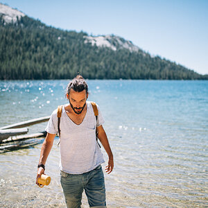
Wonderful photo. She really pops from the background. The three light setup really brought her away from the background even though it looks relatively compressed (I'm guessing longer focal length?). She is also extremely clear and in focus and I'm sure that the lights really helped out with that.
 
Wonderful photo. She really pops from the background. The three light setup really brought her away from the background even though it looks relatively compressed (I'm guessing longer focal length?). She is also extremely clear and in focus and I'm sure that the lights really helped out with that.

I think I shot this with a 50mil on a crop body. Thank you for your kind words.

Cheers!
Jake


Sent from my iPhone using Tapatalk
 
Looks good to me, I think the back/hair light was well done. One idea that strikes me, is that it might have been nice if that hair light was coloured to simulate the low (red, orange) color temps of the setting sun. It might have made it look just a little more natural.
 

Create an account or login to comment

You must be a member in order to leave a comment

Create account

Create an account on our community. It's easy!

Log in

Already have an account? Log in here.

Back
Top Bottom