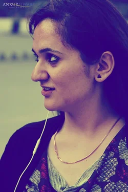
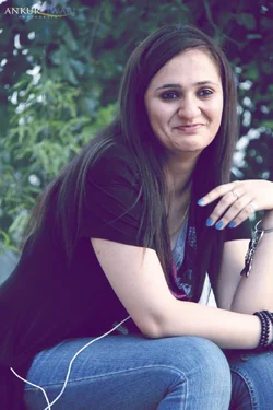
Ankur...1st white balance is disbalanced....the green cast cud be removed.
2nd if u pl included both hands, it wud have been looking a perfect portrait.
3rd. WB incorrect...true skin tone lacks pl
us half stop cud go well in lighting the face.I tried to remove the colour cast...as ur pix are ok to edit.
^ agreed
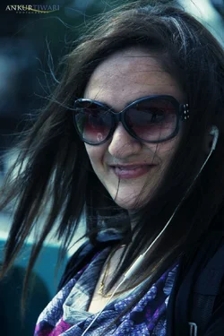
also (on number 3)there's a lot of hairs set loose on her face, its hard to ignore them. that and the fact that she's wearing glasses that cover up her face make it kind of an awkward portrait for MY personal taste.
and the headphones seem confusing in number one and two. if you're going to use the prop, it looks better in number three since you can really see what they are
Yea I don't like these photos at all. The framing is bad, the color is all wrong. It could work for some type of artsy look but I'm not feeling it. Sorry. I try to be honest.





![[No title]](/data/xfmg/thumbnail/36/36676-cb11e40ab23f22c2a0af6fbf4ab02371.jpg?1734169174)

![[No title]](/data/xfmg/thumbnail/39/39443-45e1b162b6c7c1d8ebbc8faf5623b705.jpg?1734173533)


![[No title]](/data/xfmg/thumbnail/37/37518-fb05b52482bd05e84fb73316ba1a9c8f.jpg?1734170679)
![[No title]](/data/xfmg/thumbnail/37/37519-6093821531f744039f3ac2b3e30c7dbf.jpg?1734170680)