Portrait

pisto1981

TPF Noob!
Joined
Apr 23, 2013
Messages
313
Reaction score
33
Location
Daventry
Can others edit my Photos
Photos OK to edit
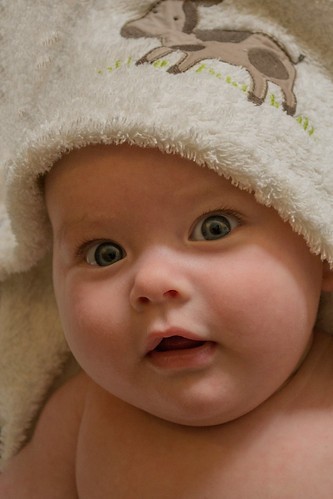
Took this yesterday, best of the bunch and noticed that i left the changing mat in the top left corner. So, i used the little PS skills that I have to try get rid of it. I was left with a nasty line. I have managed to get rid of it to my best capabilities but i still find my eyes drawn to it. Do you seem the same?

Holly-1 by Pisto1981, on Flickr

On another matter, she was awfully blownout, so ive toned down the highlights, whites and increased the shadows. Have I over done it?
 
The top left looks like a fold in the towel or blanket to me, you just know what it is. The second question about over doing it, I don't know for sure about that, but looking at it as is, it looks underexposed to me. The eyes are in shawdow with the cheeks really bright and the hard line of the towel on the cheek. imho. I will say this, the baby is very cute and it looks like you are just about to get a smile there.
 
Desperately needs fill light in the shadows on the face. I would not call this a keeper.... It is a cute shot, but the lighting is just way off.
 
Thanks ronlane. Isn't she just. I got plenty of smiling but not as good as this one. I will have a look at the exposure when i get home.
 
cgipson, how would i got about said fill light? Flash? I always find if i use flash on her, i get this sort of texture on her skin and don't like it.


skin-1 by Pisto1981, on Flickr

Where am i going wrong?

Not sure ive got the eye for it, i honestly thought the original picture was good. Keep the C&C coming though, its all good
 
Took this yesterday, best of the bunch and noticed that i left the changing mat in the top left corner. So, i used the little PS skills that I have to try get rid of it. I was left with a nasty line. I have managed to get rid of it to my best capabilities but i still find my eyes drawn to it. Do you seem the same?


Holly-1 by Pisto1981, on Flickr

On another matter, she was awfully blownout, so ive toned down the highlights, whites and increased the shadows. Have I over done it?

Can you show us this photo before you edited it?
 
Took this yesterday, best of the bunch and noticed that i left the changing mat in the top left corner. So, i used the little PS skills that I have to try get rid of it. I was left with a nasty line. I have managed to get rid of it to my best capabilities but i still find my eyes drawn to it. Do you seem the same?


Holly-1 by Pisto1981, on Flickr

On another matter, she was awfully blownout, so ive toned down the highlights, whites and increased the shadows. Have I over done it?

Can you show us this photo before you edited it?

As requested


pre edit-1 by Pisto1981, on Flickr
 
cgipson, how would i got about said fill light? Flash? I always find if i use flash on her, i get this sort of texture on her skin and don't like it.


skin-1 by Pisto1981, on Flickr

Where am i going wrong?

Not sure ive got the eye for it, i honestly thought the original picture was good. Keep the C&C coming though, its all good

Doesn't have to be flash... could have used a reflector in front of her face to reflect the light and lighten the shadows. Or placed her to where the light that was there would have struck her face directly instead of coming from above / behind her.

You could also have used flash... and diffused it to prevent that glare / texture that you have in the other photo. Getting the flash off camera helps a lot..
 
I did see the link you suggested for a diffuser when i was posting about macro shots. Could the same one be used in this instance? I'm very limited on funds atm so really have to work with what I have.

With regards to placing her nearer the natural light source, 'taken on board'
 
I did see the link you suggested for a diffuser when i was posting about macro shots. Could the same one be used in this instance? I'm very limited on funds atm so really have to work with what I have.

With regards to placing her nearer the natural light source, 'taken on board'

That diffuser would help.. but so would a piece of white poster board used as a reflector (or white foamcore from Home Depot or whatever). Don't have to spend big bucks to get the job done! ;)
 
I agree, this photo would benefit from some fill. As it is, the eyes are sitting just on the wrong side of a rather distinct shadow boundary, which is not what you typically want because the eyes are the most important elements of a shot like this.

On another note, just as it’s often obvious that a photo has had its contrast bumped up in processing, a manual lowering of contrast has a rather characteristic look to it as well, and that is what I saw right away when I looked at this photo. For whatever reason, my eyes don’t take as kindly to the latter as they do the former (I’m sure an explanation for that could be found in the gobbledygook of digital sensors and bits).

I know you’re just trying to optimize the photo and learn, which is good and a worthwhile exercise for everybody, but if you really want to go after some serious “keepers”, it’s probably best to just cut your losses when the exposure SOOC is way off. That’s what I’ve learned to do, anyway. It’s actually kind of liberating to realize that some photos just can’t be saved. :D You just try to learn something from it, and get it right next time.
 
The photo appears to be in the wrong key. We see a big, shadowed area, but it's too light. We see highlighted skin, but it's slightly too dark. THis could, I think, be corrected in post. It needs more contrast. THe tonal values are represented in a most unusual way...light shadows, and dark highlights...
 

Most reactions

Back
Top