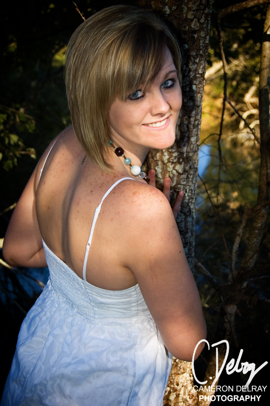
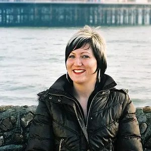
1- I find there is a lack of sharpness / focus in her eyes and mouth which is distracting. Seems that the focus was on her hair.
I'm also not a fan of the pose, I find her head is too twisted back.
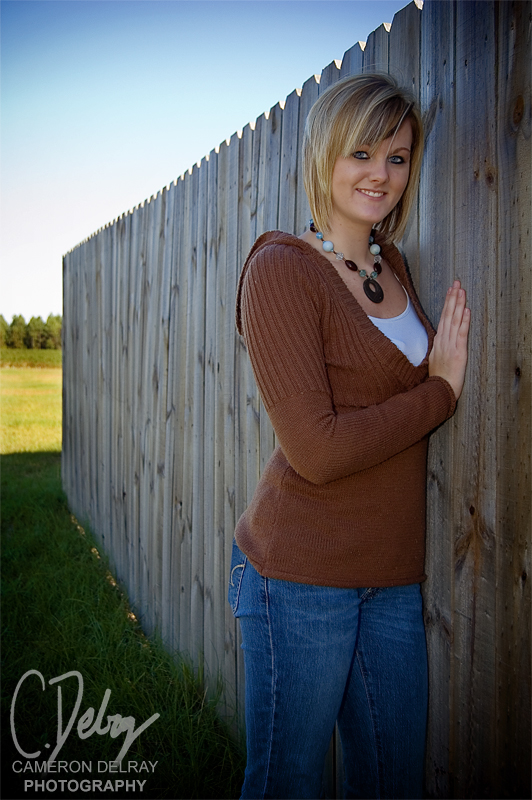
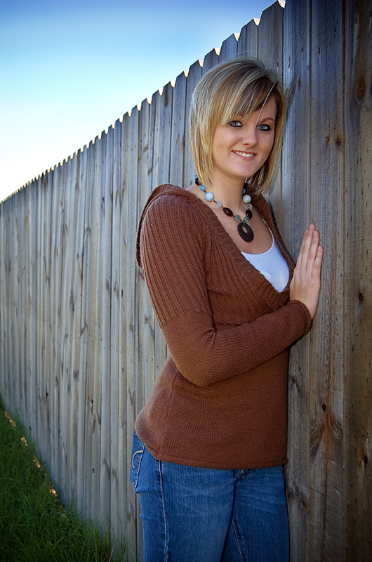
2- Much much nicer than the first. The sky is nice, the pose is nicer and the model is in good focus and nice and sharp. I also much prefer the choice of clothes in here as well.
I would of however cut out the back part of the fence as the open field area in the back draws my attention from the model. I love the line of the fence, just not the fact that it ends.
The image also seems slightly dark, probably due to shooting in the shade. Cut out the back open field (which is bright) and then up the exposure / brightness / levels / whatever tickles your fancy to get the image lighter.





![[No title]](/data/xfmg/thumbnail/31/31089-cc3a7a6049305e29a6be920fad49acce.jpg?1734159219)

![[No title]](/data/xfmg/thumbnail/31/31018-a537939c7ad9fc1126461101c651a8a0.jpg?1734159105)