littlenomad
TPF Noob!
- Joined
- Aug 26, 2012
- Messages
- 33
- Reaction score
- 2
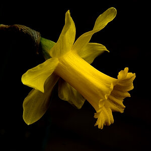
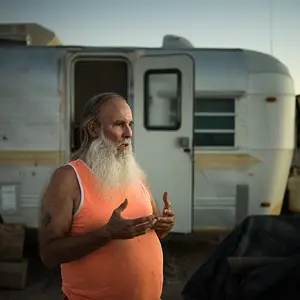
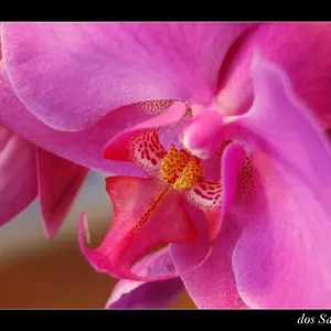
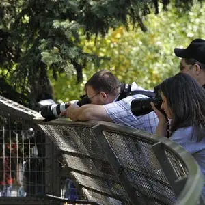
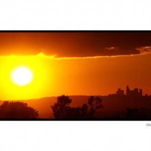
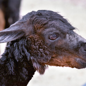
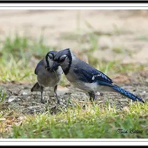
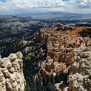
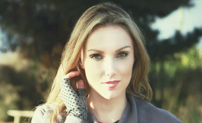
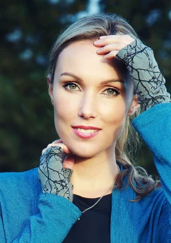
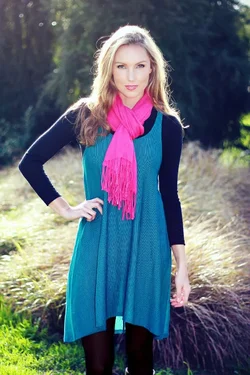
Here's just 4 recent pics for fashion (apart from the guy)...hope that's not too many?
Appreciate any thoughts. Thank you so much!
1
and the uncropped version for reference:
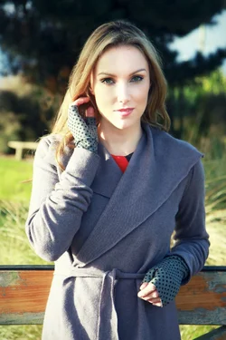
2

3
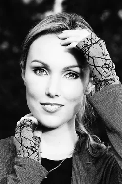
3b Or in Colour:
4
Appreciate any thoughts. Thank you so much!
1
and the uncropped version for reference:
2
3
3b Or in Colour:
4


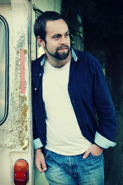


 I started doing our photography for the label after various photographers just fell flat on top of the massive prices they charged.