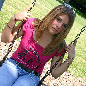
Portraits of the day! =)

Chrispyphotos

TPF Supporters
Supporting Member
Joined
May 18, 2014
Messages
111
Reaction score
81
Location
Guam
Can others edit my Photos
Photos OK to edit
The pose in one is too Hustleresque.
Give her a classier pose.
 
Agree with above. A good set.
The position of the legs in the first photo leads my eye to a spot that makes the photo uncomfortable.
 
I don't mind the position of the legs in #1 at all. Particularly with her feet bare and flat against the stool, her leg position feels more like a yoga pose to me than it does at all "Hustleresque". Where the pose falls apart, IMHO, is that her arms are positioned to come down precisely to obscure the transition between her shorts and bare legs. She's very well covered from her shoulders down to her shorts and then BAM! Suddenly a whole lotta bare leg.

That aside, I almost really like this image for its symmetry. There are a few details that are off (the floor/wall transition is at a bit of an angle, she seems to be leaning a bit to the left of the frame). If those could be evened out next time I think this (or a variation of it) would make for a great pose.

Shot 2) I like this a lot, the strongest of the bunch IMO. Nice relaxed pose, nice tonal range. The only (minor) nitpick is to consider where you cropped the bottom of the shot - right through her belly button, with that glint of the piercing right above it. I would suggest taking a look at cropping either above the piercing or below the belly button, and/or cloning out the piercing so it doesn't draw the eye. I'm not saying it would necessarily be better, just worth taking a look at.

Shot 3) Now might be as good a time as any to mention that I've noticed a bit of a trend in your work (at least the few posts I've seen since I've come back) to shoot your subject square to the camera. Here it doesn't do her any favors. With her baggy pants, her legs (apparently) straight, and both feet straight on to the camera, it's just not a particularly dynamic pose. Your background also comes into play here - the ground/wall line is at an angle, and the vertical line in the wall is both too close to center (but not right on for symmetry) and coming out of her head.

I'd be interested in seeing this shot (or others from the set) in color. The solid "white" top, the very busy pants, and the "black" shoes just don't seem to work together in monochrome. Perhaps they're more cohesive in color?

Shots 4 and 5) I like these as well. You've again shot pretty square to the model, but here the poses are much more dynamic (leaning against the wall instead of rooted to the ground, and the hip kicked out in #5 puts her on a nice angle).

Thanks for sharing!


Thank you for the in depth response! =) I appreciate the comments & time you took!
 
I don't mind the position of the legs in #1 at all. Particularly with her feet bare and flat against the stool, her leg position feels more like a yoga pose to me ..
I agree with that. I like the portrait overall, just not so much the base of the wall junction with the floor. Also, this crop works quite well, but if you print to frame it, you're going to need to allow a bit more space above her head.
 
#1 Give off the impression of being 'yoga-like',,, but the overall balance is very un-yoga like. Top half does not balance off the bottom half. As for the rest I agree about the face-on camera pov....put succinctly they all give a 'Drivers License' effect, or at best a quick snapshot. Technically I can find few faults, but that is small praise as I am way far from having any expertise in this tyoe of photography...so these truly are just my impressions and thoughts.
 

Most reactions

Back
Top