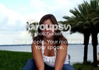
Christina I first one is reasonably good. The composition is somewhat boring with the face centred and the landscape view giving a bit much background for my tastes but the subject stands out and has clear separation from the brickwork behind her. If this shot showed much more of the subject it may actually fall down because of the white shirt grabbing the viewers attention. It helps if you will shoot against a darker background to dress in dark cloths to help bring out the subject.
Picture 2 I am not very fond of. I look at it and the first thing I see is the sky and the trees. The dark subject has to really fight for attention. I am of the opinion if you are going to shoot high-key then do so without worrying about the background and bump the brightness as high as you need to. Someone will always jump on the technicality that the highlights will be blown, but at least the subject clearly stands out. If a high-key picture was not your aim then this just seems to have too much contrast to work properly in my eye.







![[No title]](/data/xfmg/thumbnail/30/30880-eb7252c7e6df26b6cbc7065d2838df96.jpg?1734158883)