I kinda like that first one but the leaf thing feels like it's crowding in the letters. If you could incorporate that differently somehow- perhaps have it with the left hand side of the letters overlaying the graphic by 30% or so... though you're going to have to figure out how to make the graphic not overwhelm the letters.
With number 1, what purpose does the plant motif serve? Unless you are primarily a nature photographer, and even then I would suggest not having a motif in your logo, because when you put it on an image, all it does it draws the viewers eye away from the subject of that image. And frankly, it does not look very professional.
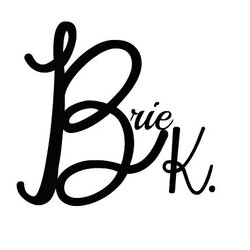
Image number 2, you are closest to a good logo, but I feel that your 'B' and 'K' arent quite on that same axis. They feel somehow off balance. And your "photography' is quite working for your composition, its too central, and doesnt sit comfortably.
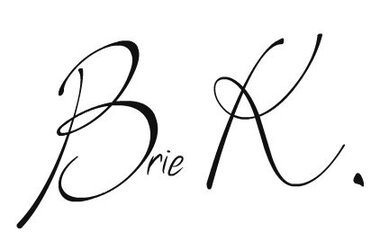
Number 3 is bordering on illegible, that font is not condusive to reading the businesses name quickly.
It sometimes helps to juxtapose two fonts to help make the name more legible, so often you will see a cursive font with a serif font works rather well.
As I posted in your previous thread about this, here is my rendition:
With number 1, what purpose does the plant motif serve? Unless you are primarily a nature photographer, and even then I would suggest not having a motif in your logo, because when you put it on an image, all it does it draws the viewers eye away from the subject of that image. And frankly, it does not look very professional.
Image number 2, you are closest to a good logo, but I feel that your 'B' and 'K' arent quite on that same axis. They feel somehow off balance. And your "photography' is quite working for your composition, its too central, and doesnt sit comfortably.
Number 3 is bordering on illegible, that font is not condusive to reading the businesses name quickly.
It sometimes helps to juxtapose two fonts to help make the name more legible, so often you will see a cursive font with a serif font works rather well.
As I posted in your previous thread about this, here is my rendition:
I would agree with Ryan. My question is what for is this logo ? Is it to be placed on the business card or on the pictures ? That might be two separate issues.

")


![[No title]](/data/xfmg/thumbnail/36/36674-2a99a33f8b4e9e3d34b08a4ec08fbde8.jpg?1619737676)