As both a foodie and a visual artist, I enjoy photographing food, but I usually don't share them as examples of artistic photography unless they are exceptional for some reason. They are great for posting on recipe forums, though. I know some people are truly annoyed by photographs of food on Facebook, but it only really annoys me when it is someone who posts poorly taken photos taken from their phone of nearly every meal they eat, often with comments intended to show that they expect everyone to be jealous of the wonderful food they are eating.
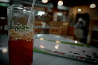
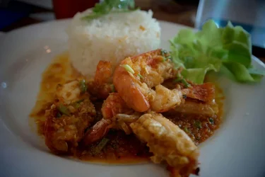
Food usually looks best with a warm color profile, so keep that in mind when lighting or processing images. The exception is with greens, which should be deep and saturated. Usually food pictures can stand a good deal more color saturation than other photographs generally benefit from. Also, the depth of field doesn't work because the dish is presented as a whole, but the focus leaves half the plate completely obscured. If you were just presenting the prawns without the other elements, a shallow depth of field might work okay, but only if you do it "right." The drink is fairly uninteresting- it looks pretty much like virtually every glass of iced tea I've ever seen, so while it may have tasted fantastic, there's nothing particularly special about it to warrant a photograph.
One great way to light food is with a bounced strobe if you have a hot shoe mounted strobe. Consider pointing it at a wall so that the light comes in from the side. If no wall is available (you don't want to blind someone at the table next to you, etc.) try using a napkin or menu to bounce the light from instead.
And do keep the background in mind. Generally, less busy is better. Especially avoid distracting splashes of color. Try moving to change your perspective in order to get the best possible angle for light and background. The food should be the most vivid thing in the shot.