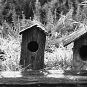
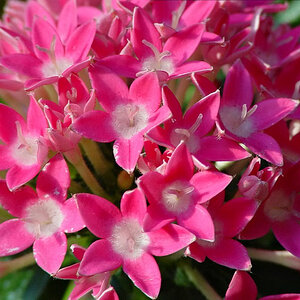
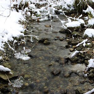
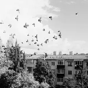
The photos are all great, i don't feel i can add anything to the crits thus far, but the borders feel kinda silly. When ever i see black digi borders and white text, i think of those dumb "inspiration" pictures with captions under them like this: http://www.triton.studver.uu.nl/img/teamwork.jpg
This is all purely subjective anyway, but at least the repetition of the titles between pics seems a little repetitive
yes, the first one is a bit phallic.. even got balls
well, some nice images here! I love the light on the second one. but the framing is not really working for me. too much dark space on the right - a void where the mind does not create anything (at least not my mind). that right region is a region without tension, so it throws the image off balance (at least through my eyes)..
On the Great Gaddsden one I like the composition, just a pity that the foreground is so dark. But that is something you could not change unless you had a giant reflector



 saw these bad boys on Deviant Art! Love em'!


![[No title]](/data/xfmg/thumbnail/37/37109-62e1b65e6f8bd2a349250acd6d653f1e.jpg?1734169830)
![[No title]](/data/xfmg/thumbnail/37/37113-886cb28b1e3fb197bdd00a9148269407.jpg?1734169831)