professional headshot: c & c please

Heitz

No longer a newbie, moving up!
Joined
Sep 10, 2011
Messages
941
Reaction score
145
Location
Chicago, IL
Website
www.heitz.org
Can others edit my Photos
Photos OK to edit
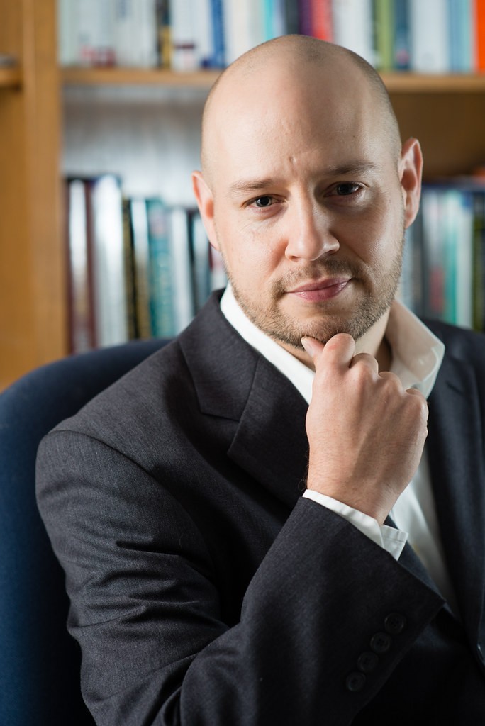
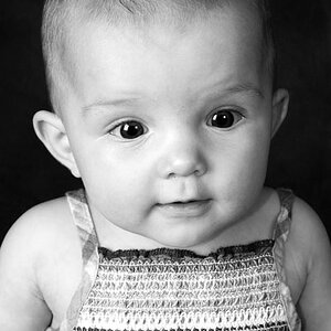
My first time trying to do a 'professional' headshot for a friend. I used a 2 light setup, and during the shoot I was thinking I was nailing it, but now I'm not sure the lighting was great. Perhaps too dramatic for a professional shot? Opinions appreciated.

9688412963_ec1c232899_b.jpg
 
Perhaps emphasize the catch light in the right eye, otherwise really nice look. Certainly not too dramatic. Nice lines.
 
Nice shot! I like the books in the background. the books and the suit together feel professional and more interesting/lively than a solid background.
The only thing is that I'd like to see a little less shadow on the right side of his face.
 
I find the bright spot on the back shelf distracting. My eye is drawn straight to it. Other than that, I don't think the lighting on the subject is bad at all.
 
I find the bright spot on the back shelf distracting. My eye is drawn straight to it. Other than that, I don't think the lighting on the subject is bad at all.

+1
 
This is a great shot, I like it, but if judged by the striсtest pro standart, I would pick these faults:
1. the guy is too much to the right - there is a space between his right shoulder and the frame, while his other shoulder is cut off and blurred, and it all creates the wrong compositional balance. The texkam edit makes it more balanced, but does not solve the problem entirely: it became too tight and i do not like half blurred business suit. This composition may work well with , let's say a vulnerable girl, but a self assured businessman has to have space in front of him, not behind him, if you catch my drift. It is a psycological thing.
2. I like the bookshelf, but the verticals and horizontals there are bent, due to the shooting angle and it is a bit distracting and untidy for a pro business portrait.
3. Way too much unnesessary gray/blue space in the lower left corner. It makes the image unnessessary heavy. Again texkam addresses this problem
4. His posture is a bit unnatural - it is debatable, but I personally doubt it is his natural pose.
5. The lighting was already mentioned.
6. His cuff looks untidy, as if it was not ironed.

Other than that - very nice.
 
Last edited:
This is a great shot, I like it, but if judged by the striсtest pro standart, I would pick these faults:
1. the guy is too much to the right - there is a space between his right shoulder and the frame, while his other shoulder is cut off and blurred, and it all creates the wrong compositional balance. The texkam edit makes it more balanced, but does not solve the problem entirely: it became too tight and i do not like half blurred business suit. This composition may work well with , let's say a vulnerable girl, but a self assured businessman has to have space in front of him, not behind him, if you catch my drift. It is a psycological thing.
2. I like the bookshelf, but the verticals and horizontals there are bent, due to the shooting angle and it is a bit distracting and untidy for a pro business portrait.
3. Way too much unnesessary gray/blue space in the lower left corner. It makes the image unnessessary heavy. Again texkam addresses this problem
4. His posture is a bit unnatural - it is debatable, but I personally doubt it is his natural pose.
5. The lighting was already mentioned.
6. His cuff looks untidy, as if it was not ironed.

Other than that - very nice.

All of the above, plus, I'm not a fan of the fingers on chin. What's the point of it?

what these guys said
 
Heitz; you shouldn't pose men with a hand to the chin. Also, less light on the left, and more centered would be better. Does this professional ever wear a necktie? If so, he should have worn one for his photo.
 
Well the other guys mentioned the main technical points. I think that the library books are a bit of an odd ball. For me they are too modern and too light, along with the 60's book case it makes him look like either a librarian or a school teacher. I think if you are going for the educated, powerful look the books need to be a lot older.
 
Image is ok or I mean the subject is lit well but I am not liking the crop with his head off to the right side, feels very awkward to me.
 
Contrast on his face is too strong for a professional headshot... IMO! Shadow is much darker than it should be... and the highlights in the background are distracting. Crop on yours is odd also, as several have mentioned. Pose is a little unusual also...
 
The above, + the head tilt is on the feminine side. If the hand was a must, perhaps the other hand with the head straight or tilting in the other direction.
 
about 2-3 minutes work trying to get something that looks close... This really needs a reshoot IMO! The lighting makes it impossible to repair adequately.

$h25.jpg
 
Last edited:

Most reactions

Back
Top