Question about composition, framing and street photography

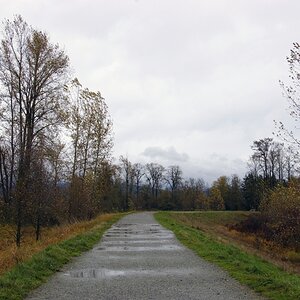
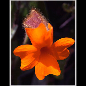
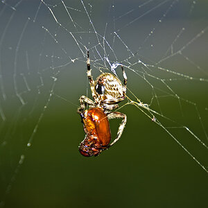
Thanks Bitter, I can totally understand the difference and the reasoning for the differences and I think that your photo is very interesting. What you have said adds a lot to the discussion and my understanding.

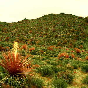
I'm just going to have to go walking back to that spot when I get off work and see how I can change this and make it better.
 
They apparently have a very high tolerance for Richard Craniums there.
 
Now, one thing to consider is that a lot of theories of composition completely change as soon as people enter your frame. People carry a dynamism that in many ways demands that they be treated differently compositionally than inanimate objects.

Typically street photography is viewed to be photography of people in a public setting, the name is a bit of a misnomer for what people generally consider to qualify for street photography. Much of it is 'on a street', but it's more a type of candid photography of strangers than anything else.
 
I have to say that I approach street shots in a different way. Usually, there isn't any time to pause and think and compose.
One sees situations developing and you get to where you need to be to get a good shot if it occurs.

I see something that 'speaks' to me in some way, that has something special beyond just documenting the instant and I quickly try to frame it to take best advantage of the situation. It is all about conceiving of the shot before it occurs, pre-visualizing and preparing.

You have got to get past the "handling of the camera" and "thinking about composing stages."

p1050136867-4.jpg


p290919263-5.jpg


p765868779-4.jpg


p916887202-4.jpg


p852595069-5.jpg
 
I went back this afternoon, which was about an hour or so later than when the original was taken so the light was TOTALLY different today. This time I took a step ladder to be able to get higher. Sorry Derrel, I still only took the one lens. Here are three different angles. These have a little less post processing than the original did.

1. Moved up and camera left of the original to get the really hot sun out of the background.


IMG_6992 by Ron_Lane, on Flickr

2. Again I moved up but a little less left than the original to bring in the sun a little more. This was cropped tighter to have as little of the house as possible.


IMG_6989 by Ron_Lane, on Flickr

3. This one was about 21 feet back and to the camera right and I was standing on the ground instead of the ladder.


IMG_6983 by Ron_Lane, on Flickr


Is any one of these an improvement? I do see how changing the angle of shooting makes a difference. I think I prefer either 2 or 3 the best.
 
A lot of things get thrown into the "composition" category. Because street signs themselves may not be interesting, you might leverage them because the color combination plays off an interesting background. You might play off them because of the way one geometric patterns plays into the background. Or because of how they frame something. It goes on and on.

If you haven't already, pick up a book on composition (I like "the Photographer's Eye - Composition and Design for Better Digital Photos" by Michael Freeman. )

After you read a book on composition you may fiend yourself starting to look for photo ops based on compositional elements.... E.g you found a "frame within frame" shot, or you found a fantastic color balance shot, or you found some interesting geometry. You probably WILL find yourself more carefully framing up the shot on the camera. ... realizing that the framing can make or break the whole geometry of the shot.
 
Ronlane,

the basic problem with those signs is that no matter how you frame it, there's no takeaway.
There's no aha, I see why that guy is shooting that, I understand now.
sometimes you can't get any more than a decent documentation but street shooting is much more than that.

Do this to learn to frame before the camera gets to your eye, to estimate exposure compensation and to get ready to be shooting when it really counts.
Then take your skills to county fairs, to public amusements, to anywhere that the situation is fluid and changeable and use your skills to create shots there.

The point of this kind of photography is to isolate interesting, unusual things from the entire world and capture them in a way that shows the viewer what you saw and gives them a chance to see something special.

I think it is not easy at all; but worth the work.

Lew
 
I like 2 the best. You get the whole picture, nice angle, and nice light behind it. 3 I enjoy but the sun on the top sign is distracting to me.
 
Thanks TC, Travler and True. Traveler, I agree that this sign is not interesting no matter how I frame it. But it is there all the time and I can go back to it to actually do the things that were suggested above. That is what I was doing with these last three photos. It was suggested to back up 15 feet, I went about 20. It was mentioned that angle was adding some distortion, so I changed the angle to see if that would help, and I think that it did. I realize that I have a LONG way to go to get good but the good news is that it's got to get better and I am willing to try suggestions to get better.

I greatly appreciate all the input to this thread as I have gotten great feedback and suggestions. I wished all threads could be this helpful.
 

Most reactions

Back
Top