- Joined
- Jul 8, 2005
- Messages
- 45,747
- Reaction score
- 14,806
- Location
- Victoria, BC
- Website
- www.johnsphotography.ca
- Can others edit my Photos
- Photos OK to edit
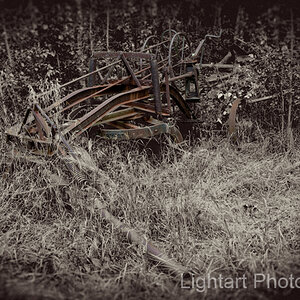
Is #6 above a fireless cooker? Do you have more images of that one?
Follow along with the video below to see how to install our site as a web app on your home screen.

Note: This feature currently requires accessing the site using the built-in Safari browser.
Thank you everybody for the replies. Ysarex, the changes you made look great. Could you possibly either post the .psd or a screenshot so I can see your layers, if you still have it. I also have photoshop cs3, although I am very new to it. I also want to thank you for all of the white balance advice, I have been using lightroom's auto, although it is something I have been working on. Finally, thank you Shipman for the photos, number 4 would have to be my favorite. Keep the advice coming!")


 DSC_2107.jpg by jdhoehler, on Flickr


I can see it, but I have this advantage of a whole lot of practice (about 40 years worth). It's a skill that you will eventually develop but it's a little tricky because you're internal wiring isn't helping you. Human color perception is complex. Maybe Gavjenks (he's a psychologist with solid background in human perception) will chime in here with some details.
I've got lots of suggestions.
1. What you don't see immediately as a color error will become in-your-face obvious when seen in comparison with the error corrected. A ring around is your friend. LR unfortunately doesn't provide one but Photoshop does: Image/Adjustments/Variations.
2. Learn to use the custom white balance function of your camera. Here's a first step in determining if you have a color problem: Check the photo's EXIF data and see if the camera white balance was set to auto. If yes, then the color is wrong. The auto white balance function in today's modern cameras does not work. The camera can't measure the color temp/tint of the light after it has reflected off the subject.
3. If you're not going to use the camera's custom white balance feature then save raw files and set the white balance in the raw converter. This is best done by finding and/or placing a known grey point in the photo (you can shoot a reference frame with a grey card). Grey points are pretty common in the world out there but are no guarantee in every photo. In the above example I was able to start with what I fairly assumed were grey points. Reading the RGB values from those grey points confirmed what I was seeing -- they were blue grey. Hanging out of the front of the engine are rubber break line hoses; should be pretty neutral. The crossing lights in the back far right were painted silver; should be pretty neutral, etc.
4. Learn to paint by number. There are colors in our world that are pretty consistent, the most obvious being blue sky. Most of the day blue sky in a non-backlit scene anywhere on the planet will have a hue value (sRGB color space) right around 210. If you check the sky color and get a value below 205 or above 215 you can be suspicious that there's a color error. Another example, the back of your hand (sRGB) has a hue value of 19 give or take a few points.
5. You'll encounter a lot of comments on this topic along the line of; there's no real right or wrong, it's your personal taste and you should feel free to adjust the color to suit your esthetic expression. That's true, but this is often offered up as an excuse by those who don't have the skill or discipline to get it right in the first place. Learn to get the color as accurate as possible first and then feel free to express yourself.
Joe


![[No title]](/data/xfmg/thumbnail/41/41778-1940e957c27e1919c300dfedbc32d1c3.jpg?1619739889)