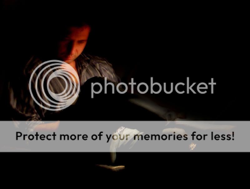
I like the idea, and the feel to this pic. I would maybe crop out the dark side, and somehow dim the light a bit or eliminate it. My eye keeps getting drawn to the bright sopt in the middle and not to the subject. Just my opinion...but.... cool shot!!!
Thanx for the advice, chiller! here's version 2! (hey, i'm getting better with photoshop!) is it better? ( actually a bit out of focus...)
Very nice Alexandra. Even though it is not 100% sharp, it has a cool effect to it. Nice PS work..I think it looks better.
I prefer the original, it might be slightly distracting, but at the same time, helps develop the overall scene. Very nice capture. Must have been tough with so little light! Now I am curious as to what he is reading, he looks very absorbed in the material. Nice1 -Ricky