C&C per req:
Thank-you, thank-you, THANK-YOU for not doing the "Heart of hands" shot!
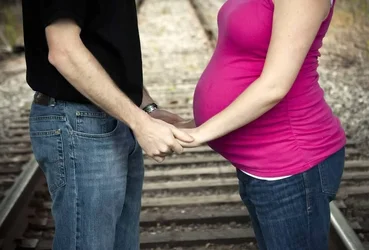
1. This is a nice shot; the exposure is good and the composition is fine, albeit perhaps not the most exciting. I would suggest though, that it would have been stronger had you moved their arms; as-is they're obscuring a significant part of her belly, which is, after all, the "star" of the maternity shot. I think too, moving closer and having a little less above and below would have been better. Their eyes are a little dark and featureless.
2. As mentioned, cliche, but sometimes that's what the client wants, that's fine (as long as it wasn't your idea!

) Be careful of the details however; not the laterally bisected arm and the busy, distracting background. I think a crop just below her breasts and above the arm would be better; in future, consider this against a white or black backdrop.
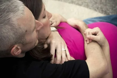
3. Again, a nice shot, but he's suffering from racoon-eyes; a reflector low and left would ahve made a lot of difference.
4. The same comments as per #1 with respect to arm position. While railroad tracks make great (if not over-used) leading lines, try and place the subject at, not in front of, the vanishing point. In this one it's not bad, but there is enough rail beyond the couple that it does try and grab the eye.
5. I'm afraid I get nothing from this one. The viewer doesn't really see either face, nor the fact that she is pregnant. A wider perspective might have worked better here. Try and avoid "messy" fingers; keep them together, and flat whenever possible.
Overall, a nice set.
Just my $00.02 worth - your mileage may vary.
~John











![[No title]](/data/xfmg/thumbnail/39/39183-f229dae0963376879140c9959e33f935.jpg?1734173057)
![[No title]](/data/xfmg/thumbnail/38/38293-15e3a85f038b239e3c60bf9f38f5d56c.jpg?1734172201)
![[No title]](/data/xfmg/thumbnail/36/36301-27972c0474532c2ef657014362950733.jpg?1734168626)
![[No title]](/data/xfmg/thumbnail/37/37520-d3e4d6582aa2781be7abf64e8651db45.jpg?1734170680)
![[No title]](/data/xfmg/thumbnail/39/39442-c7791194bfea1b4d6bd382b004fb8488.jpg?1734173531)
![[No title]](/data/xfmg/thumbnail/39/39182-efc21fe87c9b5f9b2fa9ab0f8f01c205.jpg?1734173056)