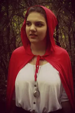
Interesting. I think #3 is the only one that's much good here. There are technical problems, as noted, but I like the idea pretty well and your execution is pretty good.
I would:
1) clean up the edges of the selective color, as noted.
2) frame more loosely, so she is a bit smaller in the frame, and more importantly the cloak is entirely in-frame.
3) get more stuff between you and her, so it's clear that We are Watching Her through a veil of trees and branches.
You might try a vignette, and/or shallow depth of field. You're after, I assume, the wolf's eye view of the girl, so the monochrome makes sense. Now try to imagine how a predator sees the prey, and emphasize that. I imagine it as a sort of tunnel-vision, where everything goes black except the prey. You may have a different idea, though.
") Feedback appreciated
Feedback appreciated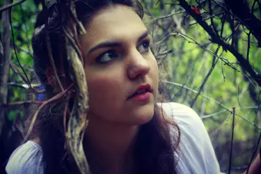


![[No title]](/data/xfmg/thumbnail/35/35264-5ade32b7036391926536661aeb7491c3.jpg?1734166921)
![[No title]](/data/xfmg/thumbnail/35/35263-86f580cf5d28d23109a45984030a79ad.jpg?1734166920)


