What's new

Retrohedz and Victoriana Bonkers

Bend The Light

No longer a newbie, moving up!
Joined
Jun 8, 2010
Messages
2,591
Reaction score
375
Location
Barnsley, Oop-Nooerth, UK
Can others edit my Photos
Photos OK to edit
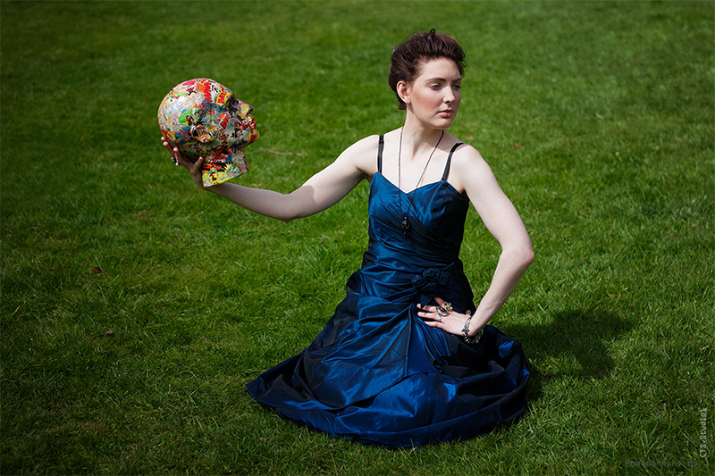
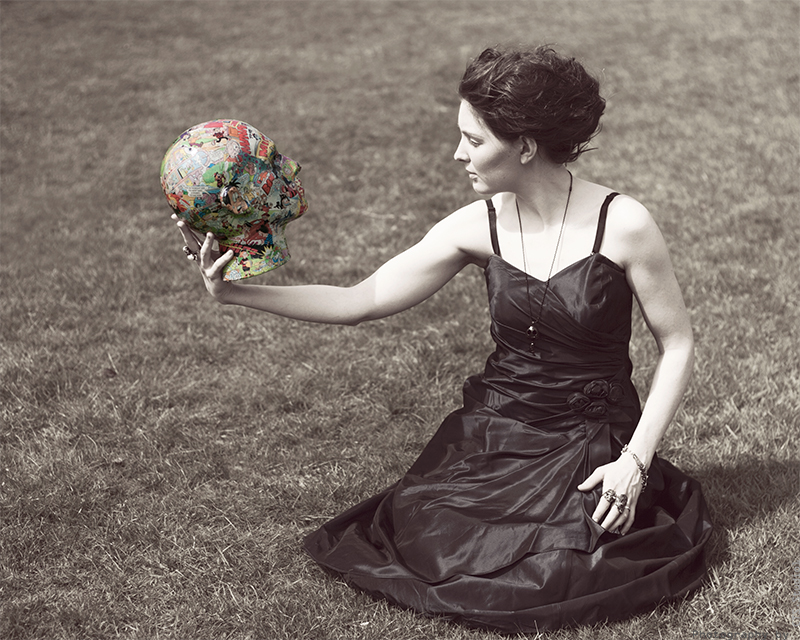
Today I did a shoot which was arranged to make pictures to promote a friend's business - that of making RetroHedz. Retrohedz make heads covered in comicstrips and old magazines which people buy as "home decor".

One of out themes was to have our model (the gorgeous Katarina) as a quite austere character, victorian to look at, and contrast that with the more modern, bright RetroHedz. During the shoot, Katarina's name evolved, and henceforth she is to be known as "Victoriana Bonkers". Which about sums up the shoot, really...utterly bonkers!

So here's a few images (not all the images had a RetroHed in them...:)

Your thoughts, as always, graciously accepted. :)
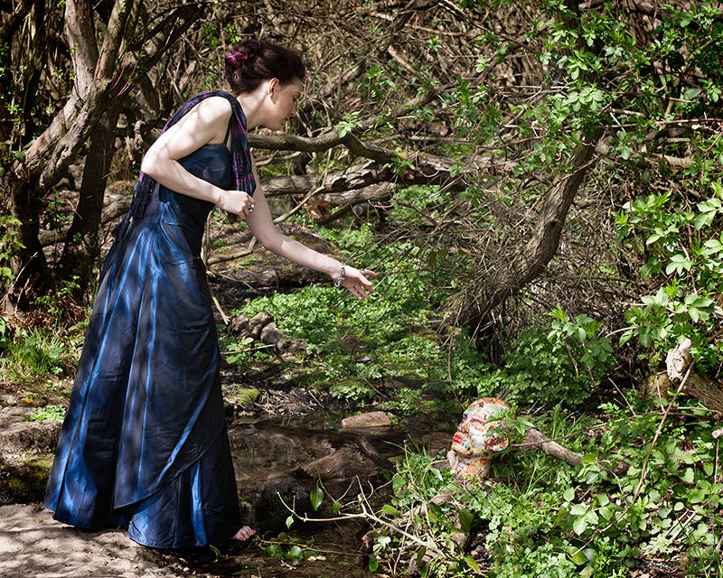

Victoriana Bonkers 3 by http://bendthelight.me.uk, on Flickr
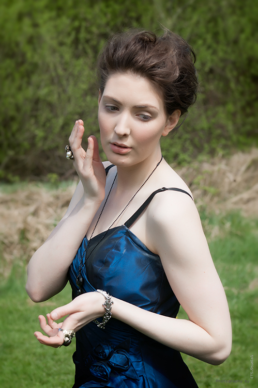

Victoriana Bonkers 4 by http://bendthelight.me.uk, on Flickr
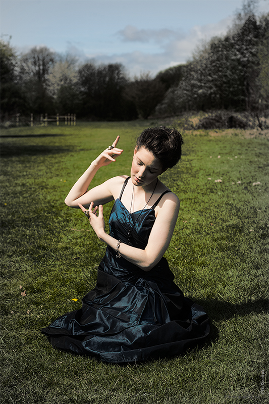

Victoriana Bonkers 5 by http://bendthelight.me.uk, on Flickr

Victoriana Bonkers 8 by http://bendthelight.me.uk, on Flickr

Victoriana Bonkers 6 by http://bendthelight.me.uk, on Flickr

Victoriana Bonkers 9 by http://bendthelight.me.uk, on Flickr
 
Very quiet around here. :(

I'd really like some critique on these as it's my first outdoor photo shoot (other than shooting animals in the zoo, birds, or my kids).

Let me know what you think.

Thanks. :)
 
I like her poses in 4 & 5. Yes, they look posed but I still like them.
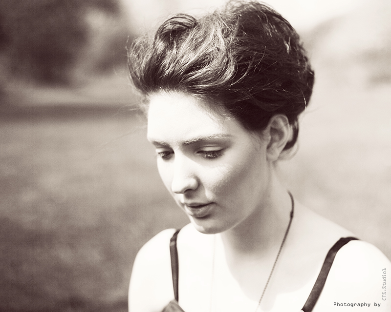
I also like the high key look in #6. The facial expression fits right in.
On the others with the head I get to much competition from the head itself. Meaning I don't know which you are photographing. Her or the head.
 
The 3rd is my favorite. The shadows are a bit deep, but I like the classical pose.

However, if you are trying to sell a product, it is better to have that product in the image, imo, especially for a small business.

Best product shots are the 4th and the last. Normally, I despise selective coloring, but for this type of thing it works. I would selectively color the last shot, and that would be the one to use.
 
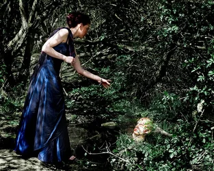
#1 is wildly busy, and kind of surrealist in a lot of ways. What on earth is she doing in the woods? What's going on here? As is, it's a dud, but it's possible that if you gave it a dramatic surrealist treatment in post, you might have something. Maybe something like this:

$foo.webp


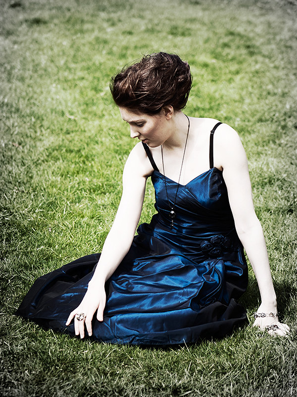
#2 is a lovely girl on an ugly background.

#3 is pretty nice, and I think so mainly because it's starting to look a little like my ideas ;) Dramatic, surrealist!

#4 is the alas poor yorick pose is pretty obvious. Not convinced it works against plain-jane grass (and not very pretty grass either)

#5 is a lovely picture of a lovely girl. Well done.

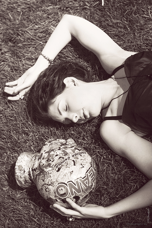
#6 is a really interesting idea. Sort of a creepy lovers vibe here. I dig it. Not in love with the processing here, but that's just a matter of taste anyways.

I think you've got some good ideas in here, but I don't feel like it's coming together quite yet. You have fantastical elements and a lovely girl shoved into a sort of dull looking park too early in the spring to look nice.
 
I like her poses in 4 & 5. Yes, they look posed but I still like them.
I also like the high key look in #6. The facial expression fits right in.
On the others with the head I get to much competition from the head itself. Meaning I don't know which you are photographing. Her or the head.

The shoot was arranged to shoot the heads with a variety of scenarios. So in answer to your query about what we are shooting, it is "Both". However, I took it upon myself to also shoot images WITHOUT the heads, merely to entertain myself - in other words, not for the customer.

Thanks for the crit. :)

The 3rd is my favorite. The shadows are a bit deep, but I like the classical pose.

However, if you are trying to sell a product, it is better to have that product in the image, imo, especially for a small business.

Best product shots are the 4th and the last. Normally, I despise selective coloring, but for this type of thing it works. I would selectively color the last shot, and that would be the one to use.

Thanks. The shadows are deep, yes, as this was the first decent weekend we've had in a long time. The shoot had to go ahead on this day, although with hindsight there may have been the odd alteration I could have made to make it a little better. As for shooting without heads, those are for me, the ones with heads are for the customer, who was there at the time. Some of these are his ideas anyway. :)

I know what you mean about selective colour, but, the whole idea with the heads was contrasts, and the selective colour enabled that, I think. :)

Cheers

#1 is wildly busy, and kind of surrealist in a lot of ways. What on earth is she doing in the woods? What's going on here? As is, it's a dud, but it's possible that if you gave it a dramatic surrealist treatment in post, you might have something. Maybe something like this:

View attachment 44210


#2 is a lovely girl on an ugly background.

#3 is pretty nice, and I think so mainly because it's starting to look a little like my ideas ;) Dramatic, surrealist!

#4 is the alas poor yorick pose is pretty obvious. Not convinced it works against plain-jane grass (and not very pretty grass either)

#5 is a lovely picture of a lovely girl. Well done.

#6 is a really interesting idea. Sort of a creepy lovers vibe here. I dig it. Not in love with the processing here, but that's just a matter of taste anyways.

I think you've got some good ideas in here, but I don't feel like it's coming together quite yet. You have fantastical elements and a lovely girl shoved into a sort of dull looking park too early in the spring to look nice.

1. Yes, I like that, and I did go deeper and more dramatic on other images (like the third one)

2. Yes, but it was better than the other direction. :)

3. Thanks. I like this one, and yes, I agree, it's better being darker and more dramatic.

4. First pose we thought of, of course. We did one where she's dressed as a superhero with bright wigs on both her and the head. That's different. :)

5. Thanks. One of my favourites too, despite the burnt out bits. :)

6. The lovers idea was what I thought...what processing would you do? I do appreciate your ideas.

Cheers for the crit. :)
 
Thoughts, per req:

1. I like the idea, but the location does not work, IMO. As stated, it's too darn busy. In fact, until I saw it mentioned, I totally missed the fact that there was a head in the scene. Given the model's look and attire, I think a much plainer, more 'gritty' enviornment would have worked well; something industrial with lots of plain concrete, etc.

2. Wonderful model, and nice look & lighting, but the background really kills this one for me.

3. I like the treatment and look here; rather 'hand-coloured Victoria post-card', but I'm not sure what the purpose of the scene is, that is: What is the point of interest for the viewer supposed to be?

4. Apply the treatment from the one above to this one, and you have a winner. "Alas poor Yorick..."

5. To be honest... Mehhh.

6. Again, not fond of this treatment, and her skin seems at least 2/3 of a stop too hot. I think the treatment in #3, or perhaps a black & white would hav worked well, but this just seems, well... rather insipid.

Just my $00.02 worth - your mileage may vary.

~John
 
Thoughts, per req:

1. I like the idea, but the location does not work, IMO. As stated, it's too darn busy. In fact, until I saw it mentioned, I totally missed the fact that there was a head in the scene. Given the model's look and attire, I think a much plainer, more 'gritty' enviornment would have worked well; something industrial with lots of plain concrete, etc.

2. Wonderful model, and nice look & lighting, but the background really kills this one for me.

3. I like the treatment and look here; rather 'hand-coloured Victoria post-card', but I'm not sure what the purpose of the scene is, that is: What is the point of interest for the viewer supposed to be?

4. Apply the treatment from the one above to this one, and you have a winner. "Alas poor Yorick..."

5. To be honest... Mehhh.

6. Again, not fond of this treatment, and her skin seems at least 2/3 of a stop too hot. I think the treatment in #3, or perhaps a black & white would hav worked well, but this just seems, well... rather insipid.

Just my $00.02 worth - your mileage may vary.

~John

Thanks for the write up.

1. The location was suggested by the model, and we were looking for a grassy area to have her strolling around in the grass being victorian, and then plonking some wierd heads in various shots. I agree that some of the places didn't quite work, but we were committed by that time. Next time we recce the site a little more...:)

2. That Background is the reason that I shot down on the model in the third image. :)

3. The purpose? Nice girl in a pose on grass. Nothing too deep. ;)

4. Yes, I agree. I think I have others now that have different treatment:


Victoriana Bonkers 13 by http://bendthelight.me.uk, on Flickr


Victoriana Bonkers 17 by http://bendthelight.me.uk, on Flickr

5. Awww, that's one of my favourites. :)

6. It is a little blown in places...not in the original, but the processing is part of that...a straight, contrasty mono may work better. :)

Thanks for your crit.:)
 
I don't actually get a "Victorian" vibe from these, mainly due to her immodest attire...

I like the headz...those are interesting objects. I like the model. But the unmodified sunlight just seems so stark and harsh on these shots. I "want" to like these photos, I do, but for some reason they are not resonating with me. I think it's the pasty, pale-white girl seen against the deep,dark greens and the dark blue sleeveless, spaghetti-strap dress...just feels...discordant. In keeping with that discordant feeling, I think the most-successful frames are the ones where both she and the head appear in the same picture.
 
I don't actually get a "Victorian" vibe from these, mainly due to her immodest attire...

I like the headz...those are interesting objects. I like the model. But the unmodified sunlight just seems so stark and harsh on these shots. I "want" to like these photos, I do, but for some reason they are not resonating with me. I think it's the pasty, pale-white girl seen against the deep,dark greens and the dark blue sleeveless, spaghetti-strap dress...just feels...discordant. In keeping with that discordant feeling, I think the most-successful frames are the ones where both she and the head appear in the same picture.

Thanks. Discord was the order of the day, that's true. So to have everything appear to be completely normal would NOT have fit the brief of the shoot. But yes, technical issues are apparent and show my novicity in outdoor photo shoots. (is "novicity" a word? If not, it should be!)

The shots sans head were taken for my own pleasure, rather than the brief...so shouldn't be seen as having the intention of promoting the heads...but they are apart of the same shoot, hence their inclusion here. :)
 

Create an account or login to comment

You must be a member in order to leave a comment

Create account

Create an account on our community. It's easy!

Log in

Already have an account? Log in here.

New Topics

Back
Top Bottom