Ridge Run

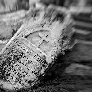
Nice selection. I like the first of course. There you are again doing rusty/decaying stuff. I see you getting more and more abstract in the future until we can't recognize you anymore.
 
OK. I agree. But I think it's still a bit flat. Personal preference, but I did this after seeing that B&W was a bit tough to pull off here:

i-ScfPgVL-XL.jpg


I wanted to bring out more of the texture.


Awesome shot Rick58! I did agree it was a little dark. I like this edit ^^^. The texture really pops.
 
Thanks Ken and ProPilot.. I refuse to go to the dark side of abstract (;)), but I'll bend and say I'm starting to see detail instead of just the overall picture.
I'm a little surprised at the responses. The sign was actually my least favorite but got the most mention. I thought I'd get the 'ol "Yeah, it's a sign...next". I really liked the Doors & Strips, but I seem to be alone. It's a familar feeling.:lol:
 
Wow, I just went back and looked at my Doors & Strip photo. I'm surprised no one mentioned how FLAT it is!
I need to walk away from the PC for a while and take second look before posting. Over done?
View attachment 41926View attachment 41927
 
Nice series!! Looks like a fun place to grab some shots.

This edit above is overdone for my tastes, but then, I tend to prefer more subtle color. You've made it pop, that's for sure.

I like both versions of the sign, too - the edit someone did helps show off the great texture of this image.

Good work!!
 
Thanks Terri, I think it might be somewhere between the two. The colors of the wood and rust is what drew my attention to keeping it color, which I think I lost on my original.
The wood was full sun and the colors pronounced but it may be just a tad on the tacky side.
 

Most reactions

Back
Top