- Joined
- Mar 18, 2013
- Messages
- 15,470
- Reaction score
- 15,382
- Location
- Boston
- Can others edit my Photos
- Photos OK to edit
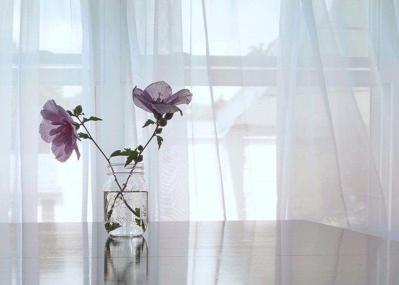 rose of sharon6 by SharonCat..., on Flickr
 rose of sharon2 by SharonCat..., on Flickr
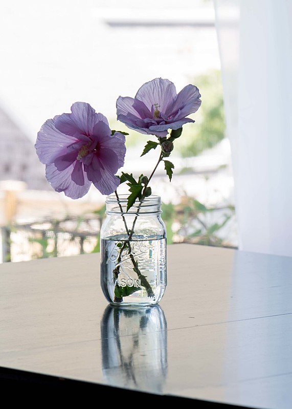 rose of sharon3 by SharonCat..., on Flickr
My original subject before I got distracted by the window when the breeze picked up. The last is my favorite out of these 3.
")


![[No title]](/data/xfmg/thumbnail/32/32698-38e2346942223e17b43fb958f66064c1.jpg?1619735601)


![[No title]](/data/xfmg/thumbnail/37/37614-3833b9d2e46075829c91cf9c0f47af69.jpg?1619738150)