rose of sharon

Really like the theme, who would of thought that Rose of Sharon was so transparent? Excellent.
 
I agree - the last is my favorite, too. Nicely done.

On a slightly unrelated note, I can never read the name of that flower without thinking of The Grapes of Wrath (Rosasharn Joad, whose actual name was Rose of Sharon.)
 
Really like the theme, who would of thought that Rose of Sharon was so transparent? Excellent.

Thanks so much!

I agree - the last is my favorite, too. Nicely done.

On a slightly unrelated note, I can never read the name of that flower without thinking of The Grapes of Wrath (Rosasharn Joad, whose actual name was Rose of Sharon.)

Thank you! I've always felt a bond with the flower since my name is Sharon. We planted 3 of them around our house and they are all in full bloom right now.

I really love the deciduous shrub myself. I had a stunning one in my Detroit home, I use to shape and love on it always, even though it was deemed maintenance free. I drove by the home a few weeks ago and it was out of control, people didn't have a clue what they had out front.
 
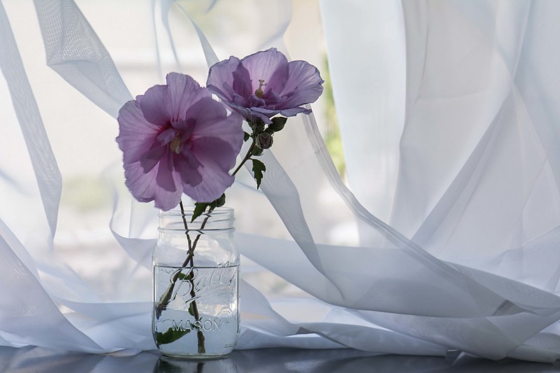
Nice set! I like them all but love the second one. For me it creates a sense of delicacy and nostalgia . Very nicely done! :)
 
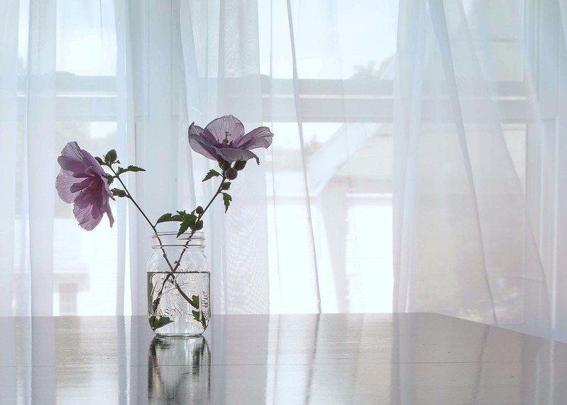
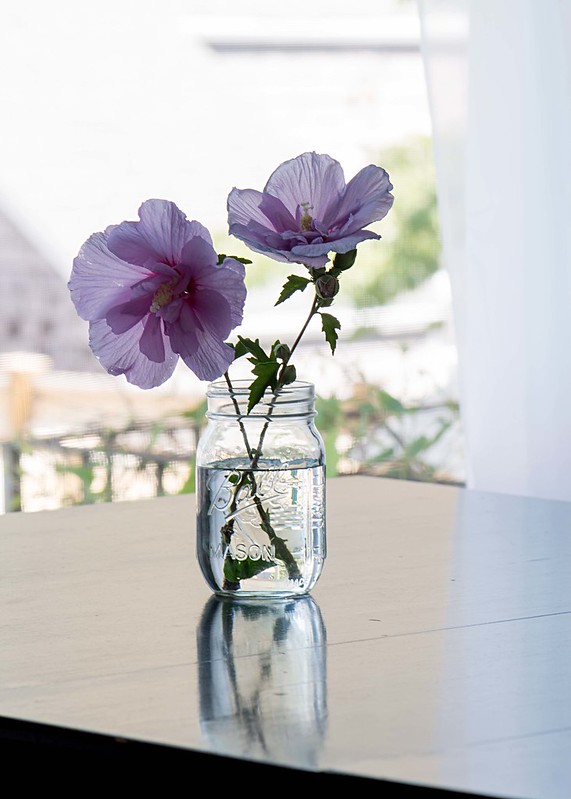
As I look at them more, I was wondering why #1 was initially my favorite and then I switched to #3. I love the composition and the way the light falls, and the great use of negative space. I prefer the comp to #3, actually, but I think the background is too distinguishable and it's ultimately distracting.

As for #2, I again thought that I'd like it the best because I love the delicate folds of the sheer curtain, the contrast provided by the color of the flowers, and the balance of the flowers on the left of the frame while the curtains and blossoms lean gently towards the right of the frame. I just wish there weren't that opening in the curtains.

I know they are tiny niggles, but they are ultimately why I decided the third was my favorite, even though I liked specific elements of the first two better. The third one comes together in a holistic way as well as in the details.
 
I'm going to have to buck the tide and say my favorite is #2. I agree with @limr that the shot would be better without the opening in the curtain, but really the same could be said for #3. Nicely done!!!
 
I really love the deciduous shrub myself. I had a stunning one in my Detroit home, I use to shape and love on it always, even though it was deemed maintenance free. I drove by the home a few weeks ago and it was out of control, people didn't have a clue what they had out front.

Too funny! I frequently drive by my old neighborhood and am always amazed at the transformations (for better and for worse) that take place when new owners move in.

Nice set! I like them all but love the second one. For me it creates a sense of delicacy and nostalgia . Very nicely done! :)

Thanks!

#3 is my fav, but #1 and #2 convey a picture of being soft, nicely soft, baby soft.

Thank you!
 
Last edited:
As I look at them more, I was wondering why #1 was initially my favorite and then I switched to #3. I love the composition and the way the light falls, and the great use of negative space. I prefer the comp to #3, actually, but I think the background is too distinguishable and it's ultimately distracting.

As for #2, I again thought that I'd like it the best because I love the delicate folds of the sheer curtain, the contrast provided by the color of the flowers, and the balance of the flowers on the left of the frame while the curtains and blossoms lean gently towards the right of the frame. I just wish there weren't that opening in the curtains.

I know they are tiny niggles, but they are ultimately why I decided the third was my favorite, even though I liked specific elements of the first two better. The third one comes together in a holistic way as well as in the details.

I'm going to have to buck the tide and say my favorite is #2. I agree with @limr that the shot would be better without the opening in the curtain, but really the same could be said for #3. Nicely done!!!

I know!!!! And I noticed that while I was shooting and fixed that opening and took more pics but I somehow messed up the composition and left no room at all under the jar so it looked wrong.

@limr loved having your detailed feedback on each, thanks so much!
 
Very nice. I have both white and lavender in my back yard. Haven't played with them yet.

For me, it's the first shot. I like the negative space, but I think it's also the open, airiness of the shot. Can't figure out if there is something more emotional with it or what, but that's the clear winner for me that says summer.

Thanks for the feedback, much appreciated. We don't have a white rose of sharon but I have the perfect spot for it in mind!
 

Most reactions

Back
Top