Roses Part Deux! (Adjusting DOF C&C appreciated)

JWellman

No longer a newbie, moving up!
Joined
Oct 20, 2010
Messages
705
Reaction score
90
Location
Indiana
Website
www.jwellmandesigns.com
Can others edit my Photos
Photos OK to edit
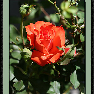
First off, thanks for all the useful advice with my last photos! :thumbup: I didn't make it back to the mansion today so I just played at home with leftover Valentine roses. I went up to f4 for these shots. Hopefully they are a little better today ??

#1
2_15_11_sunlightBW.jpg


#2
2_15_11.jpg
 
number 2 is better for the reason that the keys are easily identifiable as piano keys. :thumbup:
 
There you are again! Gosh, I like your work. The top photo really, really captures texture for me. I love your composition and use of muted color. Have I said I really like your work?!:wink: It's very classy IMHO.
 
Oooh, #2 is killer. Liking the yellow on the roses and the blurry keys in the foreground. I wonder what it might have looked like with a little wider of a field of view.

#1's not tilted really.. but the downward slope and the bright keys pull my eyes to the right until they're out of the frame, kinda taking away attention from the flowers.

Nice setup though, really like #2.
 
There's a joke here somewhere, something about Tulips...


Ms. Wellman, you are doing some nice work! Keep posting.
 
#2 is phenomenal, the center of the rose is so beautiful and the piano just compliments it. Great work!
 
There's a joke here somewhere, something about Tulips...

Ugh, I know that joke. :p

I like the colors of the first better (mostly cause of the purple in the second, I do like the yellows though), and the comp of the second better. :)
 
I've been reading "The Man Topic" :lmao: and I return to find your lovely replies...thanks so much. :hugs:

I really liked #2 also and used it for my "One-A-Day" collection.
 

Most reactions

Back
Top