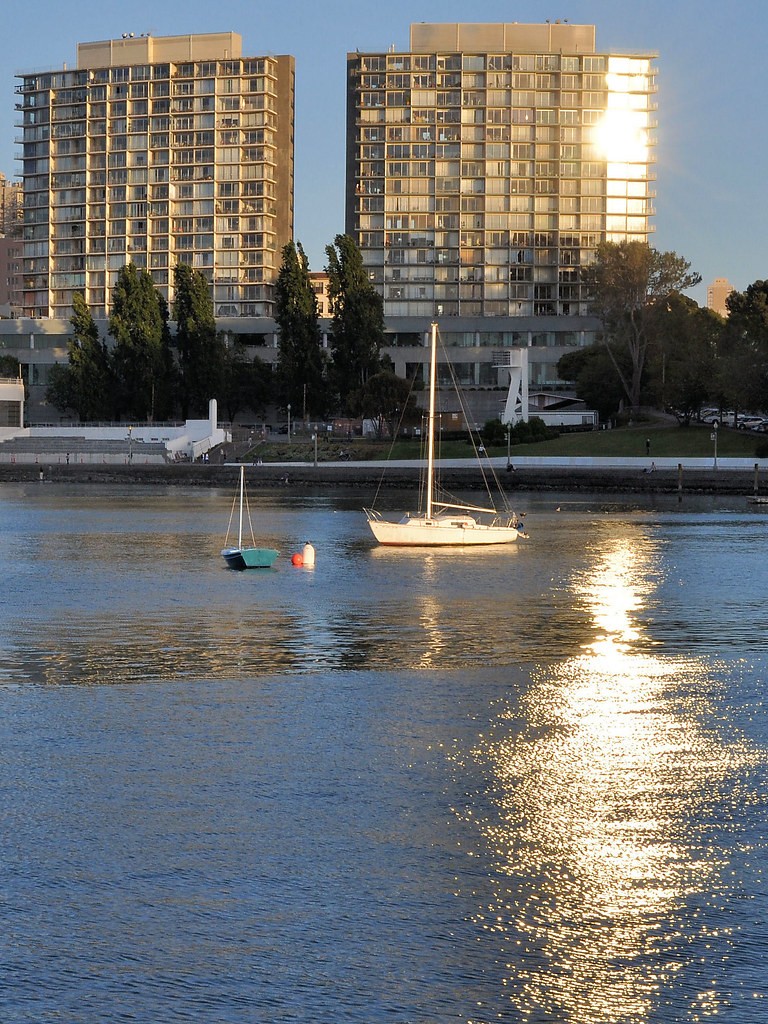
#1 is boring, but #s 2 and 3 make up for it. (#2) great directionality, complementary color scheme, haze adds more interest to the subject. (#3) is clean and crisp. love the colors. the only problem i have with these is that they are common. you see a lot of this style / subject / sunsety photo. just being honest. i say get out and experiment with different subjects, environments and angles.
1. My eyes cant stray away from the blow out on the building.
2. i enjoy. love the tree and some reason makes me want a cup of coffee and my fishing pole lol
3. the color is nice but its not doing much for me.
The second one is definitely the standout from this series! Nicely framed with the branch above the bridge, pretty colours, and I like how the scenery seems to emerge from the haze. :thumbup:
No.2 i feel is by far the stand out picture of the 3 that you've posted up. With regards to the construction of the shot I would've actually completely ditched the tree in the foreground.
My reasoning being that the picture as a whole has very little contrast, which is beautiful, but makes that tree stand out like a sore thumb! I would've left the tree out and other than that I think it's a fantastic picture. brilliant - makes me think of the 1930-40's for some reason!