Bring your highlights into Zone 8 (lightest shade that still has texture). This is a very textured image, and having areas with no detail doesn't fit. Then let's see it again and see if it works.
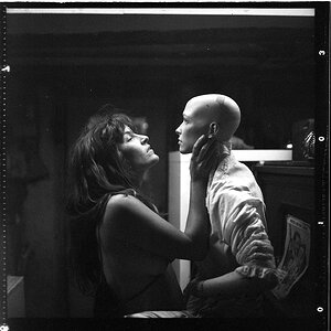
Not too bad--far from epic fail territory. You have pretty legs, and the outfit's nice...I wish there was a bit of a visible eyeball or two under the brim of the hat....buty shown dark and grainy like this, I think the body,and the pose, are more important overall than the eyes...judging from the facial expression and angle of the head, it seems as if you are looking right at the camera...but one cannot actually "see that", one must decipher that...so there's a little aura of mystery about the woman....who is she? we cannot see her eyes and their expression...so, not too bad overall,and far from epic failure!
I disagree with these guys about your legs, they are terrible.
Just kidding lol, your quite pretty. :thumbup:
I like the 1st one better.
2nd one shows too much of the background imo.
Edit: What I mean by that is that the eye is drawn to you more in the 1st one. In the 2nd one I was finding myself getting distracted by the background, not a good thing.
Tentatively, everything looks OK about the first one except for the highlights. Can you reproduce that image without the loss of highlight detail? I much prefer it to the second one (where the highlights are also still blown).
Well, I have seen the original, the now-removed first edit (which I did not like),and now the third shot which is in Post #8; I think something in between the original, which had burned out highlights, and in between the shot in Post #8, which looks a bit flat and too low in local contrast. Perhaps, try boosting the local contrast of the shot in Post #8 by applying USM at 10 percent, 150 pixel radius, threshold 0, which will give you about a "one contrast grade" boost, to use old film-speak.
Incidentally, this shot is so small that it's hard to appreciate it fully; once images on the web get below a certain threshold size, they lose a LOT...and this image is in that too-small size category...at the 450-500 pixel long side category, there just isn't much "meat" in a digital image.
Well if this one doesnt work I might just give up! Still not sure if it works quite right. But it seems better. More contrast, but a lot less blown details in the shirt. This time I am posting a bigger picture
I want the photo to have overall contrast, but I don't want the white of the shirt to be blown out in any areas. I am having problems with this, because I really am not great with editing as far as knowing what I am doing. I just try to play around and get it right.
I think this latest,larger picture is pretty close to what I'd expect. I do think that the legs could be lighter in tonal value though. But that little glimmer of an eye catchlight helps. I like how the background, of the room, and the chair feet, is still kind of dark.


![[No title]](/data/xfmg/thumbnail/31/31740-83040d547efdbb1f87736f24d2e9985c.jpg?1619734985)
![[No title]](/data/xfmg/thumbnail/31/31739-79afec4abf40a7270ab73b65a6bbf108.jpg?1619734985)
