

Photographiend
No longer a newbie, moving up!
- Joined
- Jul 31, 2012
- Messages
- 1,234
- Reaction score
- 188
- Can others edit my Photos
- Photos OK to edit
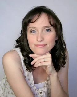
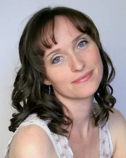
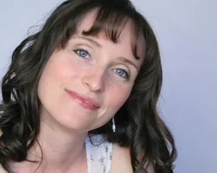
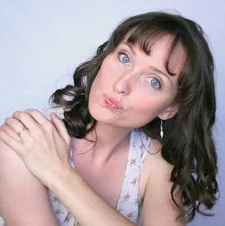
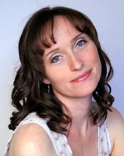
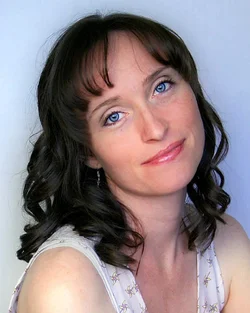
Finally used the remote for my cam today. Struggling with getting it to focus where I want it to with the self portraits.
1.
2.
3.
4.
1.
2.
3.
4.





![[No title]](/data/xfmg/thumbnail/30/30883-04222f7ae234efdf80dff6f96ddad16f.jpg?1734158884)
![[No title]](/data/xfmg/thumbnail/34/34114-dd12be026979ccd4182c5f478bd91448.jpg?1734164566)



![[No title]](/data/xfmg/thumbnail/30/30882-ce388519574371448d7493784524607a.jpg?1734158883)