Thoughts per req:
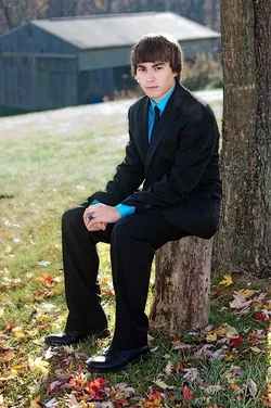
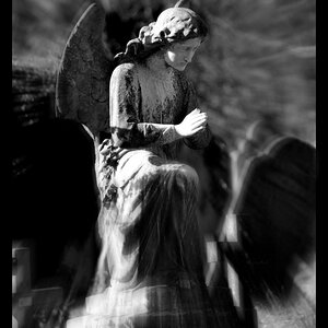
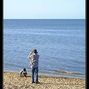
1. The clothing doesn't really match the setting, and I think a little more fill image right would have helped. Dark clothing in a relatively bright scene can be tough; this is pretty good, but just a little more detail in the black would help.
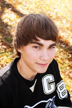
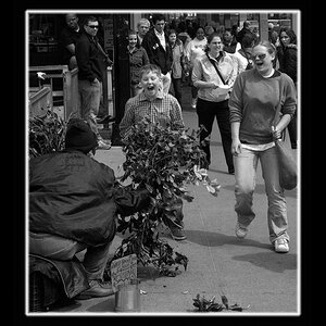
2. Good exposure! Not fond of the perspective though; too close and too high for my taste.
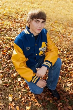
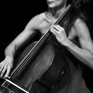
3. Move him a little more toward the LH side of the image, and see if you can brighten his face & front. Fill light would have been useful.
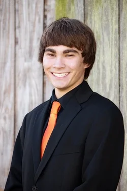
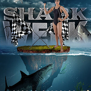
4. Pretty much a classic. Good exposure, good expression. A little more separation from the background wouldn't have gone amiss, but it's not bad at all.
Just my $00.02 worth - your mileage may vary.
~John