Senior Portraits C&C

BekahAura

TPF Noob!
Joined
Feb 23, 2010
Messages
355
Reaction score
23
Location
Putnam County, New York
Website
reflectivephotos.net
Can others edit my Photos
Photos OK to edit
I'm happy to discover that I don't have to use flickr to post my pictures here anymore, I can link them right from my website! I love this forum.

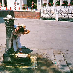
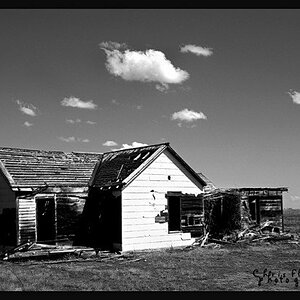
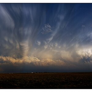
Anyway, this is my first senior shoot. The girl's grandmother was happy, but I'd like to hear what you have to say about them. If you paid for these would you be happy? Any feedback is appreciated.

1)
vanessa_01.jpg


2)
vanessa_02.jpg


3)
vanessa_03.jpg


4)
vanessa_04.jpg
 
A general impression of the set-

1) I feel like this needs a tighter crop, or more light on the subject. She feels slightly underexposed/dark compared to the background, and the empty space on either side of the bench isn't needed.

2) The girl is lovely, but she looks a little hunched over and awkward in this pose. I like the simple, feminine dress she wore for her session, but I'd like to see a more relaxed pose and expression to make this shot work. I also don't like where it cuts off at her knees.

3) I'd like to see this one more from the angle that number 2 was taken at, also without cropping the knees. From this angle, her hand on the far side of the tree seems slightly disembodied. She seems a little dark in this, as in number one as well.

4) This is your strongest of the set. I love the lighting, the pose, her expression, and your choice of framing and composition. The catchlights in her eyes are perfect, the DoF is nice, and the entire picture just feels like it has more depth and feeling.

If these were my senior pictures, I think I'd be overall please with them, particularly number four. But from a photographer's eye standpoint rather than a highschool kid looking for nice pictures, I think I'd only be happy with the fourth shot. Overall great attempt, keep shooting! =)
 
the are happy.. thats all that matter. I personally woud blur the background more on 1,2,3. But thats just me.
 
Aayria,

Actually her grandmother liked that last one the best as well. My boyfriend said he thought the pose was weird and I thought there was too much shadow on her face. But I'm glad I posted it now! Thanks for all your comments, I will definitely take them into consideration when posing and shooting people in the future.

Schwettylens,

Yes, I also wish I shot with the aperture wider... shoot and learn. Thanks for your comment.
 
I like these over alll...

The suggestion regarding bluring the background in 1, 2 and 3, is valid in my opinion as well...

And I feel there is a bit too much "free space" at the ends of the bench in no. 1.... Perhaps a re-crop using a 1:1 aspect ratio??? Just a thought...

vanessa_01.jpg
 
Last edited:
I can see why the grandmother likes them. They are great pictures. I would be proud of them if i took them
 
I would say that #4 was the best, but other than that the lighting is relatively flat. And for next time if you do one similar to #4 I would try and soften the shadow and/or have her look more towards your light and a little down (or just look off to camera right but still keep eye contact with the camera). That would help wrap the shadows around her face because it looks like a somewhat hard light source.

But it looks like she had a great time and that she was comfortable in front of the camera, and that is one of the most important things!
 
Mark,

I love the crop, thanks.

Silvius,

It's funny you mentioned that, I was just thinking the same thing. I remember a thread a few months ago also mentioned this problem in someone's senior photos, you'd think I'd learn from it. I do have a few shots of her with a relaxed face, but aside from smiling and relaxing her face, what else can I suggest for different expressions?

Thanks Morpheuss =)

Redtippmann,

Yeah, I wish I took out my other light for this one. I needed some fill. I must admit it was pure laziness, it was extremely humid and hot, and I could barely keep the one light stand up with my umbrella catching wind.

Thanks everyone, I appreciate the feedback.
 
+1 on the lighting being pretty flat except the last one. Plus by using strobed light you can bring down the brightness of the backgound down so your subject 'pops'. (light advances, dark recedes)

Do you keep a conversation going with your subject, tell some jokes to get a laugh and some sparkle in their eye? I'm always telling them to smile with their eyes.

Backgrounds, backgrounds, backgrounds......

In general, poses that have the shoulders parallel to the image sensor plane loose a lot of dynamicism and interest.

IMO in #1 she should be at the other end of the bench, so the tree would not be right beside her. You could have used the tree near the bench and the one camera left in the background to frame her. You would have had to move a couple of feet to the left too to make that happen.

#2, #3 - Tell your subjects to stand tall, lean slightly forward at the waist, the foot closest to the camera should be pointed at it and the rear foot should be at 90° to the front foot with most of their weight on the back foot. All that makes them look stronger and more regal.

#4 - Your light was a bit to high. It let the shadow from her nose fall onto and below her lip line which really weakens her smile.

There are some good tips in this old thread Dao found: http://www.thephotoforum.com/forum/professional-gallery/20071-hot-tips-portrait-photography.html
 
Last edited:
As always Keith, thanks so much for your valuable input!

Believe it or not I did have a flash on her in all of the above photos. I guess it just wasn't close enough in the first 3. (I think I had it on full power but I can't remember)

And I actually did make her laugh once during the session, but of course I missed the shot. With my friends I'm usually a funny person, but I'll really have to work on balancing my attention to the camera with my attention to the subject.

I'm pretty sure I will use this location in the future, so I'll have to try that bench shot again with your tips in mind.

I will definitely check out that link.

Thanks again!
 
I wanted to add, that I really liked the coloring and skin tones in all of these - spot on =)
 
I agree on the cropping and posing issue. Overall nice job though. I hate the first dress style, they make all women look mildly pregnant..i also would have removed the forhead blemish. She clearly has nice skin, so one blemish removed shouldn't be too obvious.
 
Incredibly attractive and I'd say pretty good composition. Maybe a little lighter exposure and tighter crop, but other than that no problem.
 

Most reactions

New Topics

Back
Top