What's new

Senior Portraits Critique Wanted!

xxWesxx

TPF Noob!
Joined
May 19, 2012
Messages
101
Reaction score
2
Location
Tennessee
Can others edit my Photos
Photos OK to edit
$_MG_421Watermark9.webp
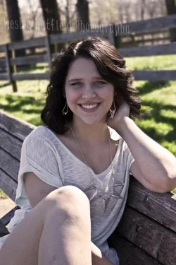
This turned out "in my opinion" a very good shot. What could I do, to make this a better photograph?
 
Pretty girl, but she's underexposed and there's some hot spots on her arm and leg. A reflector would have worked good in this situation and would have brightened her face and eyes. Also watch out for limb chops. I would have had her put her leg down because it doesn't look like part of her body.. I think it's the angle you took the shot.
 
Cute girl, with a nice smile.

I'm not a portrait photographer either--it's something I'm working hard on this year--so take what I say with a grain of salt (and possibly some tequila…)

I *like* how you've focused in on her.
I like that it's portrait orientation.
I like that she's obviously comfortable and has that at-ease sort of smile.

She's underexposed though, and so my attention is drawn more to the bright green grass behind her.
Her elbow is cut off on the right.
Having her knee up like that in the foreground is HIGHLY distracting, imo.
And, she has things growing out of her head…something I struggle with myself. Seems like no matter where you pose them, SOMETHING ends up sticking up out of their heads!
 
I would process this an entirely different way, with much lighter shadows (meaning, her face and hair, which are in the shadow ofd the backlighting), and some "other" kind of filter effect; this desaturated yet dark Ultimate Fighter-type of look (named after a Lightroom preset) is too "heavy and depressing" for her, and for her smile. Bringing the raised knee into the pose is a 50/50 shot...it works here I think. I can "see" a decent shot within this frame, but I do not think it quite springs forth due to the processing effect that was applied, but I agree--this shot does have something and it did turn out.

 
Tami pretty much nailed it. Fill light was needed here to bring up the exposure on her face and knock down the background; remember that the human eye is attracted to bright objects, so generally speaking, in single-person portraiture, you don't want large bright areas which pull the viewer's eye from the subject. In addition to the slighly awkward pose and chopped limbs, you've got "antlers" growing out of her head in the form of the two trees behind her. Had you moved just a bit to your left and added a bit of fill, this would have been a great shot!
 
Try shooting in open shade (exposing for the subject), you will get much softer light and not have to deal with harsh shadows. I like her pose, the background is a bit distracting but only because it is brighter than the subject is.
 
Thank you guys for the critique! Defiantly see what you guys are saying by underexposed. Ill work on it!
 
I would start by bringing up the shadows on her face and bringing the temp up a little, and then reevaluate and go from there.
 

Create an account or login to comment

You must be a member in order to leave a comment

Create account

Create an account on our community. It's easy!

Log in

Already have an account? Log in here.

New Topics

Back
Top Bottom