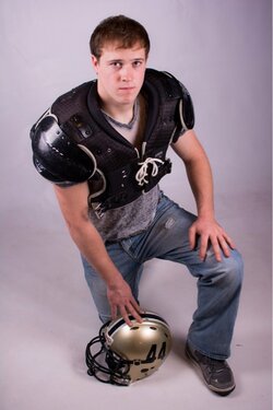
We didn't have a lot of time but we got a few good ones! I am very new to strobes so it was take a picture mess with lights. Great learning session for me!!
One thing that stands out to me (for future consideration) is that you've mis-keyed these (considering that they are portraits). In other words, you have him in dark clothing against a light backdrop. The result is that it's the clothing that contrasts and stands out the most. That's OK, if your goal was to emphasize the clothes over the person, but I don't think that is what you're going for here.
The better way to do it, is to 'key' the background to the clothing (or vise versa). This is so that it's the subjects skin (face) are the areas of greatest contrast. This immediately draws the viewer's eye to the subject's face and makes for a stronger photo.
Also, if you are going for the 'bright field' white backdrop look, you need to be able to light it up brightly and evenly. Usually best to do that with at least two lights just for the backdrop.
I think Mike pretty much nailed it. Senior sessions aren't a big thing in my part of Canada, so I don't have a lot of first hand experience, but I don't see many done in-studio against a monochrome background. It's just nto that exciting... look for backgrounds and settings that really show off the personality of the individual, or have meaning to him/her. The football field would have been a great setting for these. To get an idea of how these can look when they're executed by an expert, check out member twocolor's work in the pro gallery.
Agree with those above. The only other thing that I would add is just my opinion but I don't think that the shoulder pads work being on him in jeans. Maybe with them by his other foot, but I think that shot would work well with the jersey on, with or without pads, and the helmet as posed.
Along with the rest of the comments, I never liked the Cyclopes shots where you can only see one eye. It's just a small knit pick that I try to stay away from.
I think your first pic is out of focus in his face or eyes, the focus of the second one is better and third one is good.
Do you guys feel the same way?
And that is why I post here! Thank you! I knew something's were off and just couldn't figure it out. This is a friend so we have plenty of time to reshoot. Well try darker backgrounds and bright shirts. Football field is a no go pretty crappy fields at this school. So we were going for a casual fb picture. Thanks again!
Agree with those above. The only other thing that I would add is just my opinion but I don't think that the shoulder pads work being on him in jeans. Maybe with them by his other foot, but I think that shot would work well with the jersey on, with or without pads, and the helmet as posed.
Because you have so much to learn, I'll just say... If you hang out here long enough and are willing to keep looking, reading, posting and learning, someday you will look back at these shots and cringe.
Let me add to the above: The heavy vignette in 2 is awkward and poorly executed. Spend some time on YouTube tutorials and keep shooting and learning.


![[No title]](/data/xfmg/thumbnail/39/39532-073f9eb14e26e2b99cc29112b92a2ab6.jpg?1619739072)
![[No title]](/data/xfmg/thumbnail/33/33494-b043d63ade80615498faca324203747a.jpg?1619736004)