What's new

Shoot with High School Crush!

DGMPhotography

Been spending a lot of time on here!
Joined
Mar 23, 2012
Messages
3,161
Reaction score
718
Can others edit my Photos
Photos OK to edit
Hello!

So here are a few shots from my latest shoot, which just so happened to be with a girl I had a crush on in high school. You can probably see why! She's gorgeous, and I think some of these photos turned out pretty well! What do you think? I'm open to C&C.

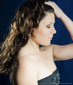
1. Not 100% sure how I feel about the hand placement, but her eyes look amazing.
$DSC_0133.webp

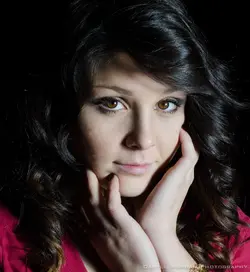
2. Simple, fierce. I like the darkness. Her shirt is a little wrinkly though...
$DSC_0145 copy.webp

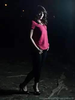
3. Just a "shot in the dark." Get it? HA! So in this one I actually shopped out the wrinkles in her shirt. I tried to do that with the last one too, but just couldn't get it to look right.
$DSC_0137.webp

4. Now this is just my absolute favorite shot. I had a fan blowing from her left so her hair looks awesome, eyes look amazing. Perfect expression. And I plan on doing something super cool and creative (it's a surprise) with another shot from this look.
$DSC_0266.webp

Thanks!
 
I like the lighting. The important question is did you get her number?
 
The lighting is a bit harsh for my personal taste and I wouldn't mind seeing these warmed up a bit, they are coming across as blue to me and it's making her skin look a bit pale.

i think her pose coupled with the lighting in #2 works well, I'd just maybe try to brighten her left eye to match her right.
 
Very nice model, BUT... Black/very dark hair + black backround -rim/hair/background light = do-over! Your key light positioning was good, and the key exposure is okay, but a lot of her hair is lost in the background. You could have gone a few different ways; my preference would have been for a strip box 90 camera left, and a dark green gelled background light. With the red top she's wearing that would have been dynamite! These shots aren't bad, but they're only partly lit. They all need at least one more light.
 
Without the background or rim light, as tirediron points out, you lose separation from the background.

I kind of like the look, but it feels very stagey, as if she is literally on a stage. It sets a sort of dark tone, with this girl appearing out of the darkness, and I don't feel like the rest of the lighting idiom is really working with that. You're striving for a traditional portrait look (classic Rembrandt in the middle two!) with a pitch black background, and fairly harsh light. With a single unmodified (or barely modified) light, in the darkness, I think you would do well to try for a more noir feel, or something, anything other than a traditional portrait look.
 
I think you are getting better at lighting, and I see advancement in your work over the last few months. I think it is instructive to look at the C&C you've received on these. YES, she is a lovely young woman. She has fabulous, black, curvy hair and good teeth, a nice face. Your lighting is very much better than straight, on-camera flash. Your technique (focusing, lighting, exposure) are pretty good, but it seems from the C&C that some people are seeing some things they'd like to see done differently.

I think one of the toughest things to do in a situation like this is to separate out the attraction one had or has for the subject, and the subject's physical beauty, and to be able to objectively evaluate the photographic results. I think these are about 75% pretty girl, and about 25% photo technique. THis is one of the trickiest things about photographing women; being able to SEE the technique, as opposed to being wowed by the woman.
 
I am going against the tide here but, on my monitor, the light looks harsh and flat and her skin looks blue-grey here to me.

I will be happy to be wrong.

DSC_0266lew2.jpg~original
 
Cool, thanks for the feedback, y'all. I agree using two lights probably would have helped. The biggest reason I haven't been doing that is probably laziness, but I'll work on that. Also because I was told to practice and get good with one light before moving onto multiples, but I'm thinking perhaps it's time to get more advanced. As a matter of fact, I did do a few two-light shots with that last look.

$DSC_0313-2.webp

I know there's a hotspot on her chest.. I had the light angled just a little wrong before I fixed it. Whatcha think?

Also, Derrel, I agree about the model-photography skill thing, but I also think that in photography terms these are a lot better than when I started out! :D
 
the last one i think was the best lighting but like the_traveler said the color looks bad his edit fixed that and made it look awesome, the other ones i thing have dark nose shadows over there faces that just looks bad but thats me and what i think, but other than that i can see some good work.
 
the last one i think was the best lighting but like the_traveler said the color looks bad his edit fixed that and made it look awesome, the other ones i thing have dark nose shadows over there faces that just looks bad but thats me and what i think, but other than that i can see some good work.

Yeah, I intended for the background to be black, not blue, but the light interfered with that more than I anticipated. That can be fixed in post I'm sure, I just need to do it xD
 
Any other thoughts?
 
$DSC_0313-2_TPF rework.webp

I just dropped the blue saturation and luminance to zero, and made a couple subtle lighting changes. Her arm is still not quite 'right' though.
 
Any other thoughts?
Was she really funny?

jk 1-3 are good. She has a wide face and the straight on light makes her face look even wider. Maybe try a different pose or light style.
 

Most reactions

Back
Top Bottom