show your business card(s)!

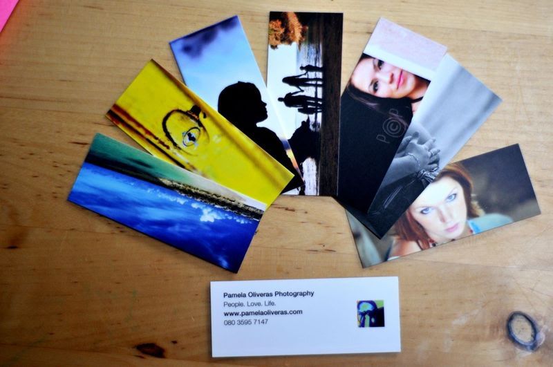
Here's the card I use for my stock photography business.

Have Fun,
Jeff

Business-Card3small2.jpg
 
4 different fronts #2-4 are pearle:


And then one common back:


UV coats on the front, none on the back (so I can write on the blank spots)

Feedback? I've only got about 150 or so... so I'll be making another run in not tooo long.
 
I have just designed mine - just waiting on their arrival! :D

VistaPrint_BusinessCard-2.jpg


VistaPrint_BusinessCard-back.jpg
 
I was actually thinking about making some cards just for fun. I'm thinking it might get some creative juices going for some design ideas. Moo.com let's you make cards with as many different designs as you want. Not sure if anywhere else does it, just thought I might mention it.
 
this is a great thread. I need to make new ones too.

These are the ones I made when I was the featured business at my local WAMU branch. They worked great for that but I really need to design something new. These were printed on pearl paper

3221478589_0f71130b96.jpg
 
oldCrimsonFox_rear1.JPG


This is the rear of my old card design when I first started the business. I was pleased with the fact that the size of the images ended up not being as small as you might imagine. In the end, they were only meant to be a teaser anyway. The quality of the print job from VistaPrint is largely what compelled me to do new ones (see below).


newCrimsonFox_elderrear.jpg


This is the rear of my new cards (see the front below). Two-sided cards are the only way to go in my opinion, as this is the side that I present first on most occasions. They are printed by an excellent local company: two-sided, glossy UV-coated, thick 16pt card stock. People really respond to these cards, but any criticism would still be appreciated (though I can't promise how colors, contrasts, and opacities will appear on your screen).

newCrimsonFox_ben1.jpg


This is the front side of the same card. I tend to hand cards out with this side up to mothers since they are most drawn emotionally to the child. I designed these myself so, again, criticism is welcome; many have loved them and no one has dissed them , but perhaps they were simply being nice. I've heard general photog business card advice before that photos should not be included since people will judge your work by those one or two images, but these cards have definitely worked. Is there anyone who feels that either side is too busy/hard to read? Other criticism, etc? I may soon get these redone.
 
Last edited:
Eh, nothing too flashy. It was my first round of cards. Next time I may spice it up a bit with something a little different. Maybe a wedding scene behind it.


livepreview.jpg

"Capturing all of your once-in-a-lifetime moments." Hyphenated... and lifetime is one word. Sorry to play grammar police, but you really shouldn't be sticking a business card out there with huge grammar issues like that in the only sentence on the card.

I'm not a pro photographer, but I AM a business owner and most decisions boil down to ROI for me. In this case, will having a plastic card increase the number of prospect conversions so dramatically that they pay for themselves?

I doubt seriously that your business cards are your best marketing vehicle, I'd throw the extra money into other things. How do you get most of your business now?

Sidenote: You need an obvious way to turn off the music on your website. ;)


Visual Poetry....

And the yellow type on a white background above the "info" tab is unreadable until you roll the cursor over it, and even then it's tiny!

4 different fronts #2-4 are pearle:


And then one common back:


UV coats on the front, none on the back (so I can write on the blank spots)

Feedback? I've only got about 150 or so... so I'll be making another run in not tooo long.


#2 & #4 are great shots and I'm sure they do well for you on your cards.
 

Most reactions

New Topics

Back
Top