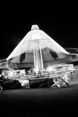
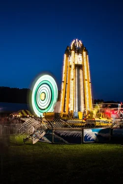
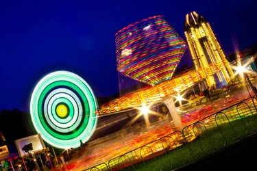
Photos three and four are decent. I like them much more than the first two. What makes #1 not as good as #3 is that in the third shot, the tilted one, the vast majority of the frame is filled with subject matter. The first shot is a tall, but there is a LOT of empty grass at the bottom of the rame, and the whilring amusement park ride actually is quite wide...meaning this composition probably would have worked better as a horizontal...and the B&W on the ride...not sure that B&W does it justice, really.
Shot #3...the entire frame is substantially filled with THREE rides...each one big, and visually able to stand on its own. I think the second shot is okay; perhaps cropping in a bit closer would improve it. I understand the concept; you are standing back a bit and "showing us" the amusement part "scene"...I mentally "get that"...and I also understand that seeing these images LARGE would REALLY add a LOT more impact to them.
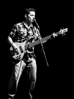
The last shot, the guitar player...overall, his body position is good, and his relationship to the lighting is EXCELLENT. A minor nit is that he is cropped off right at..the feet....kind of a no-no...I would crop this one in severely, to his mid-thigh level--that will really solidify the image AND will make him LARGER in the final image file!!! I see a lot of images of guys playing electyric guitar on stage...this shot is much better than a huge majority of guitarist-on-stage-at-outdoor-stage shots...it's cleaner, and the body position, angle of guitar, and the lighting are all much better than run-of-the-mill.