Smells Like Money

ceeboy14

TPF Noob!
Joined
Dec 5, 2012
Messages
2,566
Reaction score
788
Location
Florida
Can others edit my Photos
Photos OK to edit
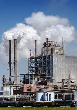
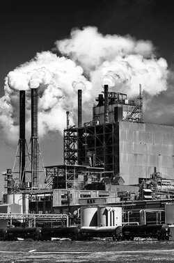
That's what the papermill workers say. the rest of us just hold our collective noses and hope the wind doesn't change direction.
$8587536435_e7475648a3_o.jpg View attachment 39988
 
Last edited:
If nothing else, give me some feedback on the B&W processing.
 
Comes across very harsh, very contrasty, which isn't necessarily bad. It seems to be about the clouds of.. steam or whatever.. which are rather beautifully rendered.

My temptation would be to try to dirty the clouds up some, they look so clean and pure here. They DO give a weird aesthetic balance, though.

For some reason I am not loving the foreground, although it seems to be necessary to complete the frame. Maybe the ugly works here, though, since that's kind of the point. I find the whole thing a bit tough to look at, which I think is good. The pure white steam/smoke contrasts with the ugly industrial building and landscape in kind of an unsettling and interesting way.

I like the layout of forms in the frame, it's well shot.
 
The whites look white, the blacks look black, and you have all shades in between. So to me that means good job!
 
The steam and sky make this work for me. The lower half is just too busy.
 
I think color would have worked better. I take a lot of these types of shots for work and I find that the color helps separate the various layers.
 
I think it could be cropped from the bottom - perhaps loose the carpark, and start just below the train carriages.
The steam looks very "solid and clean edged" as it comes from the chimneys, makes for an "anime" type effect.
The processing has a good range pf tones, but I agree with runnah, perhaps colour would have given more of a sense of distance between the foreground, mid-ground and background buildings.
Could you post the colour version?
 
Very ,Very nice in my book. I love high constrast industrial shots like this. I think it was invisible that did a shot much like this a while back. Very nice!
 
Color Version: The side by side comp is in the first post...this is for anyone just coming here.

$8589888569_2d80cc482f_o.jpg
 
No, no! put that color shot away...Boring! Still love the B&W
Can you open it up just slightly so you aren't clipping the steam on the left
 
I'm with Rick - the B&W works better (for me). The colour version just doesn't have the same "snap".
 
Definitely go b&w, but as far as processing, I think the whites were pushed just a little too hard. You have lost some detail in the smoke just above the stacks. I would also crop it somewhere around the bottom of the chimneys. I'd have a go at it, but my own computer with the software had a meltdown last night - like new computer meltdown.

Some good stuff there.
 
I prefer the B&W, but I would do three things: 1) not darken the top-most part of the sky so doggone much...looks overcooked. 2) Dodge the train cars a bit on the shadowed side. 3) Burn in the whitest-white steam clouds a wee bit. I do like the look, for the most part, but that black sky looks unrealistic.
 
Color Version: The side by side comp is in the first post...this is for anyone just coming here.

<img src="http://www.thephotoforum.com/forum/attachment.php?attachmentid=39987"/>

Much better if you ask me. The color adds much more character and definition to the various structures.
 

Most reactions

New Topics

Back
Top