Snapshots--Single On-Board Flash

midnitejam

TPF Noob!
Joined
Mar 26, 2004
Messages
314
Reaction score
3
Location
Ohio
Can others edit my Photos
Photos OK to edit
Opinions and suggestions and advice, please
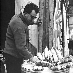
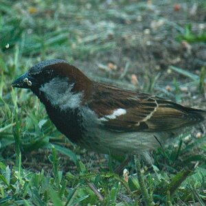
#1 Natural Lights


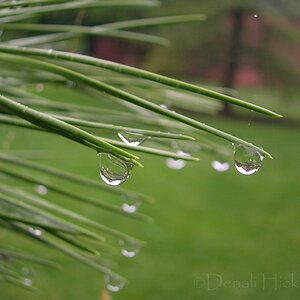
#2 Single on-camera flash snapshot- not posed, just lucky:)
original.jpg


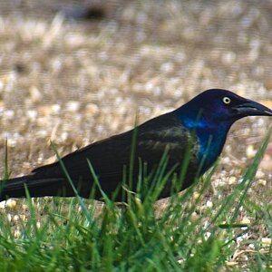
#3 Single flash on camera.
original.jpg
 
There is some weird smudgy business going on in the upper right corner of #2, and I would get rid of that bright white speck on his shoulder in #3. :) In #2, there's a strange greenish cast around his mouth and his teeth are pink.

I'm especially fond of #1, but I have a soft spot for photos showing the model actually doing something.
 
They are a little too big, it's best if you resize your images to less than 800 pixels before uploading them.
 
There is some weird smudgy business going on in the upper right corner of #2, and I would get rid of that bright white speck on his shoulder in #3. :) In #2, there's a strange greenish cast around his mouth and his teeth are pink.

I'm especially fond of #1, but I have a soft spot for photos showing the model actually doing something.

WOW! :blushing: Thanks for your very accurate and thorough observations. I definitely wasn't aware of the things you've brought to my attention.

In #2, for instance, I neglected to consider his gums would be mistaken for teeth to someone who didn't know that his lower lip was covering his teeth. I never noticed the speck until you mentioned it. I never noticed the smudge in the upper right corner. I was more concerned with whether the photos might be found to be too soft or ill-focused in general. Actually I was expecting pointers and advice on how to improve such things as skin tone, skin texture, noise, sharpness (too sharp or too soft), bokeh, exposure, composition, light ratio, etc. I'd really like to learn how to improve on these particular elements of photography.

Sorry about the size, Mike. Thanks.
 
#1 looks like it's been run through noise reduction one too many times.
#2 is a little too soft and a little too evenly lit (Flat)
#3 is better. I don't know if you consciously lit it differently or just got lucky, but this one has a little more three dimension look to it. It is very obvious though that it it was put onto another background. That's not a bad thing it just needs to be less obvious. Keep shooting.
heip , Thanks. This is helpful advice.
 

Most reactions

Back
Top