" SOLID REVIEWS????""

Joined
May 13, 2007
Messages
453
Reaction score
0
Location
Vermont
Can others edit my Photos
Photos NOT OK to edit
Ok wanna go for broke here on the forum lol...

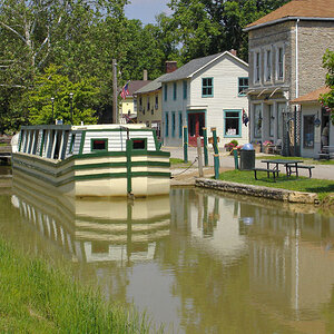
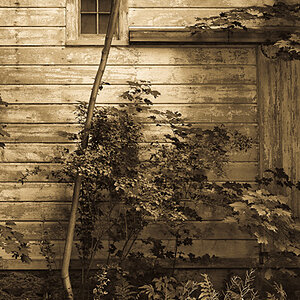
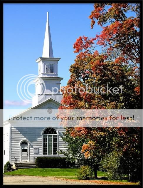
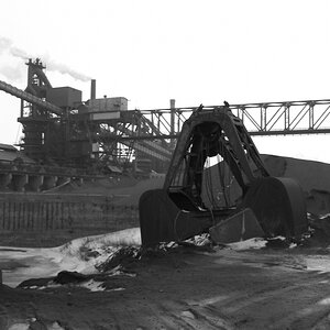
Going to post (2) pics here taken in the Fall season...

Would really like to hear a full critique on these... It can be bad , It can be good.... but lets hear the thought waves...

I know you all like the idea of pointing out a question, but how bout this one time , we shake it up... Like going into the barber shop and barber asking , " how ya want it cutt?? "" and you reply, """ JUST TAKE IT ALL OFF!!""

Go for it here folks!! good / bad ... let it out

Always Intrigues me to hear how this forum is clicking...

Don't peak and run here, C-mon , putting it in type!


publishedcraftbury.jpg


fallrd.jpg
 
Ok see hmmmmm 16 peekers, but no typing..?? lets go folks, it only takes a few seconds for a opinion.. press those keys, wanna here the takes on this,
pros' newbies, passerby's hey even Max Bloom, lets hear it..
 
#1 I’m not high on the angle, the tree is blocking too much of the front of the church for me, I wound prefer more of a 45 deg angle

#2 to much foreground, some cycle rounding the bend would be nice
 
I agree that with number 1, the angle could be better without so much tree. Number 2 is a bit of a cliché, composition-wise. I know, because I have done a considerable number of them. The leaves also seem too soft in focus.

skieur
 
#1 looks like a solid picture to me and I think you should just leave it the way it is. The colors are excellent so it brings a good combination of color blends
#2 kind of gives me a confusing direction. Not really sure that the end of the path is coming towards me to notice. Not sure why maybe the DOF but the picture sort of looks 2D all of a sudden. o_O
 
Let me take a moment to talk about your frames. The first is not bad because it isolates the image from the page (although I'm not crazy about the shadows cast on the image. It invites me into the picture. The second, however, ruins the shot for me. I can't get past it to believe I'm seeing anything other than a framed photograph.
 
I like the first one too, the second could have done with greater DOF, the blurred trees furthest away are distracting, especially as there is nothing in the foreground worth focussing on, I'd also prefer landscape view. H
 
#1) I like the simplicity of it. There seems to be a bit of hot spots on the left side of the church. Can you burn it down a bit? Or perhaps it is my screen. I'd like to see a bit more to the left of the church. It's so tight in there. Also the shadow on the front of the church creates such a hard line. But we are at the mercy of particular natural lighting. So...I like that the tree is not in full autumn regalia as the church and the tree play off each other nicely.

#2) Again, the simplicity is nice. I want to see what is on the other side of the road! The focus and DOF are ok with me.
 
With one the problem isn't really the tree for me it's the balance between the church and the tree.

In two you shot the road so low tht the size of it is huge, I don't care for that.

For me it's about the image so that's where I came from.
 
#1, according to the posted images, the sun side of the buildings is completely burnt out. I would have preferred less tree, more building but it is what it is.

#2 needs more sharpness and DOF.
you needed to sacrifice some ISO on this to get more of both.

Image Date: 2004:09:25 14:52:17
Focal Length: 52.4mm
Exposure Time: 0.058 s (1/17)
Aperture: f/4.1
ISO equiv: 50
Metering Mode: Matrix
Exposure: program (Auto)
 
ok, probably get winded here so you might want to get a cup of coffee or something before reading ....

first off Thank each of you for your comments, and consider almost all of them valid points.... I was really expecting a little harsher, because that seems to be the mode here... not just with me, but on about 90 % of posted critique pics..

I guess everyone feels if a pic is on critique, they are gonna get a jab in, regardless of how a photo appears,,, its the Beast of the critique...

Ok these two pics posted are both Cover shots used in the Magazine , WAR CRY.. in "2006"... now , I'M NOT SAYING THIS , TO SAY THAT THE CRITIQUE WAS NOT VALID ABOVE, but more as an example to beginners to take critique lightly..... The church was the front cover, while the road shot was done for a poem overlay for the back cover.. the mag also published (2) other shots ( inside use )...

Magazinecover.jpg


My point is that I believe most people, ( beginners ) are afraid to post in critique because of the harsh remarks... afterall, its even stated in the rules, " If you can't take the Heat, don't post in critique " which to me is an all out invite to take some shots , and jabs on a posted photo, almost regardless of its quality.. I feel critique is much needed to a beginner, a definite way to learn... but when I see so many posts turn into flat out arguments, and re crop after re crop , I begin to wonder.. I see on some shots , a person will respond with some real negatives, only to be followed by the next person agreeing, but digging deeper... then this is usually followed by 3 or 4 re dos on crops, followed by pvt arguments, and then private conversations between others???? Hmmmmmmm? I sometimes feel to critique in a fair manor, its easier for me to look at the pic, and not read other reviews, but just post my first reaction to the shot.. ??

Thru my years in photography, since 69" I have seen so many beginners go out and buy a camera, due to developing a love of the art , before developing their own film... and after a few months , file the camera in a drawer.. and this was because of harsh criticism, breaking their will..

Critique must display positives as well as negatives... no doubt Negatives are needed to build on, but if you can't critique in a manor to help someone build, then DON"T help that person file that camera in a drawer either...

ok, what I'm going to say now will draw a lotta gunfire I'm sure, but I'm gonna say it!

Beginners" Take Critique Lightly... and also, do some homework on the person who is giving you the Critique!! In other words , there are a lot of people who can talk a good photograph, but also can't take one... so weed and feed thru your critique..IT'S AS MUCH FAIR PLAY FOR YOU TO KNOW THEIR WORK , AS IT IS FOR THEM TO CRITIQUE YOURS! If you are a beginner I wonder what brought on your love of photography... my guess is that someone was your hero.... in my case it was an older brother who was into photography... I then went out and bought every photo mag . month after month.. During this time, I found new heroes in these photo books.. I tried and tried to duplicate their work , and they always inspired me with each issue.. I mimicked their compositions/ and camera techs.. and after awhile I with time developed my own niche.. In other words , I'm sure everyone has a photo hero, follow them... and do so even in this forum...

look at it this way , lets say you are a young boy here lovin Baseball, did you Not have a sport hero, who you molded yourself after?? Did you not develope his batting stance, and play the game as he did?? A kind of " I wanna be like Mike thing "" Well photography no different!

I just personally don't like what I see happening here... and that is a lot of Will breaking.... and ohhhh I hate that...

So, will stick around and take the heat on this one for awhile....


Ok again Thanks all...
 
Critique is not necessarily negative, it is analysis of what we see as a picture.
This one worked as a cover because there was space and placement for text, dead space that didn't specifically serve it well as a picture.
In the originals as posted, the white spots are burnt out and the second does look soft.

That may not be important to the magazine editors but you asked for critique on your picture and you got it.

histozc6.jpg
 
As I said . i'm not talking about the pics I posted, and did I not say , """ first off Thank each of you for your comments, and consider almost all of them valid points...""""


Valid points I repeat! your critique was done very well... and presented in a way that even a beginner could swallow.. I will be the first to admit that a lot of publications re work photos to how they want them.. this is why you always send your best and also what I call fillers...

Now analysis I can handle, when done with a little class, as you always have done... but another word for analysis, is dissection, and sometimes people dissect a little deep, and all i'm doing is worrying about a beginner.. I've been around the photo world a lonnnng time and heavily exhibited for a 18 month tour, so I know analysis..... so lets just think beginner here..

and thanks for coming back..
 
I agree with Traveler. If you want to get specific New England, my first works in photography were harshly critiqued by the National Association of Photographic Art before you even started into photography. Due to that "harsh" Critique, I also won top awards again before you started into this field.

Top quality professional critique at the Salon level has NEVER been encouraging or positive, NOR should it be. It has ALWAYS been totally CREDIBLE. It is the responsibility of photographers to do their own homework, research, read, learn, practice, and improve. They should have sufficient initiative and drive NOT to depend on the encouragement of others.

The role of Critique is LEARNING, not false encouragement, not building confidence and not false praise.

The person whose work is being critiqued should be evaluating the value of that critique on the specifics of technique and composition in the context of photography. The experience of the person doing the Critique is the critical element in determining the importance of the comments.

skieur
 
Ok let me add this... I did say the critique was Valid on these shots..

i also didn't put these up to come across as some wise A--.... They are up to show a beginner , or even YOU?? that even though you receive critique on a pic, such as these, ( again Valid) that ya don't just throw them away, or put your camera in a drawer... these received critique, some good some bad , but they also sold....

Did anything in my above original post on reply with magazine pic make sense??? Either I can't type correct, or can't speak clearly, but I always feel some miss my points??
 

Most reactions

Back
Top