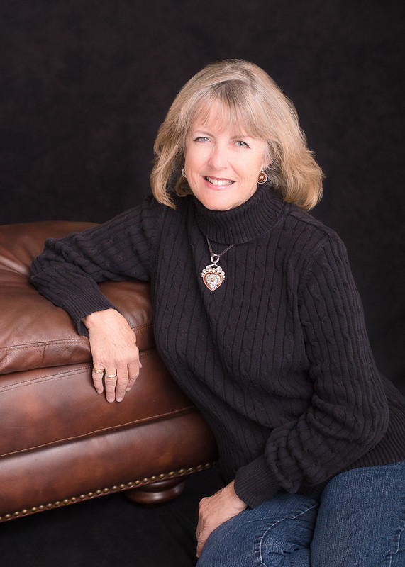
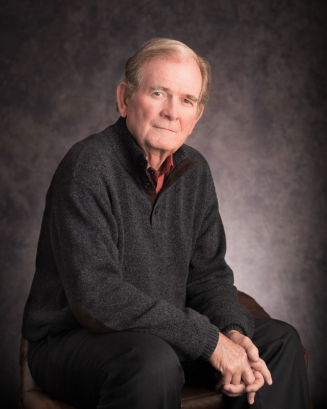
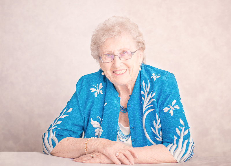
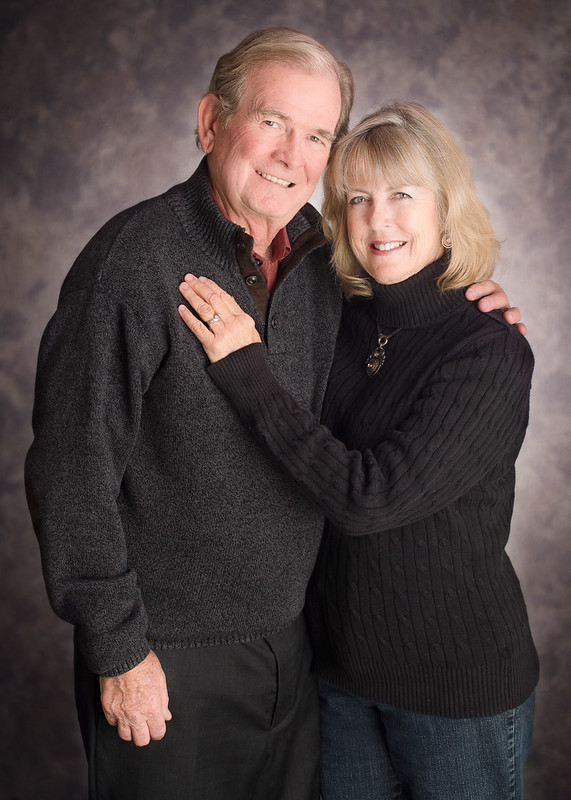
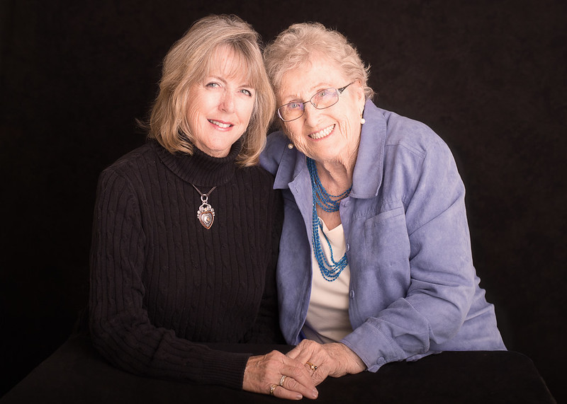
A few thoughts... #1 is spot on. Nice pose and good exposure. I'm not overly fond of the crop at the bottom; I think her legs/butt could use a little more room, but that's minor. #2 is good; I would burn in the backlight spill and maybe dieal down the red in his face a bit, but other than that, nice. #3... her face is probably a full stop over-exposed, and you forgot to have her push her glasses up; the top of the frames are almost cutting through her eyes. As well, given her skin tone, a darker background would have been a better choice. #4 is nice; again, maybe dial down the red a bit (I suspect it's the way his skin is, but it looks a little artificial in a photograph) and burn in the backlight spill. The last one is nice, but again, the highlights/exposure on the older lady's face are a bit hot, and the bottom crop is a bit tight to the fingers.
All those nits aside, this is a nice set, and I suspect they will be pretty pleased; most people aside from other photographers wont' notice the small details.
Thank you for all the thoughts. I appricate them very much.
I agree with more space needed in number one. The crop was hiding her sock. They didnt want individual photos, so I tried to make it quick, and didnt notice while shooting.
2) Believe it or not the red IS pulled back. By a TON. I pulled it back so much in fact, that I was afriad to go any further. The "correct" tone was SO far away from his actual face I chickend out and dialed it back.
3) was intentionally over-exposed to help with the wrinkles. As for the glasses, I actually did remember. I had her push them up every shot but they would NOT stay. Even for a second. Perhaps she needs a nose peice adjustment? I tried shooting lower to compensate but the angle was just too odd. Honestly, between the glare and the rims, I wanted her to ditch them altogether but she wouldnt. I have never struggled so much with glasses- ever!
I guess thats one reason I am so frusterated with this set. I feel despite my best efforts, I still fell short.
The crop on their hands is super tight! I noticed it, but didnt change it....Its an easy fix, so I am not sure why.... I ordered some prints as a gift, but I will fix that when i burn their disk. Thanks for pointing it out!
I would be tempted to add some diffusion to these for a little bit more of a soft look. I think keeping the skin tones bright like this is a good idea, to minimize skin texture and wrinkles...modern digital is soooooooo crisp and clean that skin detail shows up super-clearly when lighted with studio flash. Without any film grain to modulate large facial planes, every small flaw shows up. On #3, RE: Tirediron's idea of a darker background...I disagree, and think the light backdrop keeps a bit of attention away from her face, and prevents her from standing out too harshly by subject/backdrop contrast. I do think though that the older lady's face needs to be brought down about 4/10 EV in #3 and in the last shot...it just looks overly hot.
The best think about ALL of these is that the people look FRIENDLY, and fairly much at-ease. They look comfortable in front of the camera.
Thanksfor the thoughts and kind words!
I did over expose intentionally to help blow out wrinkles. And personally, I like the photos of mom on the white. Maybe grey would have been better, but I didnt bring my grey backdrop with me. I was thinking more along the lines of clothing than skin tone when I chose backgorunds. I will have to take that into consideration next time.
the last shot.....Honeslty, I really hate the lighting in it and I almost scrapped it, but it was the one where they have the best connection. I dont like the shadows when I bring it down, and If I work soley on the highlights it starts looking really weird.


![[No title]](/data/xfmg/thumbnail/38/38747-bbe463248feefb7affb6b5e00efb70c6.jpg?1734172603)


