#1 seems a little dark, can you up the exposure without blowing out the highlights too much?
#2 isn't too bad, I personally think you don't need as much of the water in the foreground. I say this because there isn't a clean reflection of the tower. You could also crop out the Bally's sign without cutting off any of the other buildings attached to the tower.
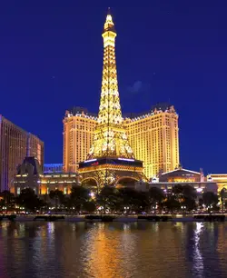
I do prefer it. Sometimes I get too close to a photo and any change I make seems to be "wrong" until I get some distance, and often I need a second set of eyes to see what I am too close to see.
Here is a cropped version of the second image- I think I prefer it, too. I was reluctant to eliminate the splash of color that the neon sign gave the image, but I don't know why, because it's really more distracting than helpful.
My guess is that this is probably because I try to compose an image that doesn't result in an image that looks highly saturated or otherwise manipulated. I love the greater depth of visible detail that HDR offers in highlights and shadows, but I try to balance this against making it look heavily processed. I guess my approach is a bit more subtle than most. For the sake of comparison, here are the images at a single exposure without any bracketing- you can see that there is a lot less visible range in them: