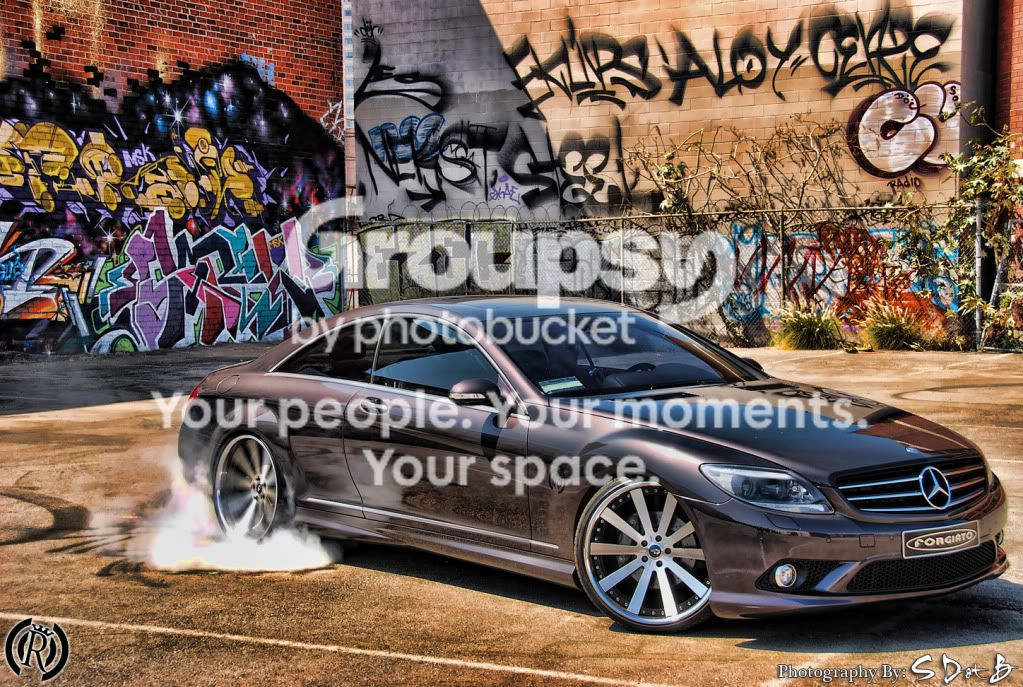
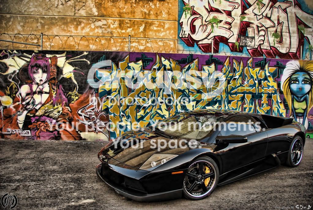
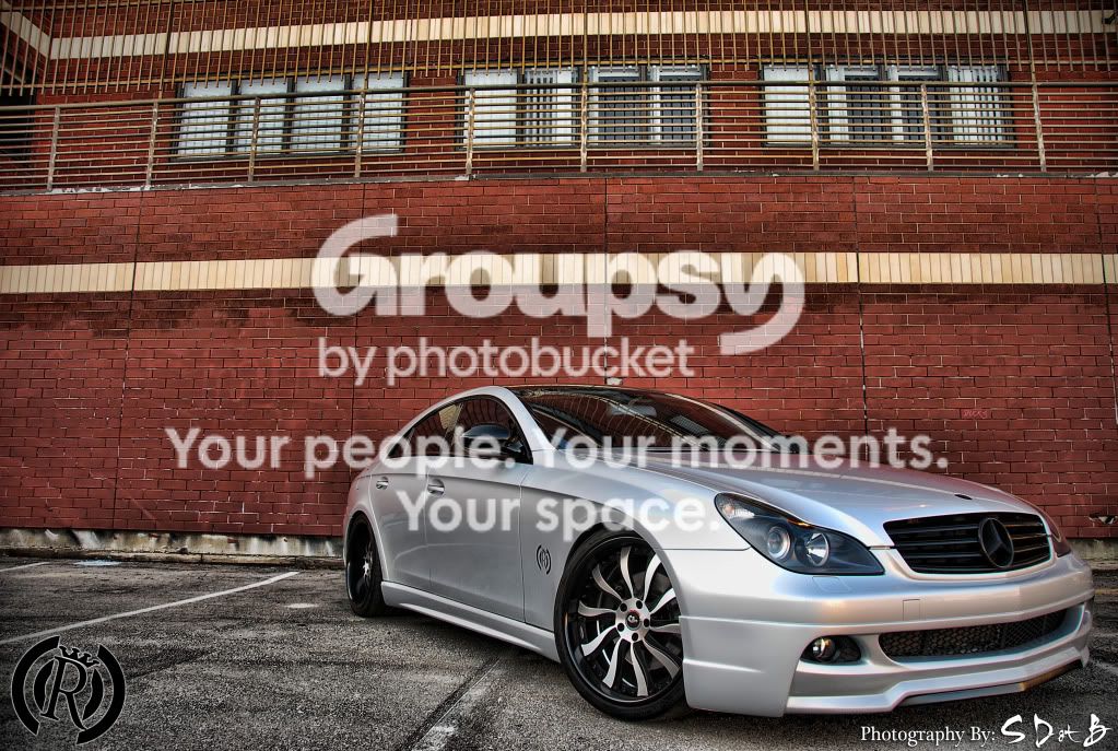
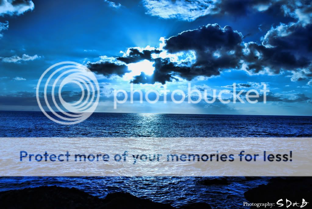
The only car photo I really like is the one of the silver Mercedes, the simplicity is what makes it great IMO (check the horizon line here, looks like the wall is a bit tilted). I think you could crop it to make it even better though. In all the others the graffiti is too distracting from the main subject (car) for me. Very cool HDR's but too busy. The last one I like alot as well, but you should deffinitely fix the horizon (the human eye can tell if a straight line is as little as 1/64'' tilted).





![[No title]](/data/xfmg/thumbnail/31/31701-24a40368b575b319cb332e3114f39172.jpg?1734160369)

![[No title]](/data/xfmg/thumbnail/31/31702-59b5519e3c9a12b85ca69439a27f5253.jpg?1734160371)

![[No title]](/data/xfmg/thumbnail/42/42493-2665d3a35f26795cc783aeb77329a032.jpg?1734177012)
![[No title]](/data/xfmg/thumbnail/35/35947-ab35bfc67d8e12ce65dda301d3bf2b66.jpg?1734167744)
![[No title]](/data/xfmg/thumbnail/39/39500-340f9581ccea2902f4cca7c656232f9e.jpg?1734173623)
![[No title]](/data/xfmg/thumbnail/39/39497-93752210dd49247220721e5ac8c61245.jpg?1734173613)
![[No title]](/data/xfmg/thumbnail/33/33361-f56184027ce743b2b7ba9d378a8bb426.jpg?1734163298)