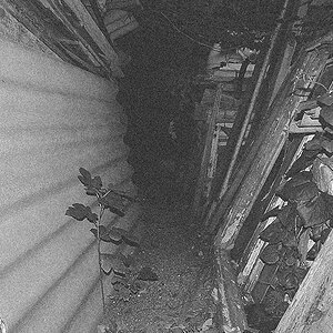
Here are two quick Lightroom edits. The problem, as I see it, is the brightness of the hand on the right hand side...that is a very bright object, in a critical part of the frame...I like these two looks overall, but didn't bother to adjust the hand...this is more of the look I envision for shot #3, in terms of color/toning, but with the hand adjusted in brightness so it's just right.
View attachment 97603
This is a neutral-tone B&W rendering. I like this look much of the time. Seeing this now in TPF's white-white-white backdrop, I think it needs a tad bit more contrast...again, another example of the misguided Adobe software interfaces of modern times...
View attachment 97604Warmer tone...but the back of the hand is too bright...






![[No title]](/data/xfmg/thumbnail/35/35963-4809c92024a0e6355dd194caf9297701.jpg?1734167812)

![[No title]](/data/xfmg/thumbnail/33/33352-15e8cd88072467dd938f6af96d0f15a3.jpg?1734163269)

![[No title]](/data/xfmg/thumbnail/35/35960-06c2714b6ed3da761ad1b4a0a0f6cb11.jpg?1734167802)