What's new

Specials

runnah

Moderator
Staff member
Supporting Member 📸
Joined
Oct 16, 2012
Messages
14,632
Reaction score
7,563
Can others edit my Photos
Photos OK to edit
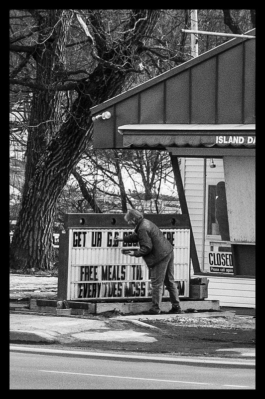
Excuse the noise she was a good distance away and I only had a 35mm.


specials by runnah555, on Flickr
 
runnah, I think that the noise helps this in b&w. Only thing I migh offer besides that is crop/clone out the pole off the building and the light pole in back of it. My reason for that is most of the light colors are by your subject except for those two things.
 
  • Thread Starter 🔹
  • Moderator 🛠️
  • #5
this, unfortunately, just looks to me like an arbitrary snapshot with no specific point.

That sounds like a challenge.

If you notice the board reads free meals. Also that the building is closed. It really was meant to be a commentary about the poverty in my area,

It's not my fault you know nothing of societies beyond your own! You should get out more! ;)
 
this, unfortunately, just looks to me like an arbitrary snapshot with no specific point.

That sounds like a challenge.

If you notice the board reads free meals. Also that the building is closed. It really was meant to be a commentary about the poverty in my area,

It's not my fault you know nothing of societies beyond your own! You should get out more! ;)

The problem for me seeing that is that you have the lady in there editing the sign.
That activity seems to trump the 'closed' sign.
And the big tree and fully 2/3 of the image doesn't contribute.
And the tilt doesn't seem to contribute.

It is just too up in the air for me.

(and there are poor people where I live.)


(I think I saw one the other day)
 
I like it and didn't even pick up on the symbolisms you mentioned.
I see a well done B&W piece of Americana. Small roadside Mom and Pop restaurant with a semi-primitive sign
I actually enjoy this very much. Being a well processed grainy B&W only gives it an extra point.
Well done snapshot? Maybe, but I'm more then good with that.
 
  • Thread Starter 🔹
  • Moderator 🛠️
  • #8
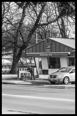
$specials2.webp

Better?
 
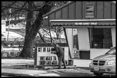
Hey Runnah, try cropping it at the curb on the street and then just below the branch above the highline pole. Making it a landscape.
 
You are just adding more elements that dilute any impact because they aren't adding to the message, they're distracting from it.
There's a entire person doing something and that will draw the eye and the viewer has to try and parse all the elements to make some coherent meaning.

Person, car, tree, big sign (unreadable), building, small sign - where is the coherent meaning in this?

 
  • Thread Starter 🔹
  • Moderator 🛠️
  • #11
You are just adding more elements that dilute any impact because they aren't adding to the message, they're distracting from it.
There's a entire person doing something and that will draw the eye and the viewer has to try and parse all the elements to make some coherent meaning.

Person, car, tree, big sign (unreadable), building, small sign - where is the coherent meaning in this?

What would you suggest?
 
I have to agree with Lew. You lost a lot of impact by opening up. You went from a good snapshot to a casual snapshot
 
  • Thread Starter 🔹
  • Moderator 🛠️
  • #13
Ok last try, after this I give up turd polishing.

$specials3.webp
 
  • Thread Starter 🔹
  • Moderator 🛠️
  • #15
I think this is the best of the three runnah.


Thanks. I knew we'd get there as long as we all stuck together and stayed positive.
 

Create an account or login to comment

You must be a member in order to leave a comment

Create account

Create an account on our community. It's easy!

Log in

Already have an account? Log in here.

New Topics

Back
Top Bottom