vipgraphx
No longer a newbie, moving up!
- Joined
- Dec 1, 2011
- Messages
- 2,415
- Reaction score
- 440
- Location
- Some Where In the Desert
- Can others edit my Photos
- Photos OK to edit
I finished up with the Cathedral Church I took the other day. I did two versions of each. I have to admit that I am proud of these shots and processing both ways.
I hope you enjoy the pictures.
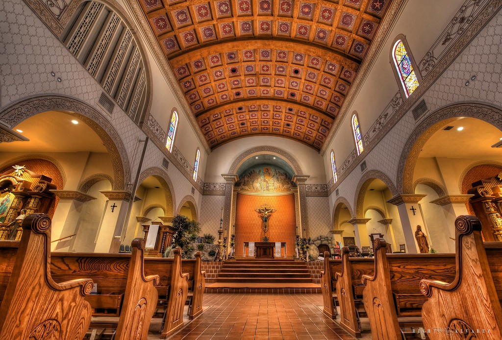
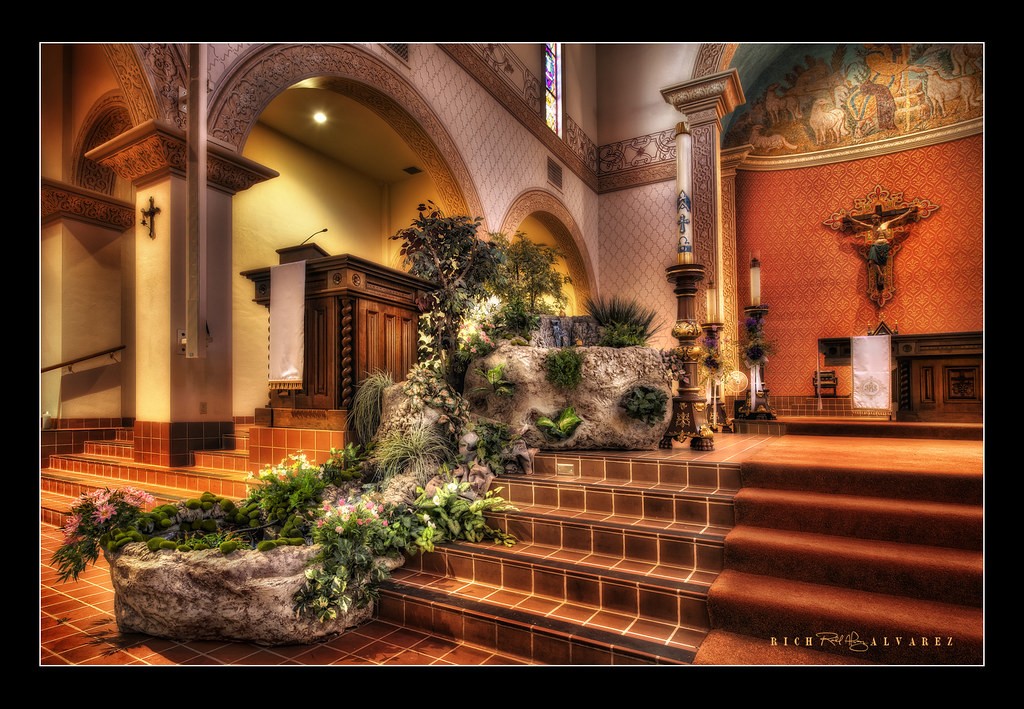
Preacher View (normal)
st augustine church by VIPGraphX, on Flickr
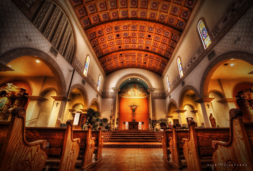
Preacher View (dramatic)
st augustine dark crop by VIPGraphX, on Flickr
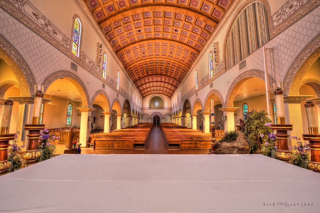
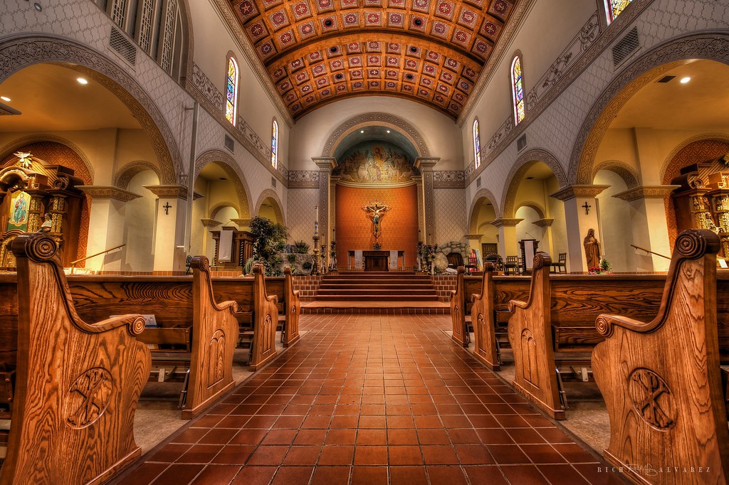
Perspective 1 (normal)
St. Augustine lower perspective by VIPGraphX, on Flickr
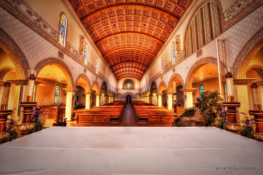
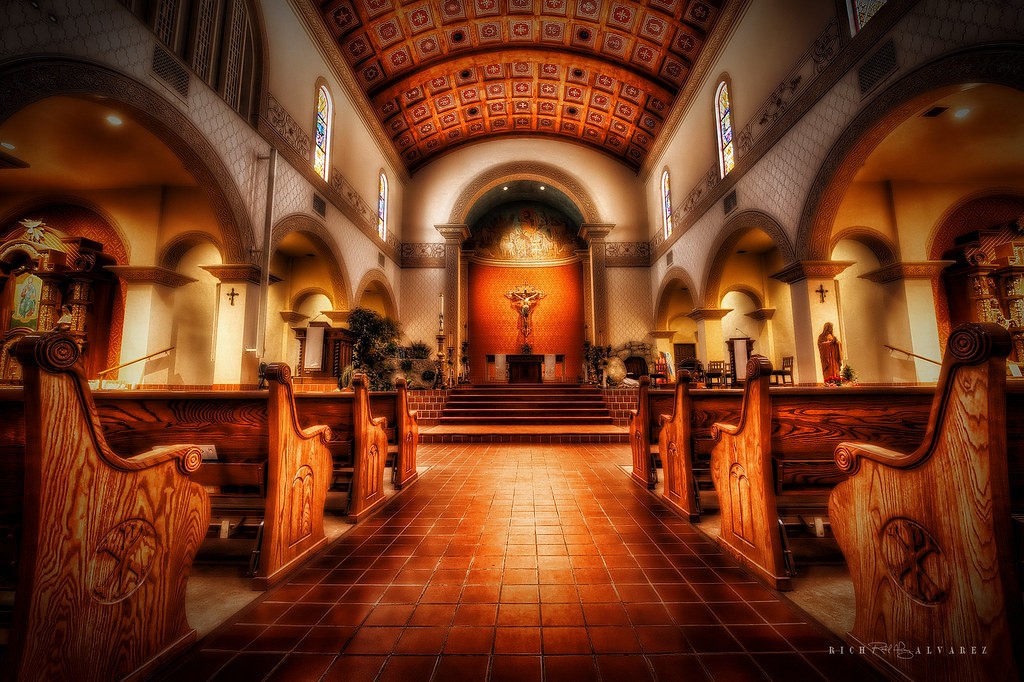
Perspective 1 (dramatic)
St. Augustine perspective cropped 2 by VIPGraphX, on Flickr
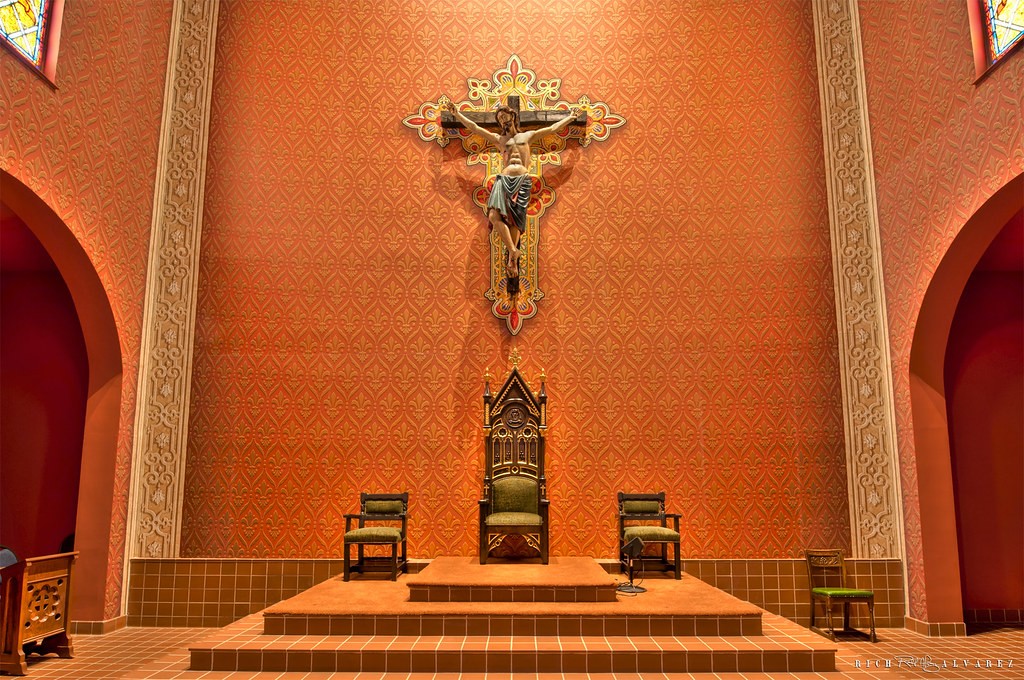
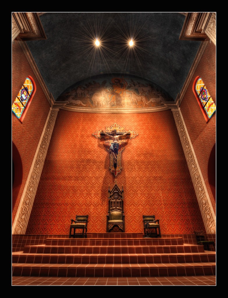
Perspective 2 (normal)
St. Augustine cropped by VIPGraphX, on Flickr
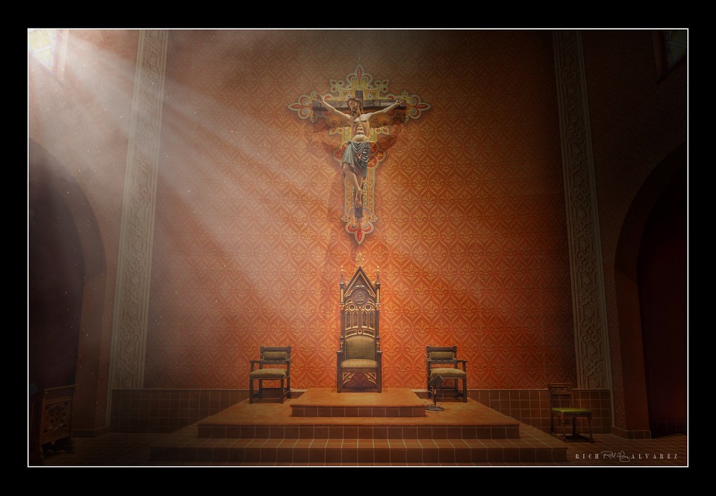
Perspective 2 (dramatic)
St_ Augustine Cropped by VIPGraphX, on Flickr
I hope you enjoy the pictures.
Preacher View (normal)
st augustine church by VIPGraphX, on Flickr
Preacher View (dramatic)
st augustine dark crop by VIPGraphX, on Flickr
Perspective 1 (normal)
St. Augustine lower perspective by VIPGraphX, on Flickr
Perspective 1 (dramatic)
St. Augustine perspective cropped 2 by VIPGraphX, on Flickr
Perspective 2 (normal)
St. Augustine cropped by VIPGraphX, on Flickr
Perspective 2 (dramatic)
St_ Augustine Cropped by VIPGraphX, on Flickr


![[No title]](/data/xfmg/thumbnail/39/39532-073f9eb14e26e2b99cc29112b92a2ab6.jpg?1734173679)


![[No title]](/data/xfmg/thumbnail/39/39529-3b8de3decb03849c8e9c6abdae9650cf.jpg?1734173673)


![[No title]](/data/xfmg/thumbnail/37/37628-b854997825aadb4eedaa3247baf8069f.jpg?1734170752)