Starting a new bussiness

How was the website


  • Total voters
    20
  • Poll closed .

jcorcoran

TPF Noob!
Joined
Jun 2, 2009
Messages
4
Reaction score
0
Location
VA
Can others edit my Photos
Photos NOT OK to edit
Hello all,
Im an upcoming photographer that needs advice on marketing my photos. How would one go about this? I have a website with all of my photos on them, please check out the website and leave comments about it. The website is www.irishdreamworkstudios.com. If you know where I can start selling these photos please comment me or message me on advice and ideas thanks.
 
You need to spell, grammar, and word check your site.
All your horizon lines are smack dab in the middle and most are crooked.
 
I already voted, but I just wanted to explain my vote for you. The website, IMO, is fine. It's easy to navigate and find what you're looking for, however I honestly don't think all of your pictures are technically good enough to be sold. I didn't have the chance to look through all of your galleries, but some of the pictures I saw were OOF, or have a boring composition.

In the 'Birds and Ducks' gallery many of the pictures have the bird in the center of the frame, keep the rule of thirds in mind to make your shots more interesting to look at.

In the 'Lighthouses and Bridges' gallery many of the pictures you can hardly see the lighthouse in the image.

I'm just a noob, and I'm not trying to act like a know-it-all, but I just wanted to help you out a little bit.
 
I think the term "starting a business" is a very loaded term. Throwing a few images on a website in hopes to sell some prints is not "startng a business" to me and if you don't want replies like the last one I think you need ot term it differently. I agree with the last poster but mabye in a more tactful way, alo of your images look like someone's half decent vacation shots and not anything REAL special. I also think the site needs alot of work especially centering the content because unless it is my mnitor that is doing it your site looks all off balance and artificially shifted to the left like it is not finished or formatted improperly..
 
I agree with Bitter. You need to fix some of the horizons in your photos. It will make them much more appealing.

Strictly from a web design perspective, its a nice first attempt with easy navigation. However, while green compliments the name of your business, I dont think it compliments your product (photos). If you would like to incorporate green into the site I would suggest in a Header/Banner or perhaps in your links providing they stay visually clean.

As far as selling your work online, you have to display a photo that shows off its quality. As a photographer, you are catering to a customer searching for a Visually pleasing product. Therefore you should make sure that all of your images are displayed in a higher (not neccessarily highest) quality so the customer gets a feel for the actual image they are purchasing. Most of your thumbnails do not do justice to your images. Personally I feel the more visually appealing the webpage, the more visually appealing the photos are. It wont make your photos better, but it for some reason affects how the customer views your images.

EDIT:: Just got this link on twitter. Check out these websites. They are professionals but still notice how they show off the images. Might give you some ideas or motivation.

http://www.smashingmagazine.com/2009/07/10/35-beautiful-photography-websites/

That being said, Good luck with your business!
 
Last edited:
couple quick things to explain my vote:
as mentioned...your color scheme could use some work. you have a black logo on a pretty dark green...not great on the eyes. this is also true of the green text on green background...not ideal.
it seems as though your site is table based...which is fine...however, i think you should probably span the second row to merge the 2 columns together. sometimes you use the right col, sometimes you dont. when you dont, the whole site looks off balance. i would consider having the second row be one column, and if you need to call something out (like your upcoming events), do that in a little callout box to the right...that way the text will wrap around it, and the flow of the site will look better.
a lot of your alignments are off...for example, im on the news and events page...it appears that your header is kicked slightly to the left, so it looks off center from the nav...then you've got this large picture that is kicked to the right of the nav, and the header. the alignment of the gallery page is all over the place as well. if you are going to stick with tables, you should have your header level in a top row, and then have all the other stuff in rows and cols below, just make sure to do a vert align on all of the cells so the gallery titles all line up. also, your footer jumps around from page to page.

i looked at your code, and i see some template regions, but i dont see that your pages are actually using a template...i would STRONGLY suggest developing a template...that way, the changes you make to the template will effect all the pages, and you wont have to do extra work. if i missed the template reference, i apologize...i just scanned the code. ;)

just as a nitpick, i would restyle your table in the prices section too...it's a very basic level looking table, and not very attractive.

sorry if this is a big jumbled mess of critique...i wanted to give you what i noticed first and foremost. i am not trying to discourage you...keep working at it, and im sure you'll wind up with a great site. if you would like any pointers or need some help with code please feel free to hit me with a PM and i would be happy to give you some help.
 
The site is ok looking but not terribly visually appealing, I think others have it fairly well covered in that regard, but it's worth pointing out that when you are selling yourself aesthetically, you need to prove to the viewer you have a good aesthetic sense in more than just one area.

More importantly, however, while many of the photos aren't bad, they are quite amateurish in their framing, exposure, and composition. In today's market, where everyone and their brother has an SLR, you've got to really produce *wow* images if you want to sell scenic and nature photography. There is nothing wrong with setting up a site like this but I think you'd be better off developing your skills for a while before you try to jump into the 'professional' realm.
 
Hello! First off I would change the design. I would have a more simplistic design (like mine!;)) But the green background and yellow text wasnt pleasant. Unless your trying to convey the Irish thing. And If you want your stuff to sell try offering a service like portraits and then people will be more likely to go to your site.(wanting to buy artwork)
 
I think you need to work more on your photography if you want to be an artist that makes a living selling prints. Your pictures are mostly what we would call "snap shots" and some aren't very good at all (issues noted above).

You might find it easier to start a stock photo business where you submit images to a large stock photo site and they sell them for you. But again, you'll have to master photography as they are very particular about what images they will allow. I've never been able to get 10 approved images to get onto their site(s) and gave up for now. It's a LOT of work.

So, in short, learn to master photography first. You're not likely to sell many of the images you have currently posted on your website.
 
A couple things I noticed:
"Wonderful pictures of Birds and Ducks"- Not really. They're ok but not wonderful.
"About us" is just about you.
$30 for a 5x7, pretty steep there on the pricing. You actually sold anything yet?
I agree with most of the comments above, and both you and your website need some work before you start pulling in any $$$ for your efforts. The business side of photography isn't as easy as pointing your camera at something and selling it. It will probably take years of practice before you sell a print but at least you're moving in the right direction.
 
Is $25 a better price?

What is this, Calcutta? Or are you just proposing he have an option to negotiate a price? I think the normal rule for the buyer is to cut the price in half and work from there, so I'd say $15 is a better price.
 
Mr. Banks, you gave me the best idea ever!
I am going to sell my prints on eBay, using the "Best Offer" feature!
Thanks!
 
Mr. Banks, you gave me the best idea ever!
I am going to sell my prints on eBay, using the "Best Offer" feature!
Thanks!

:lol: Seriously, I just laughed out loud. I'll probably just start the dollar store on ebay for my prints (probably all they're worth anyways). "Everything is $1, OBO. Duck Pics are free!"
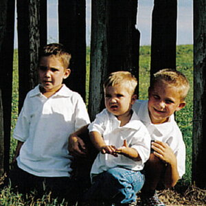
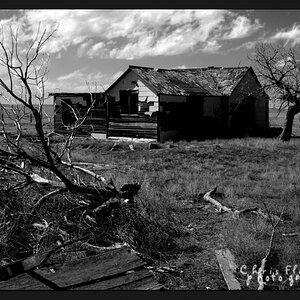
 
I have to agree with everything said here. Most of your images aren't composed very well. The "Vacation Snap Shots" Comment said it for me.

Something extra about your site. Consider making your "header" smaller. For those who still have smaller monitors, (I've been trying to get a wifescreen at work for months) when you click a link, 3/4 of the page is header. Just a turn off to me.
Definitely re-design the site a little. You have to remember, you're trying to PROVE to people that you're an artist and appeal to their wallets. Your site reminds me of a gaming site, to be honest, with the green and such.
 

Most reactions

New Topics

Back
Top