Cheex
TPF Noob!
- Joined
- May 7, 2011
- Messages
- 75
- Reaction score
- 27
- Can others edit my Photos
- Photos NOT OK to edit
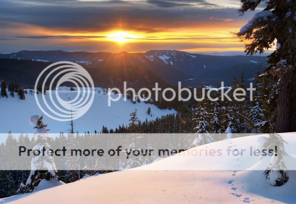
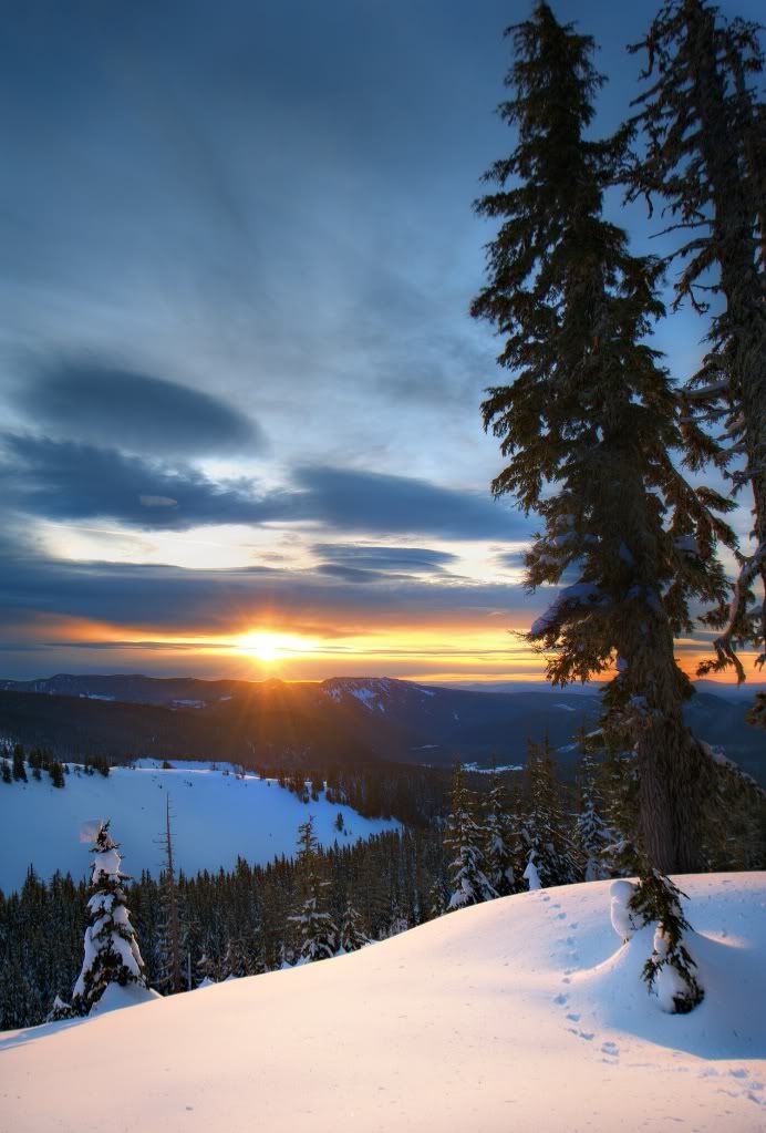
One year into photography and I still have trouble deciding between various compositions of the same subject. Would anyone care to pitch in their 2 cents on which of the following is their favorite and why?
1.
 /a>
/a>
2.
3.
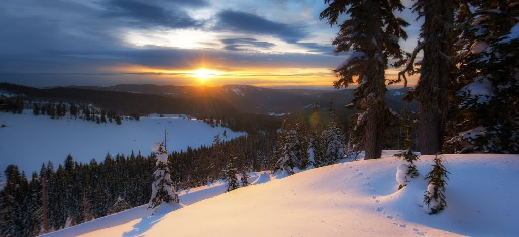
#1 is probably my favorite but I get worried about the position of the sun. Do you think a slight crop from the left would do the picture justice? It would require cutting out that small tree.
#2 is pretty great but there is a lot of sky taking valuable room from the interesting mountain layers. The added vertical length doesn't really convey how tall the trees were which makes me think sticking with number 1 maybe the safest bet.
#3 is a pano of the scene and a separate picture than number 1. It works well, but the position of the sun might be bothersome... I just don't know.
1.
2.
3.
#1 is probably my favorite but I get worried about the position of the sun. Do you think a slight crop from the left would do the picture justice? It would require cutting out that small tree.
#2 is pretty great but there is a lot of sky taking valuable room from the interesting mountain layers. The added vertical length doesn't really convey how tall the trees were which makes me think sticking with number 1 maybe the safest bet.
#3 is a pano of the scene and a separate picture than number 1. It works well, but the position of the sun might be bothersome... I just don't know.
")

![[No title]](/data/xfmg/thumbnail/32/32433-abebb6cea0cf29d5f27d9054c7b0664e.jpg?1619735443)