Still Life #2

smoke665

TPF Supporters
Staff member
Supporting Member
Joined
Mar 29, 2016
Messages
14,854
Reaction score
8,301
Can others edit my Photos
Photos NOT OK to edit
Still exploring things like shapes, colors, lines, as well as utilizing the tools available on my camera. This is a Pixel Shift Image, ISO 200, 50mm, F/9.0 at 1/60, processed in LR. Natural side lighting passing through a blind on the left was used to create diagonal shadow lines on the 18x18 tiles used for a base. A white reflector on the right was supposed to bring light back in (originally metered for a 2:1), but with light changing so rapidly I'm not sure that's what I got. The kitchen tools and pan were intentionally placed to intersect the shadow diagonals and create their own diagonals. The vertical arrangement of the vessels in the back was to create intersecting lines. The shapes are intentionally different but intended to be complimentary and jumbled to cause the viewer to stop and inspect the image closer. The red of the antique glass flower was included as a corner of a split complementary color triangle with the browns of the floor and the jug, and the blue of the porcelain pan on the others. C&C on both the composition and the image of course is appreciated.

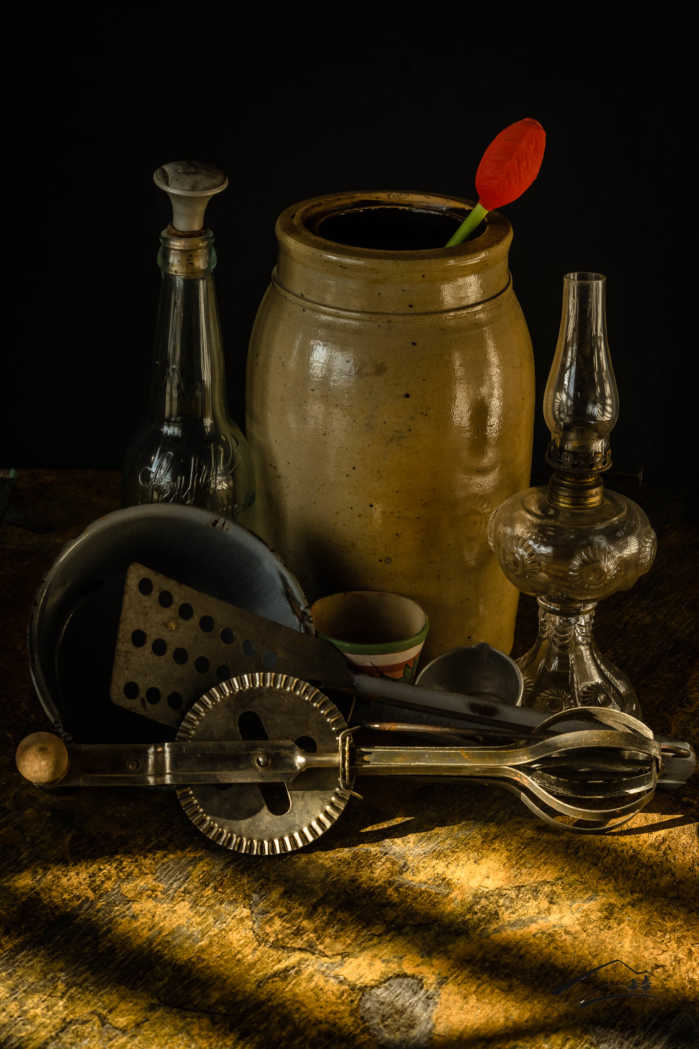
IMGP2868.jpg by William Raber, on Flickr
 
Nice, a couple of niggles: The red "flower" doesn't fit, and I think it's a bit too busy. Maybe remove the spatula and a couple of the smaller objects nearest the crock.
 
think it's a bit too busy

Wondered about that when staging, but I wanted to create a situation that items weren't instantly recognizable but required the eye to slow down. The red of the flower was supposed to be an "odd man out" scenario, in that it wasn't supposed to fit, but still fall within the color scheme. Light is gone for now. Will have to set up and stage it again.

I appreciate what you're going for with the red item, but it's too bright to me. It keeps pulling my eye away while I'm trying to look closer at the utensils in front of the crock, but I feel like given it's placement it isn't really meant to be the center of attention (maybe I'm wrong about that).
 
@Low_Sky thanks for the comments. I went way back in memory to my "artist days" when I staged this image. As I said earlier, all the elements where planned for a specific function. The red flower is an example of the relationship between surroundings and included objects with aspects of perceptual incongruity, where the contradiction of the viewers expectation is attributed wholly to the red flower. In simple terms you automatically view it as out of place, because it contradicts your frame of reference, and creates an unbalance.

Not everyone's ideal I know, but apparently it worked if it had the effect you say it did.
 
I love what you did here with the light and composition of the still. I understand what your doing but I don't love the red glass flower but applaud the attempt. If I was doing it over, I would probably carefully tape some strong siran wrap on the inner top part of the crock with black gaffers tape (so you don't see it) to make like an inner plate, and then pour in (heap to a mound) some sort of uncooked beans to make it look like the jug is full of your freshly harvested food. You could also pack the crock with cloths or newspaper if that's easier. The composition is very keen.
 
@jcdeboever I was waiting for you ro weigh in, as I suspected with your background you'd get where I was going. This image was designed from the start as one of those "Artsy Fartsy" projects. From my classes back during the "Cave Painting" times, I remember that art should elicit a response, but it doesn't necessarily have to be positive in nature.

From a self criticism point, I believe I may have to much going on at one time.

You know I really struggled with what to do on the jug. I tried a lot of different things, but never thought about the beans. I love It! Can't wait to restage and shoot again! My head is spinning with ideas.
 
I like the use of the angled sunlight coming through the window blinds, to create bright light that has shadow-lines in it. Nice way to darkend and thus help to hide that watermark-bravo on that! The titles used look good. The jug and the hurricane lamp and bottle appear to be tilted to the right a little bit, and everything in the utensils/glassware zone seems a little bit cramped. But the thing that bothers me the most is that the really interesting and dytnamic and lovely lighting is the light that is in front of the majority of the stuff in the shot; the large jug and the bottle and lantern and the hand mixer, that stuff has soft, diffused, somewhat uninteresting light. The light that hits the majority of the objects does not reveal their shapes all that much. The hand mixer's wooden crank handle, the main gear, and the blades have a shadow from the crisp light, but behind, everything has diffused light. I think this composition and arrangement is held back mostly by the way the light was used. I think the lighting on the majority of the background is too diffused; I am in love with the window blind look on the foreground tile.
 
@Derrel afraid I have to agree on the light. I wanted an appearance of it being on the edge, plus the glass bottle and lamp was killing me on highlights.
 
I like the use of the angled sunlight coming through the window blinds, to create bright light that has shadow-lines in it. Nice way to darkend and thus help to hide that watermark-bravo on that! The titles used look good. The jug and the hurricane lamp and bottle appear to be tilted to the right a little bit, and everything in the utensils/glassware zone seems a little bit cramped. But the thing that bothers me the most is that the really interesting and dytnamic and lovely lighting is the light that is in front of the majority of the stuff in the shot; the large jug and the bottle and lantern and the hand mixer, that stuff has soft, diffused, somewhat uninteresting light. The light that hits the majority of the objects does not reveal their shapes all that much. The hand mixer's wooden crank handle, the main gear, and the blades have a shadow from the crisp light, but behind, everything has diffused light. I think this composition and arrangement is held back mostly by the way the light was used. I think the lighting on the majority of the background is too diffused; I am in love with the window blind look on the foreground tile.

You bring up some very useful critique. I think the lighting is close in that it coveys a painting and/or the type of light being used in the time of the objects, this really made the whole body of the image fascinating too me. Your direction is pretty cool in that your staying on course with the artists intended vision.
 
@Derrel afraid I have to agree on the light. I wanted an appearance of it being on the edge, plus the glass bottle and lamp was killing me on highlights.

It is close, pretty impressive my friend!
 
Thanks JC. Another point to @Derrel comment. I was using natural light. Lots of clouds moving around causing the pattern to change. Wondering if I couldn't cut some mat board with slots and use on a one of my lights??
 
@Derrel to simulate sunlight through a window would it be better to use a 7" reflector behind the mask.
 
Yes, a standard type reflector that throws a crisp light will work the best, so the Alien Bee 7-inch standard-sized metal reflector on the monolight would make a lot of sense. A barn door set might also be useful, to keep all of the beam contained within the confines of smaller masks like the ones shown. Most of the time, these types of "cookies".
 

Most reactions

Back
Top