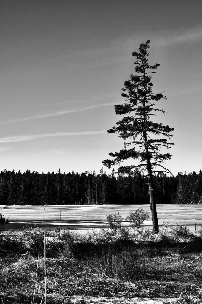
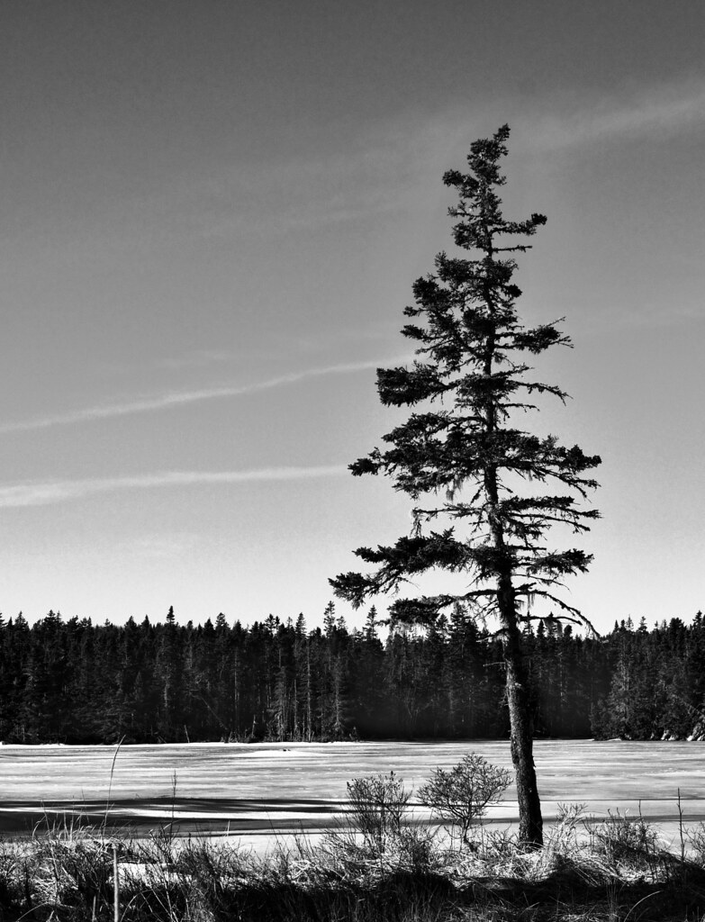
I totally agree that the picture looks great in black and white!
I feel there is a bit too much stuff in the foreground. If your intent (as per the title) was the tilty tree, then cutting out some of that stuff might help focus the viewers attention on the tree.
I like black and white images as they draw the viewers eye to the shapes and lines that the image creates. The foreground stuff has alot of twisting and turning lines which draws me eye more than the tree.
I also feel that the background tree line is a bit dark. I normally wouldnt mind, but I feel that it being so dark, along with the dark in the tree kind makes the tree mesh in with the background tree line a bit too much.
But great eye and nice image, I like it.








![[No title]](/data/xfmg/thumbnail/35/35946-771bfce9b2727c9126587d96c471da80.jpg?1734167737)
![[No title]](/data/xfmg/thumbnail/42/42484-fe2beb05d743deaf21681664722538d4.jpg?1734177008)
![[No title]](/data/xfmg/thumbnail/35/35953-1a8b92df0115ff7026f31b78855ac815.jpg?1734167764)
![[No title]](/data/xfmg/thumbnail/35/35262-02f8eba4a2a92dbae0b55547bba80b4f.jpg?1734166920)